✨ Meet Otta ✨ NEW RELEASE!
A typeface that answers the rise of AI with something different: a profoundly human frequency. Gentle, organic, artisanal. A design that reconnects us with the handmade.
👉 Try it: https://t.co/pUaY6fUGve
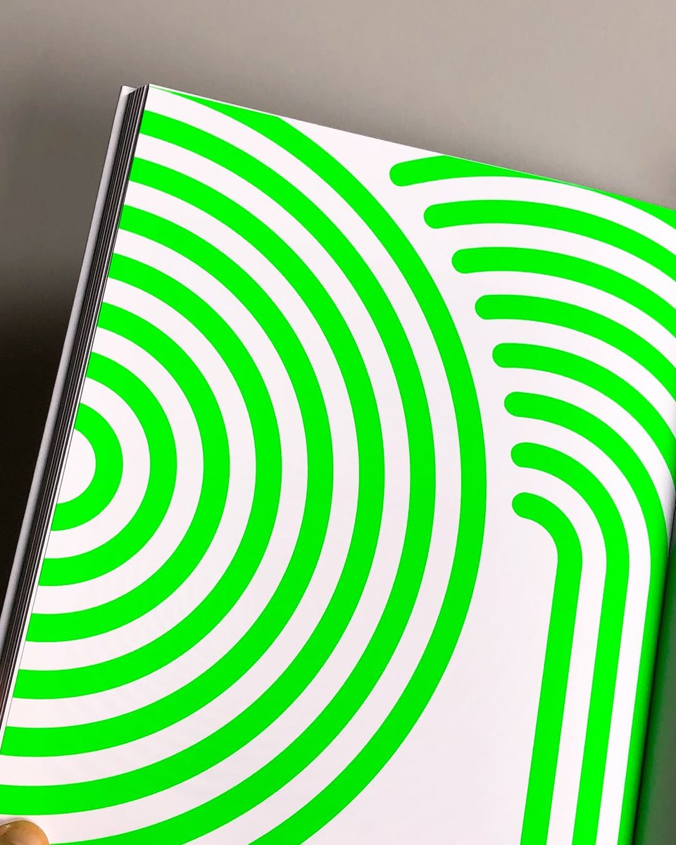
For this project, titles and opening pages were set in #Octothorpe (@ivanmorenologia), whose optical rhythm and generative character make it a natural visual companion to Apollonio’s explorations of movement and perception. The text typeface is LL Circular (@lineto_com).
[ Octothorpe in use ] Marina Apollonio. Oltre il cerchio
Beyond the Circle at @GuggenheimPGC , this catalog explores the work of Marina Apollonio, one of the most representative figures of optical and kinetic art.
Exhibition curated by @mgelussi
Published by @MarsilioArte
✨ Meet Otta ✨
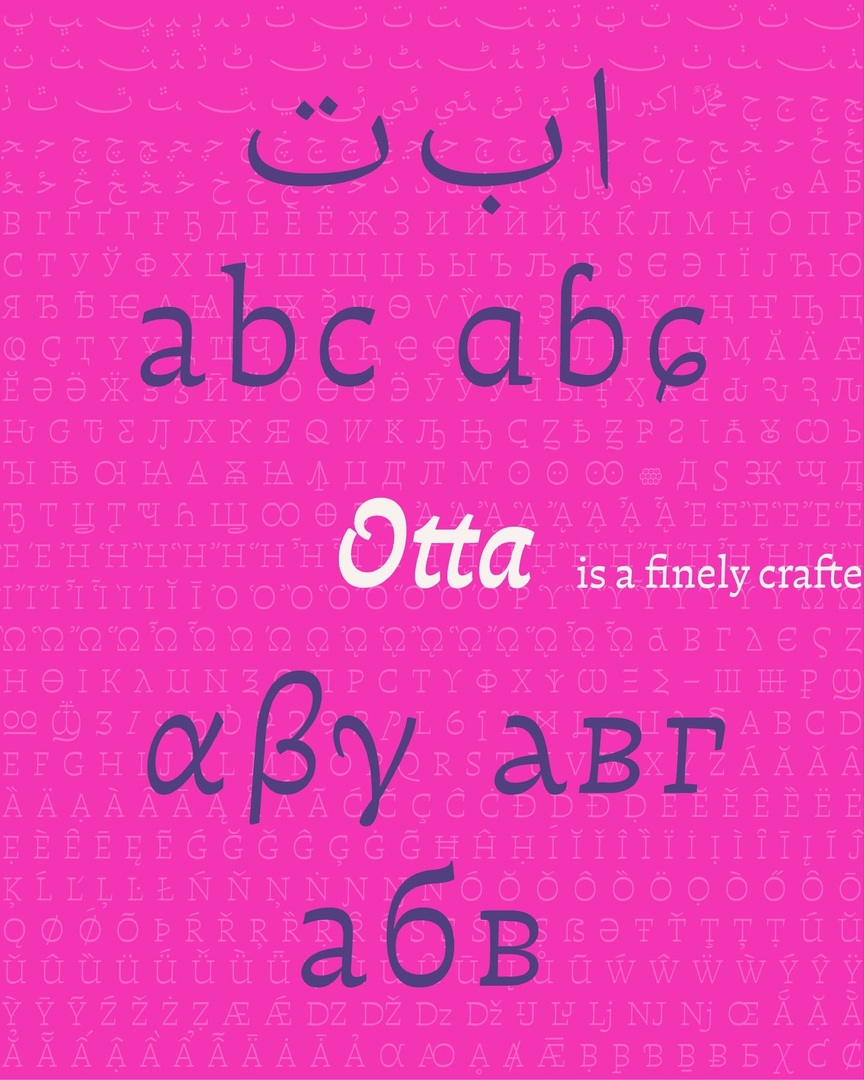
A multi-script typeface designed by Francisco Gálvez Pizarro (@pampatype), Otta is much more than a font — it’s a statement. It responds to the rise of AI with something different: a profoundly human frequency. Drawn with a strong sense o… https://t.co/jBbCZY2xZR
#Otta is the most significant achievement yet by Francisco Gálvez Pizarro — and we at PampaType are proud to publish it. 🖤 Don't miss the chance to try it! 👉 https://t.co/pUaY6fUGve
✨ Meet Otta ✨ NEW RELEASE!
A typeface that answers the rise of AI with something different: a profoundly human frequency. Gentle, organic, artisanal. A design that reconnects us with the handmade.
👉 Try it: https://t.co/pUaY6fUGve
#Otta ✨ Drawn with rhythm and care, Otta blends calligraphic + typographic forms into a fluid style for continuous reading. Inspired by Arabic & Greek horizontal contrast, it grows into an ambitious multi-script family.
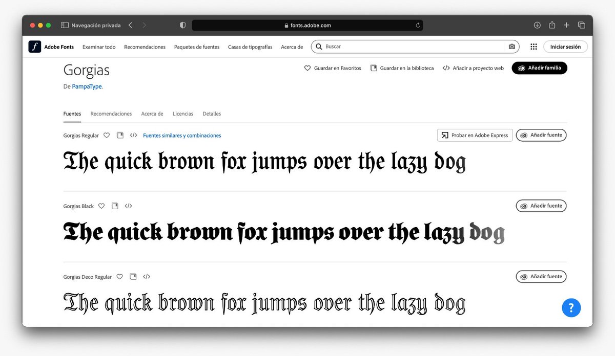
🔥 #Gorgias just dropped on @AdobeFonts! Bold. Detailed. This blackletter with serious attitude — is ready for you to try. Go ahead… and watch it steal the spotlight.
👉 https://t.co/mAzgAXQxNV
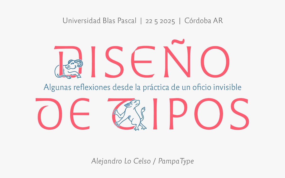
📣💻 Hoy a las 10:15 h (ARG), @alelocelso dará la charla “Diseño de tipos. Reflexiones en torno a la práctica del oficio más invisible de todos” en la @ubpascal. Pueden seguirla en vivo por YouTube 👉 https://t.co/FClMbsbo5T #Pampatype#Tipografía
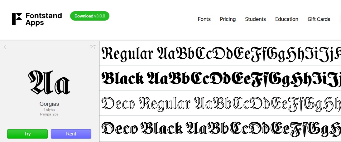
#Gorgias is now available on @fontstand! 🖤
Designed by @_ManuelLopezR, this blackletter bridges 1911 Germany and present-day Mexico City — bold, detailed, and ready to type across time and borders.
👉 https://t.co/vAde9rDIiT
#FontRelease#Blackletter
📚✨ Meet #Gorgias, a bold reinterpretation of 19th-century #Schulfraktur by Mexican type designer @_ManuelLopezR. His design blends heritage with sharp contemporary forms! Gothic never looked this fresh. 🔥
Try it at 👉 https://t.co/L2PLwqvO4I
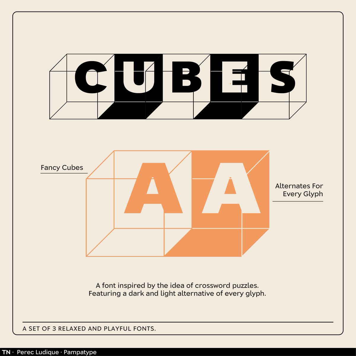
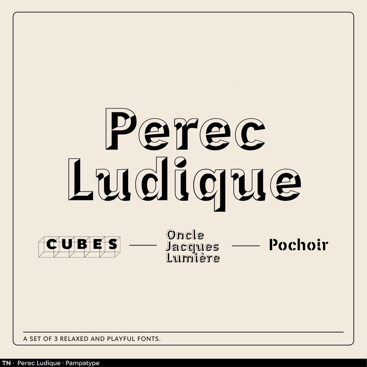
Perec Ludique brings personality to the Perec super family! From jewel-inspired Oncle-Jacques to smart, puzzle-like Cubes, this set is your creative playground. Get all 4 styles starting at $48. 👉License it here: https://t.co/Dcjrsiq1wo
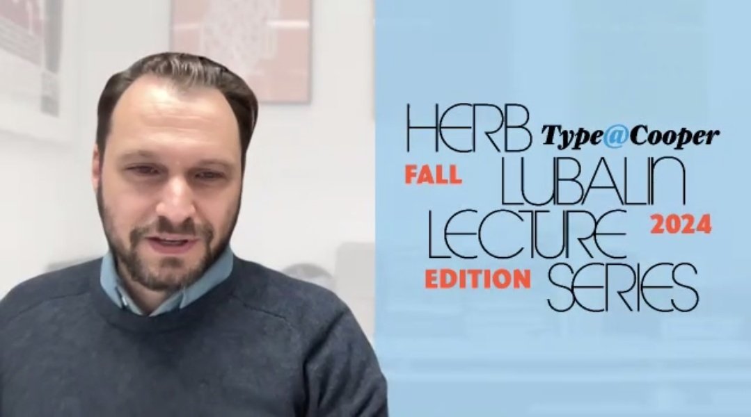
Better late than never! 🎥✨ Throwing it back to @alelocelso's session "TUSCANS: some intriguing questions over this singular ornamental type style".
👉Watch the full conference: https://t.co/BKdAQhCgB0
@CooperType@cooperunion


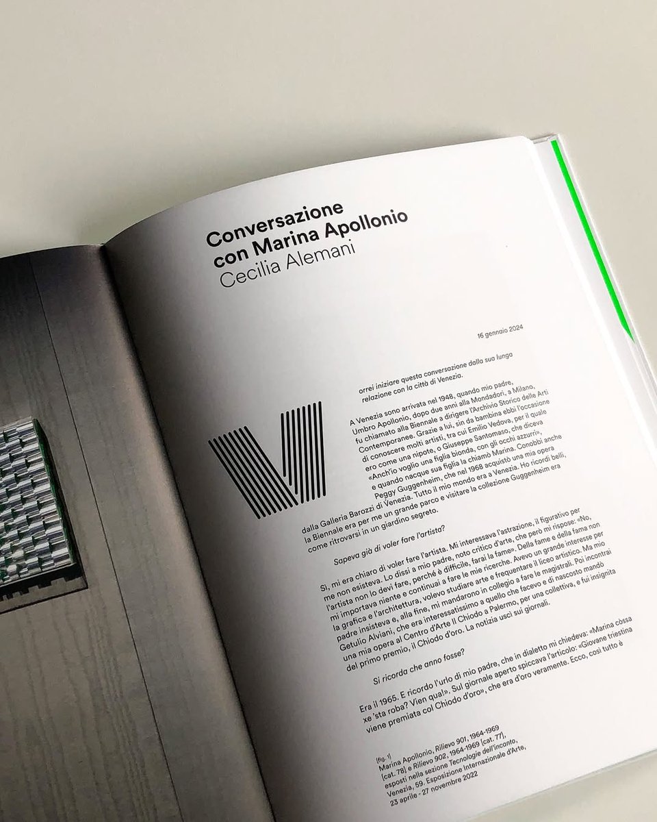

![pampatype's tweet photo. [ Octothorpe in use ] Marina Apollonio. Oltre il cerchio
Beyond the Circle at @GuggenheimPGC , this catalog explores the work of Marina Apollonio, one of the most representative figures of optical and kinetic art.
Exhibition curated by @mgelussi
Published by @MarsilioArte https://t.co/Jbqy0yoJRx](https://pbs.twimg.com/media/HDDRNRBWMAAeBFX.jpg)








![pampatype's tweet photo. [ Octothorpe in use ] Marina Apollonio. Oltre il cerchio
Beyond the Circle at @GuggenheimPGC , this catalog explores the work of Marina Apollonio, one of the most representative figures of optical and kinetic art.
Exhibition curated by @mgelussi
Published by @MarsilioArte https://t.co/Jbqy0yoJRx](https://pbs.twimg.com/media/HDDRNTtaMAgjUim.jpg)


![typecache's tweet photo. [New Font Release] PampaType released Otta designed by Gálvez Pizarro. https://t.co/UcL6eai63I #typecache https://t.co/1n6AlxVnjH](https://pbs.twimg.com/media/G0FS65caIAApg0C.jpg)



![typecache's tweet photo. [New Font Release] PampaType released Gorgias designed by José Manuel López Rocha. https://t.co/N8mo33EygV #typecache https://t.co/Sh2Wm7dVxl](https://pbs.twimg.com/media/GrENu5ibcAATwTU.jpg)


