GOLD AND SILVER BREAKING OUT FROM 18 MONTH H&S NECKLINE🚨
Below is a weekly combo chart, which has the US dollar on top, followed by gold, silver, and the GDX. Today, gold and silver are breaking out from their 18 month H&S top neckline, with the GDX not too far behind. The key to understanding what's taking place in the precious metals complex is the inverse correlation with the US dollar, which I know is not perfect, but close enough to pay attention. We can look at hundreds of charts for the precious metals complex, but it all boils down to understanding what the US dollar is showing us. Currently, the US dollar is showing us an 18 month inverse H&S bottom, which translates into an 18 month H&S top for the PM complex.
All the best…
Rambus
@ayceATH Hey Ayce I sent you direct message here in X, read it please. Something stupid I have done for sure and I can't reach your discord. Probably I didn't press the "straight to discord" button.
@MrMilkTrading it says that building bots with a prompt, new way of spending money, haven't try it yet, just put the italian gods playing obscure disco tunes, that's the solution, not ai's 😎 https://t.co/bDWFho8P3M
🚨 BREAKTHROUGH: A 25-year-old biologist has built something that sounds like science fiction.
Pilar Ferrer, from Argentina, created an injectable gel that helps the heart repair itself after a heart attack.
She's 25. Let that sink in. 🧵
This is to my point about compression being inevitable as human knowledge is too small for what we are building. As well, humans are too redundant in their wants needs and questions.
AI-generated content will clearly contain propagation errors just like human history of knowledge does. Only LLMs will iterate those propagation errors infinitely faster with less ability to self- correct, for want of understanding.
This gets to Ballard’s test. LLMs cannot attain understanding (AGI) as understanding cannot exist unless reason first exists without language. A likely impossibility for a language model.
Research on this is already focused on getting around this in some way. Though many also have not yet conceded the point.
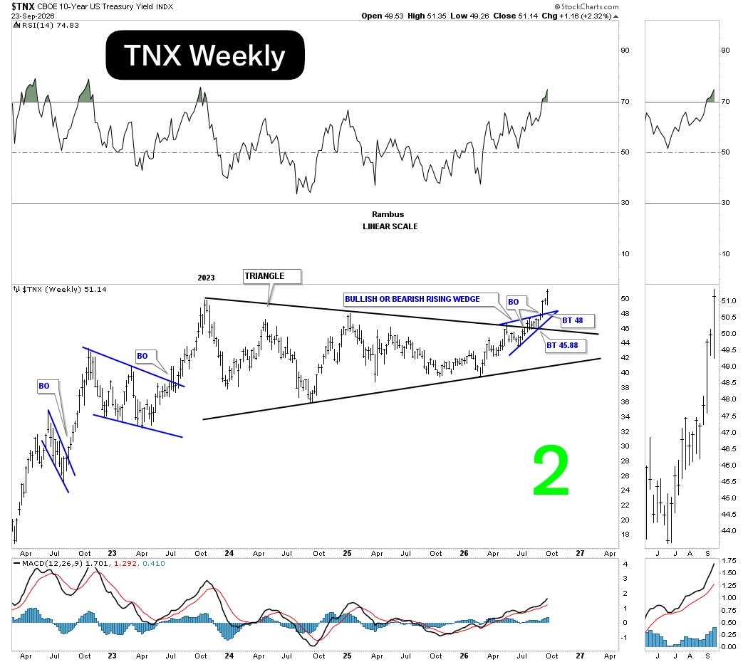
🚨TNX BREAKOUT GAINING MOMENTUM🚨
Three weeks ago, the TNX 10-year yield broke out from a bullish rising wedge. For the last week, the price action formed a classic bull flag, with the breakout today.
(Chart 1)
The bullish rising wedge formed in the middle of the top trend line of the 2023 triangle consolidation pattern. It is a bit unusual, but the actual breakout and backtest were very clean. (Chart 2)
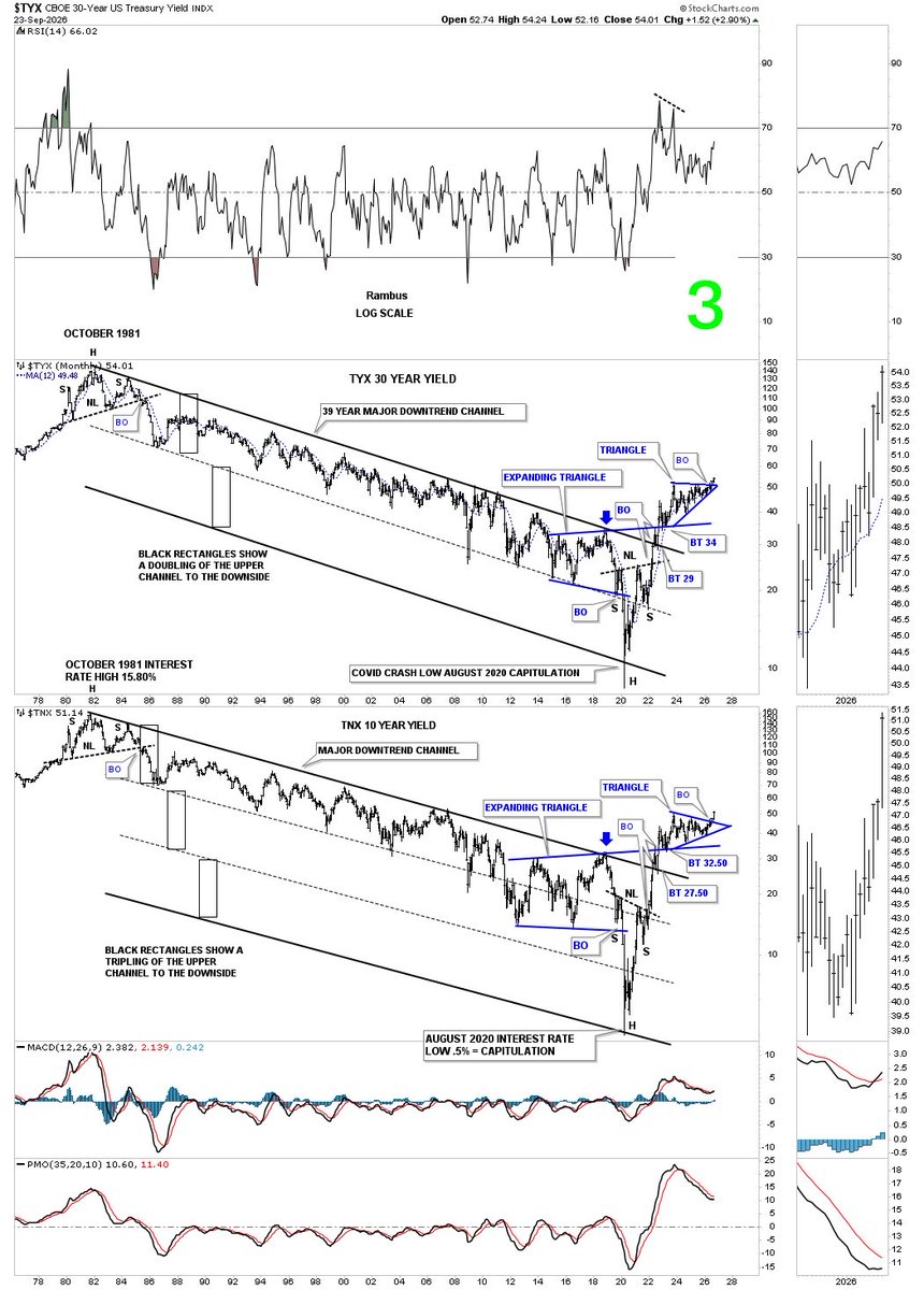
What’s taking place in interest rates right now is a secular change that began at the 2020 pandemic crash low, where the TNX bottomed at 1/2%. This combo chart goes back to the October 1981 high in interest rates, which shows the nearly 40-year decline. Note the blue triangles on the TYX and TNX that are breaking out into multi-year highs. Interest rates are still relatively low, yet once there is a secular trend change, it can last for many years. (Chart 3)
You cannot raise interest rates to bring oil prices down. There is no mechanism. Even opening the straits does not solve what Zelensky is doing in Russia. There are shortages now and lines. Our computer still warns this could go to $200 a barrel by 2028. It is impartial. It is not political.
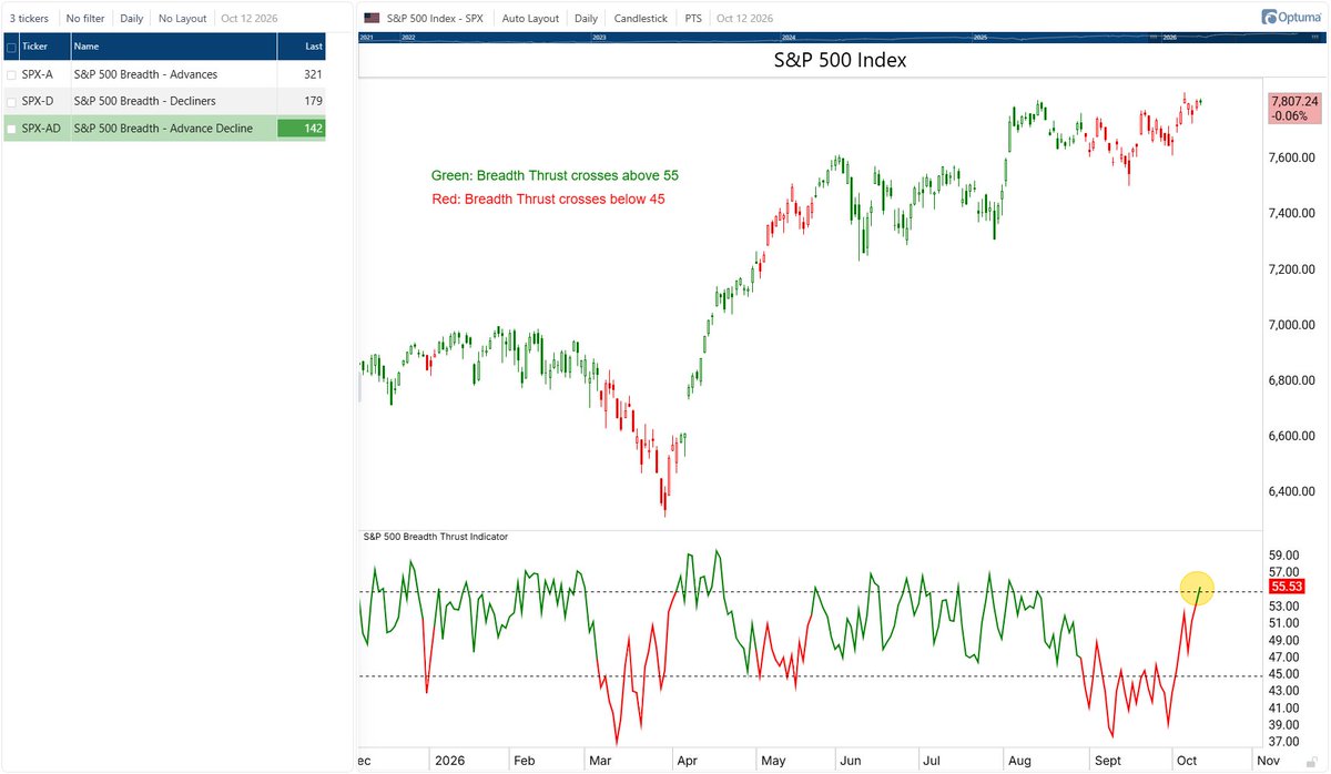
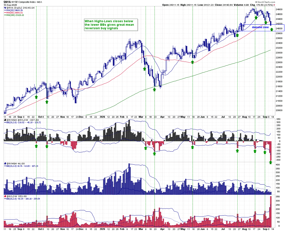
This chart I gave our subscribers yesterday was screaming for a market bounce. First off $NYSE had close at a demand zone. Secondly the 52 week highs - lows was way below the lower Bollinger Bands 2 consecutive days, and if you look back at the history has been areas where you get at least a mean reversion bounce
BREAKING: US annual interest expense is up to a record 18.5% of federal government revenue.
This is officially above the previous record of 18.4% set in 1991.
This percentage has more than QUADRUPLED over the last 4 years as interest expenditures on public debt skyrocketed.
US annual interest expense now stands at a record $1.25 trillion, more than 4x the level seen in 1991.
Meanwhile, the 30Y Treasury yield is trading at ~5.21%, just 13 basis points from its highest level since 2007.
By comparison, the 30-year yield was oscillating at ~8.00% in 1991, underscoring how much the US debt burden has grown since then.
The US debt crisis is in uncharted territory.
What this chart reveals has gone almost completely unnoticed 🚨
TITLE: SILVER’S INSANE 25-YEAR BULLISH RISING WEDGE
We’ve been following this 25-year monthly line chart for silver since the right-shoulder low in 2022. Both massive H&S bottoms are fractals, which show the same angle for the neckline, with the double head that is actually a large double bottom from a shorter-term perspective. Note the strong impulse move out of each H&S base.
What really brought this chart to life for me was how, after the breakout above the top trend line of the 1980 bullish rising wedge, the backtest came in at 55 and not 50 if you were looking at a bar chart. The long-term implications of this chart are staggering, to say the least.
It is what it is until it isn’t.
All the best…
Rambus