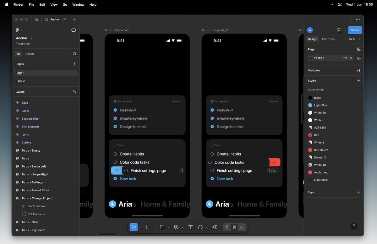
This widget is where everything started, so I wanted to stay as faithful as possible to the original vision in the final version.
It’s definitely more visual than functional and not the most useful widget for Anchor, but it felt right to make it the first. More will follow.
No Matter’s new home is live! 🚀
https://t.co/ipziWvAJni
I spent a month building the branding and website for my agency; launched it...then realized I hated it.
Together with my co-founder, we decided to start from scratch.
Now, seeing it live, I know it was the right move.
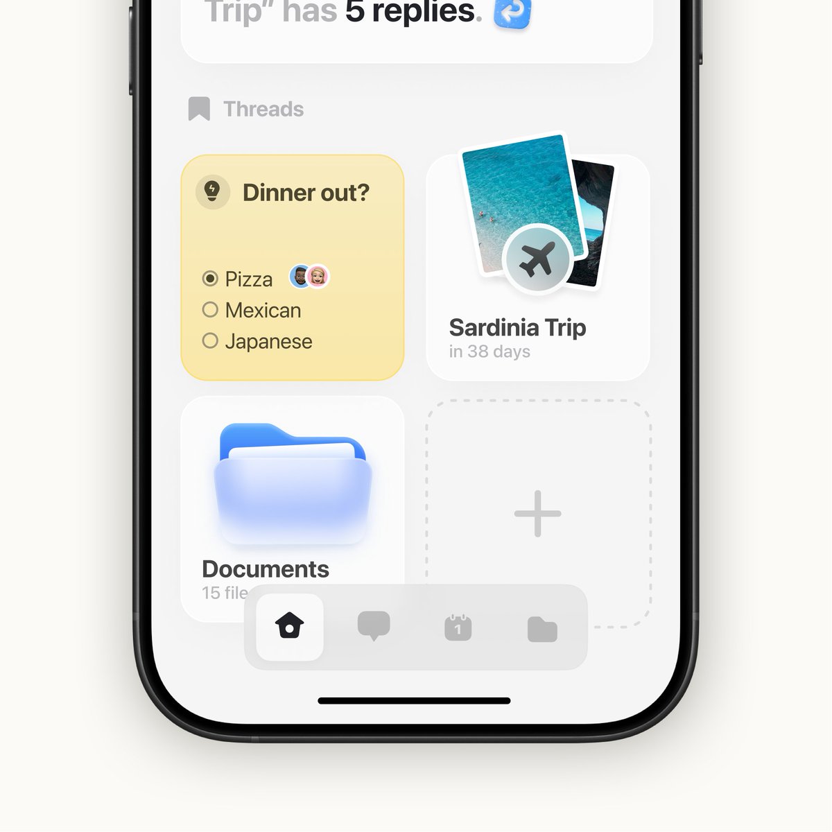
I’m crafting Anchor to be opinionated and to feel right for those who connect with it.
Settings are nestled within the project menu. No icons, no affordances.
Early on, it will guide you with visual cues. Over time, they will fade, trusting you’ll know your way around.
Apple already had everything they needed, they only had to apply Vision OS to their ecosystem...
The new OS direction feels too heavy-handed.
It feels like a fake leak.
Apple fanboy and product designer here.
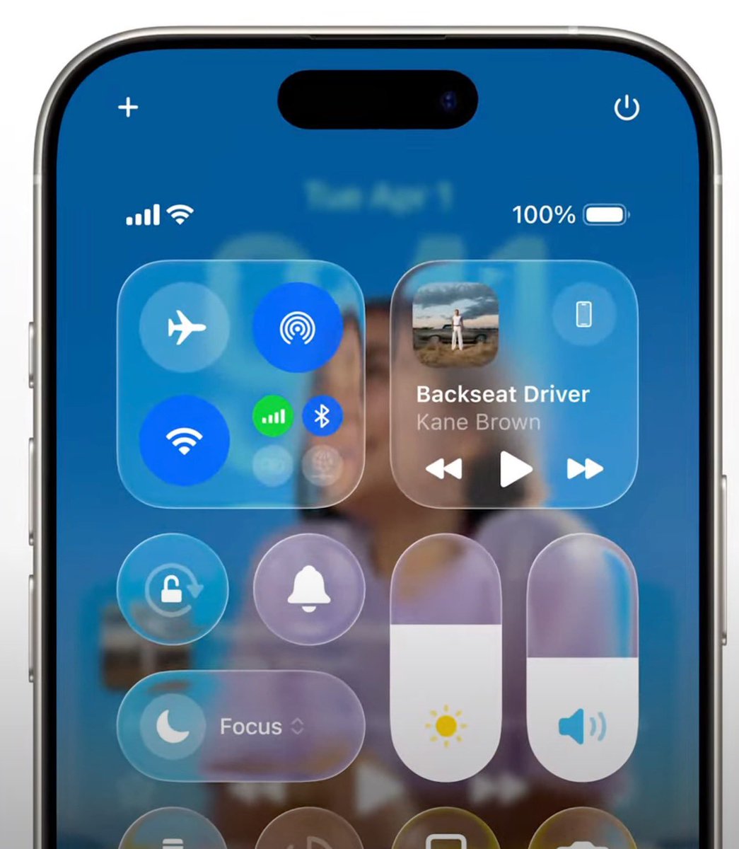
The new liquid glass effect on iOS feels odd.
Everything is hard to parse. The backgrounds end up being too prominent, making the content difficult to read.
I already miss the blurred glass effect. 🥲
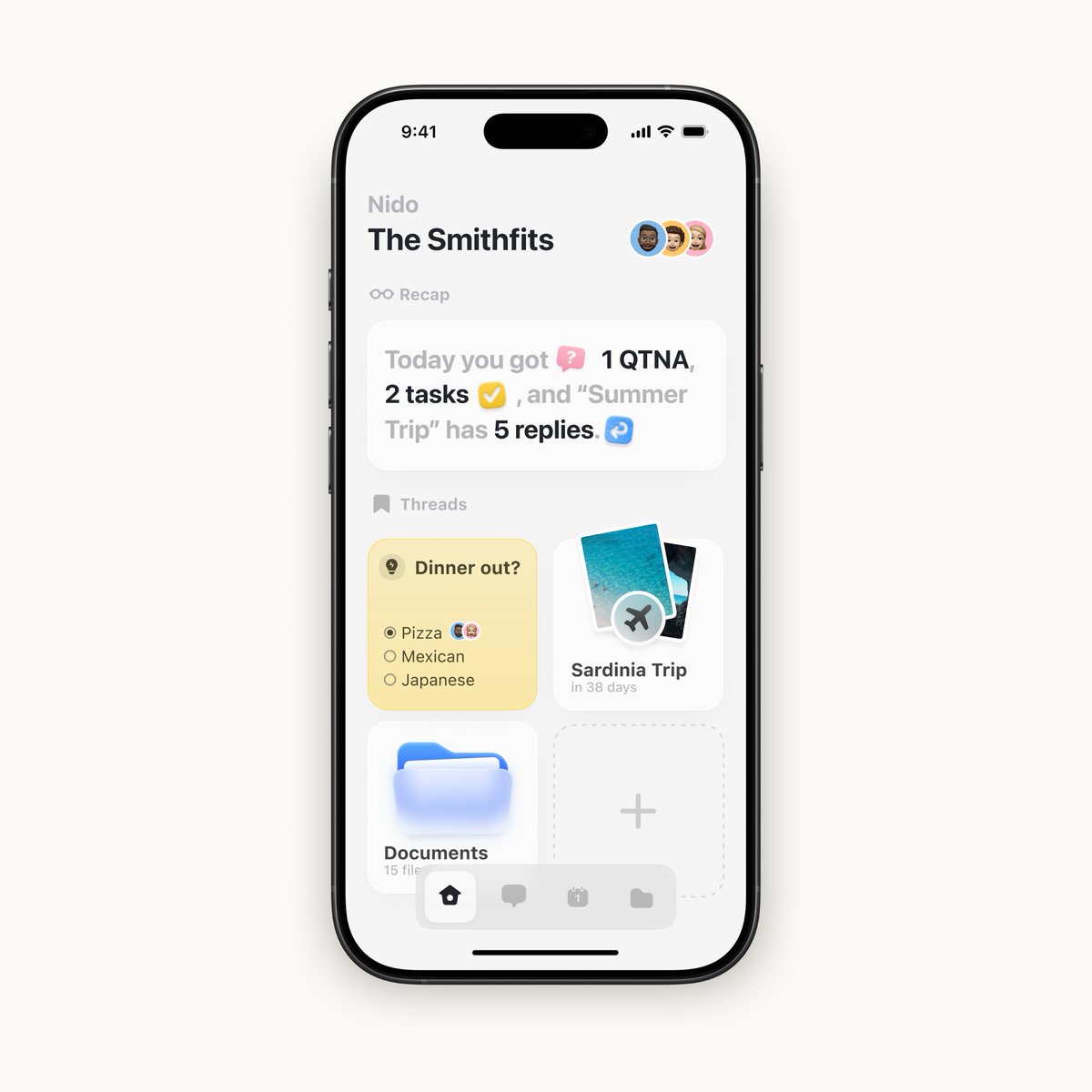
Two weeks ago, I promised to design for free a screen for one of your ideas. Douglas on Threads
gave me a cool one! 🤝
Here it is: Nido (Italian for Nest) 🪺.A cozy family hub app to manage tasks, QTNAs, projects, and more.Hope you like it.