Estamos buscando un diseñador a 20h que sea freelancer, si lo cumples y quieres ganarte un cliente fijo al mes, esta es tu oportunidad. https://t.co/v3UQKdifq6
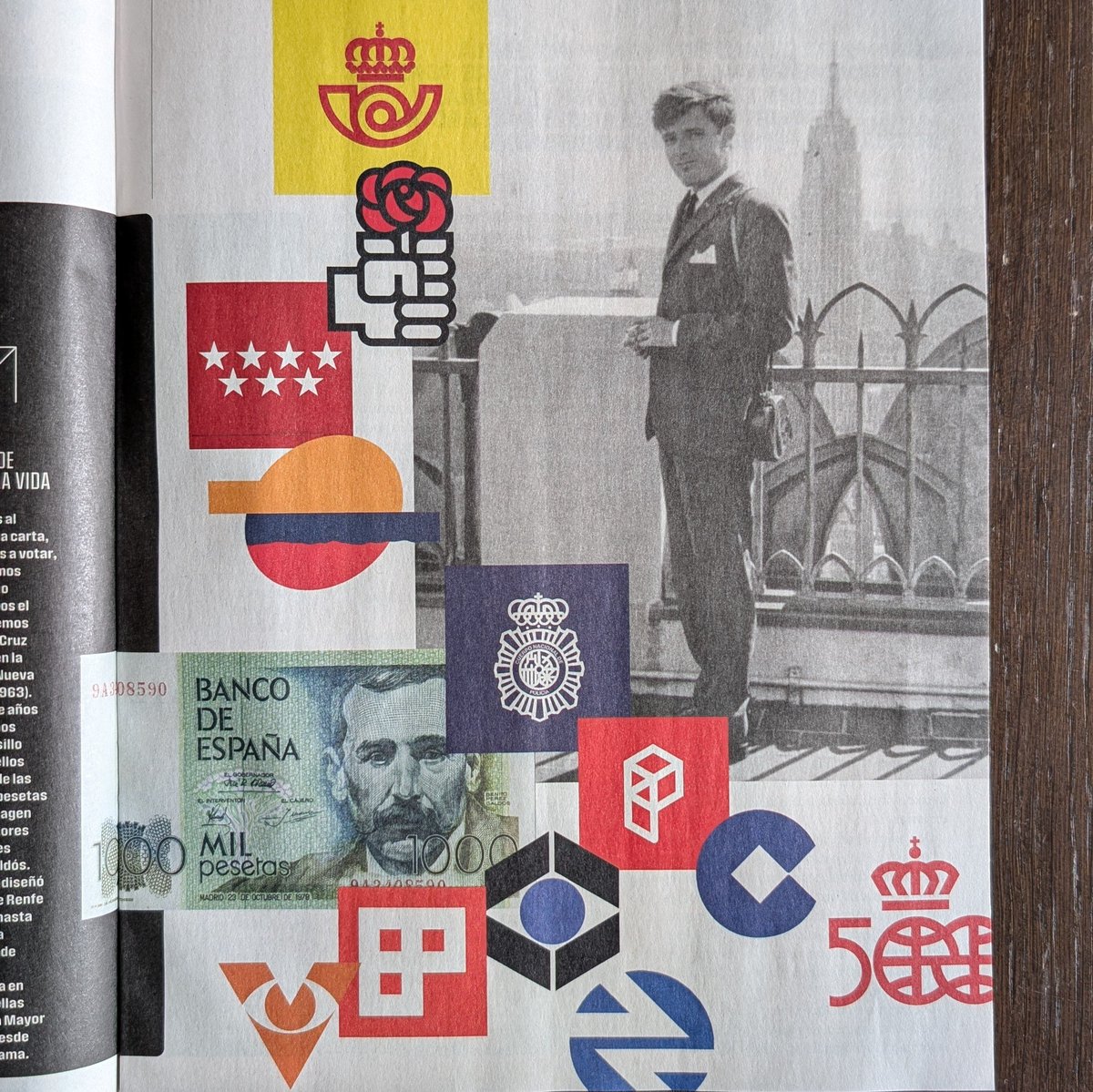
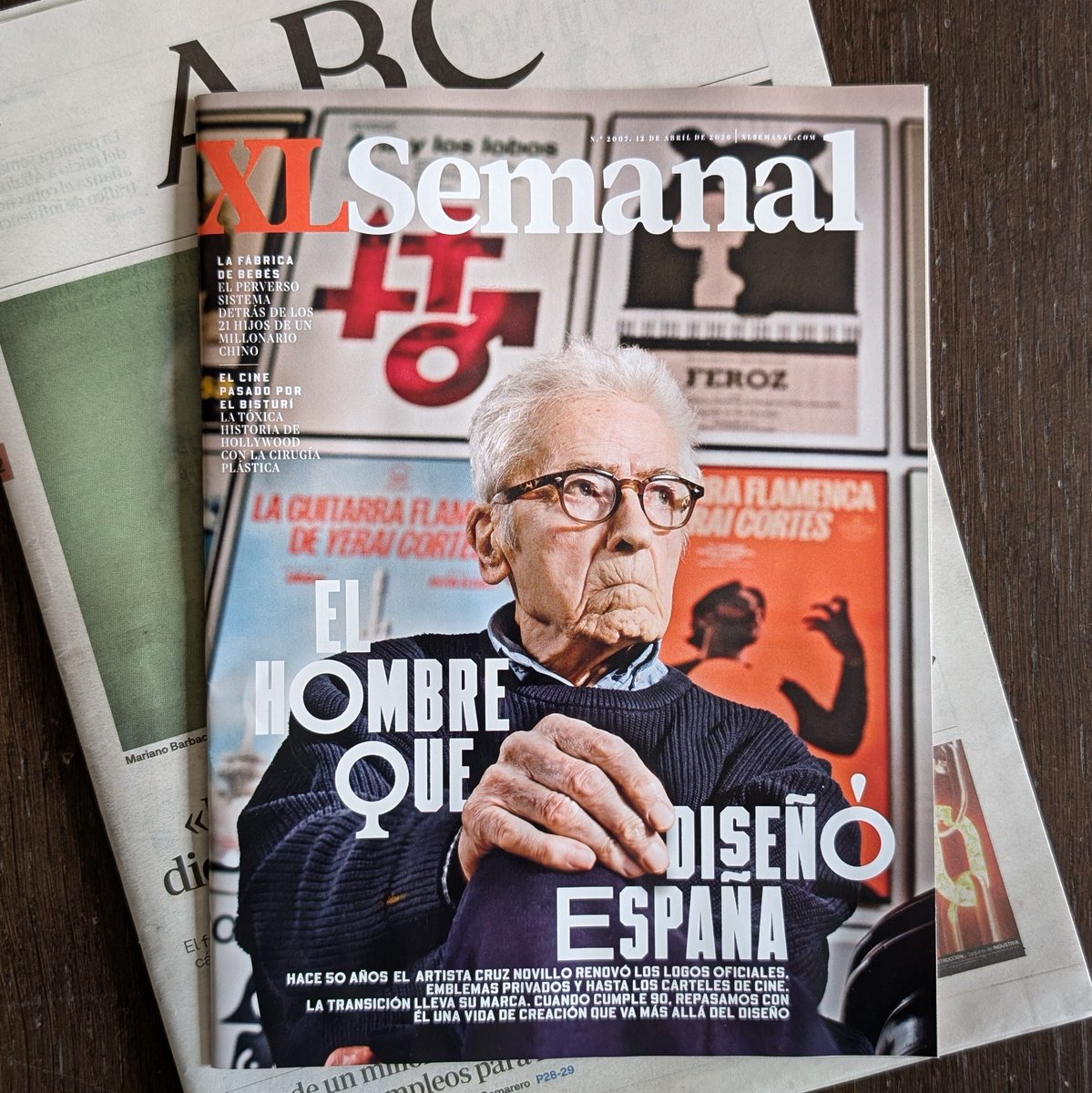
The last two weeks has seen an incredible response to our call for submissions from designers around the world to share their logo work. Many of us owe a great deal to the legendary Spanish designer Cruz Novillo who, we are sad to learn, has passed away 🥲 His contribution, not just to much of the pioneering work he did in his country, but the effect it had on the wider international design community was substantial. He must remember, the work we do today was founded on those that came before and show humility in this understanding. Sending love to his family, friends and all those influenced by and cared deeply for his work ❤️
Architect vs. Artist: Who Actually Drew the Century’s Most Iconic Logo?
The creation of the Mexico 68 logo remains one of graphic design’s most storied power struggles. While history often highlights American designer Lance Wyman for the technical execution of the radiating parallel lines, archival evidence and testimonies from the Organizing Committee strongly support Pedro Ramírez Vázquez as the conceptual architect. As the Committee’s President, Ramírez Vázquez rejected initial proposals as too "Western" and dictated the core vision: a fusion of the five Olympic rings with the digits "68." He sought to marry modern Op Art with the linear geometry of indigenous Huichol wax paintings, ensuring the identity was undeniably Mexican.
The drama between the two men stems from a fundamental clash over authorship versus collaboration. Wyman has long maintained that his arrival in Mexico City and subsequent sketches birthed the "68" logotype. Conversely, Ramírez Vázquez’s estate has produced documents suggesting the geometry was already being prototyped under his strict direction before Wyman was even hired. This friction illustrates the tension between a visionary director who sets the "Total Look" and the talented designer who refines it. While Wyman provided the expert hand, it was Ramírez Vázquez’s cultural authority and specific geometric instructions that ultimately defined the logo’s soul, leaving a legacy of brilliance shadowed by a lifelong dispute over who truly held the pen.
#logodecks