Copper Inventory Alert
Many dealers and social media podcasts pumping copper products and copper investments typically talk about a shortage or tightness in copper that will take prices to much higher levels.
These participants and social media influencers provide very little disclosure on the products or services being sold.
I have laid out in a previous post how much the precious metals dealers who sell copper rounds and bars excessively mark up these products to a point where one may never break even.
Copper is reacting to similar events that impacted the silver market in 2025. Tariffs and regional pricing dislocations.
Here is the reality. The Comex Warehouse inventories of physical copper just hit an all-time high of approximately 744,265 tons. Chart below shows inventory levels since the 1990's.
Please do your due diligence when investing in this asset class.
WHAT IF the biggest bubble of our lifetime isn't crypto?
Not AI stocks.
Not real estate.
What if it's the one asset every pension fund, every retiree, every "safe" portfolio is loaded with?
Bonds.
200 years of rate cycles say the same thing:
Every peak lasts 56–67 years.
The 1981 top was 14% yields.
The 2020 bottom was 0%.
39 years of falling rates just ended.
What if we're now at the start of the next 50-year cycle — upward?
Most investors have never managed money in a rising rate world.
Their entire career happened inside the bull.
The unwind has barely started.
And no one is talking about it.
Stocks vs Bonds Long-Term Cycles
It should be no surprise that stocks are beating bonds, but the extent of things seen in this week's chart might come as a shock...
Key implications + things to watch out for: https://t.co/Oze88sSdp7
Railroads were once 63% of the entire US stock market.
Not 63% of transport stocks. 63% of everything listed.
The history of concentration, in order:
– Tulips, 1637. A single bulb traded for the price of an Amsterdam canal house.
– South Sea Company, 1720. Shares went from about £128 in January to above £1,000 by summer, then back near £150 by December.
– US railroads, 1840s. 63% of US market cap.
– Utilities, telecom and industrials, 1929. 36%.
– Nifty Fifty, 1972. 40%.
– Japan, 1989. 44% of global equity.
– Dot com, 2000. 41%.
– AI Big 10, today. About 40%.
Every one of them was built on something real. Railroads did compress a continent. The internet did rewire commerce. Being right about the technology was never the thing that protected you.
The tulip story is also less clean than the legend. Modern research found the economic damage was modest and the ruin was mostly literary.
The bubble was never in the idea. It was in how many people decided to own the same idea at the same time.
Chart of the weekend: US Crude Inventories
Oil inventories near 50-year lows. Even though financial engineering can work for a little while on paper prices, it can’t produce “real-world assets” like oil, metals, & agriculture products.
Have a wonderful weekend!
Source: Bank of America
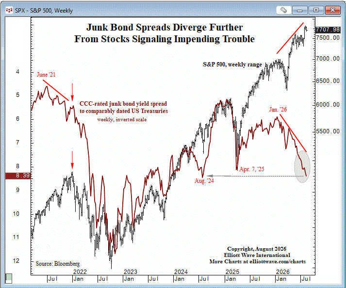
One of the stock market's most important warning signs is getting louder.
Junk bond spreads and equities usually move together.
When they don't, pay attention.
CCC-rated spreads have been widening for eight months while the S&P 500 has continued climbing to new highs.
A similar divergence preceded the 2022 market peak.
Credit markets may be flashing a warning that stock market bulls can't afford to ignore.
See our analysis and outlook for stocks, gold & silver, forex, interest rates and more: https://t.co/BDR0ZpxGc9
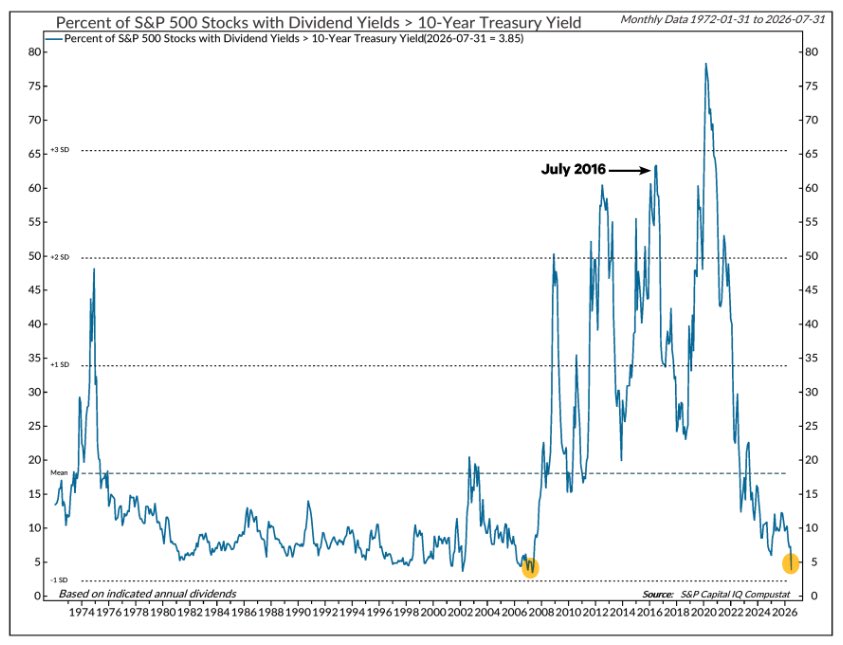
S&P 500 stocks with dividend yields > 10-year Treasury yields hit a record high of 63.4% (excluding COVID-19 crash) back in July 2016 … a decade later, that figure has fallen to less than 4%, lowest since May 2007
@NDR_Research
Upper boundary for $FCX is well-defined. I'm monitoring it closely for a breakout.
More on this and other classical chart pattern setups >> https://t.co/xNhByOrmXw
Quote & Chart of the Week…
“I would say 50% of the US market is cash flow and 50% is air. The problem with air is what happens when investors finally decide to sell it.” — Christer Gardell
Chart shows FCF/Market Cap Yield of the Q’s at record lows and price at record highs. When the two diverge this much, it’s time to take note!
Chart Source: Koyfin
After a fairly tame week, the one chart I’ll wrap up with is “The Buffett Indicator”.
The Buffett Indicator surged to a record high this week, taking out the 2021 peak before the 2022 Bear market & well exceeding the 2000 Dot Com peak.
Have a relaxing & wonderful weekend! 😊
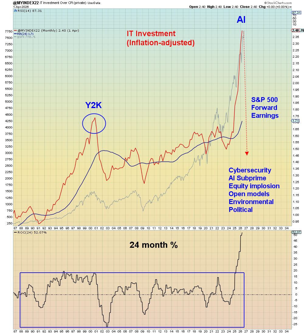
The reason why S&P 500 earnings estimates keep going up is because for the first time in history, capex expense is now being counted as revenue in Wall Street's forward earnings estimates.
If Wall Street was counting AI capex expense at the same rate as they are counting the capex revenue, then earnings would be negative.
AI is the Enronification of the entire stock market.