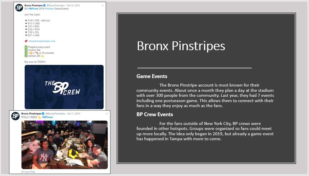
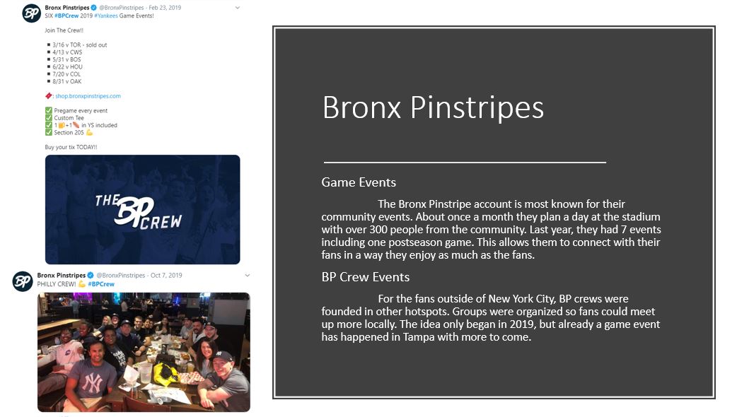
Changed a few things about this slide (new background, picture borders, bold headings), is this well designed? Should I still change the heading font, or is this enough contrast the way it is? New slide is on the right #engl318mu
@alyssamancusoPR It's definitely based on amount of likes and follows, but confusing still. Doesn't line up with the numbers or 'podium' design, I'd modify that by either going with a straight or podium design and no numbers #engl318mu
@MrHeisler I think that's a pretty good layout, having each point lined up is helpful. Maybe put a box around each section or change font colors to differentiate better? Try it out if you want #engl318mu
@Zander51486625 I think it's self explanatory, although I'm not sure you need the difference line. I can pick up on the difference from the other two lines alone, and the other is just clutter. Nice data display! #engl318mu
@lizwardwell_318 The arrows work well, it's clear what each one is pointing to. Very effective for directly identifying each element with a visual! #engl318mu
@lizwardwell_318 I will darken the background a bit. Great call on font sizes, I hadn't even thought about that! It's so much clearer to read now that I'm adding that distinction #engl318mu
Is the design on this slide too basic? All the slides in this section are designed like this, but I'm wondering if the background needs to be changed to another gray or something to add more #engl318mu
@wanli_w Keeping it simple is great for the table of contents. That's a spot you want to be clear and concise, so this is the best place for a simple design like this. #engl318mu
@DavidWaskiewic1 Nice, designing the content like the actual creator does helps me understand them a little more. It's another layer of explanation! #engl318mu
@ask_justwhy @BenjaminLacher Definitely better! I still think you could design it a little more with some of the excel tools, but this is a huge step! #engl318mu
I believe my PowerPoint usage would appeal to other Yankees writers. They all create well designed content with very structured articles and videos, and my design is very similar to that. Strong headings and similar slide design match their strategy #engl318mu
An element from my guide is highlighting the difference between normal coverage and 'pandemic coverage'. All the accounts I am researching changed their content strategy, so clearly I need to write about something else too #engl318mu
To make my data more meaningful, I compared the year referenced in tweets and articles. This year's data is very spread out from 1913-2020, but only ONE of the 324 total articles from last year wasn't about 2019. Should I graph it, or just state that? #engl318mu