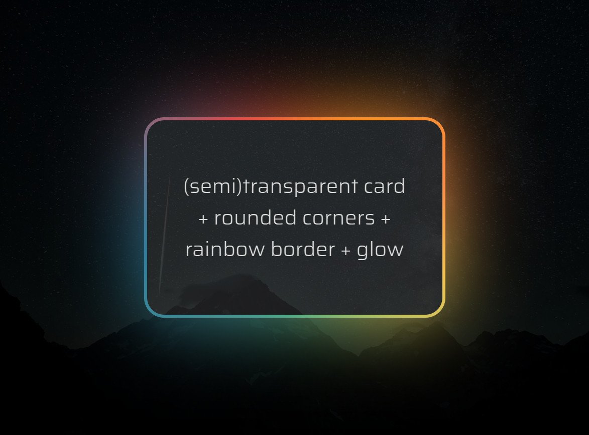
Know the animated 🌈 border + glow effect that's all the rage? It's normally done by adding an opaque cover on top of two 🌈 layers.
But what if we wanted a (semi)transparent background within the border? It's possible with pure #CSS!
Heavily commented: https://t.co/p8L9Oa641T
I made a thing: scroll-driven, almost pure CSS infinite circular gallery rotation - check it out on @CodePen
https://t.co/LfqqghJTd2
Using scroll-driven animations and the tiniest bit of JS for the infinity part of it.
Made with 🖤 for this week's #CodePenChallenge.
💡 CSS Tip!
Do you want to detect the overflow of an element? Does it have a scrollbar or not? It's possible with only CSS (No JavaScript!)
You can even style any element on the page using this information 🤩
See reply for code and demo👇
Each day of our launch week comes with a fancy animation built using @rive_app.
You'll only see it if you click through to our blog, so i'll be posting them here every day as well.
extra little details™
animate a CSS custom property to sync scrollbar-color with the active item ✨
html {
scrollbar-color: oklch(65% 0.3 var(--p)) #0000;
animation: sync;
animation-timeline: --ul;
animation-range: entry 50% exit 50%
}
@keyframes sync { to { --p: 320; } }
CSS-only magnetic link effect 🤯
li:has(a:is(:hover, :focus-visible)) {anchor-name: --a; }
ul::before {
left: anchor(--a left);
width: anchor-size(--a width);
}
using CSS anchor positioning, declare an anchor on hover for the indicator 🚀


