Vitest 1.0 is here!
- easier to read snapshots (say goodbye to \\")
- improved coverage support
- improved typechecking support
- performance optimizations
- --project option for workspaces
- a lot of bug fixes!
https://t.co/nafJXbdN7B
CSS Tip! ✨
You can make your component styles portable with container queries 😎
Change a card layout based on size 🔥
Remove button text when it's small 🤏
.card {container-type: inline-size;}
@ container (min-width: 50ch) {.info { grid-column: 2; }}
@CodePen link below 👇
Ya tenemos fecha‼️
Del 18 al 20 de junio de 2024 en la @PoliciaEscuela
Está IV edición será muy especial porque además celebraremos nuestro 200 aniversario.
No os lo podéis perder.
Próximamente más información en nuestra web.
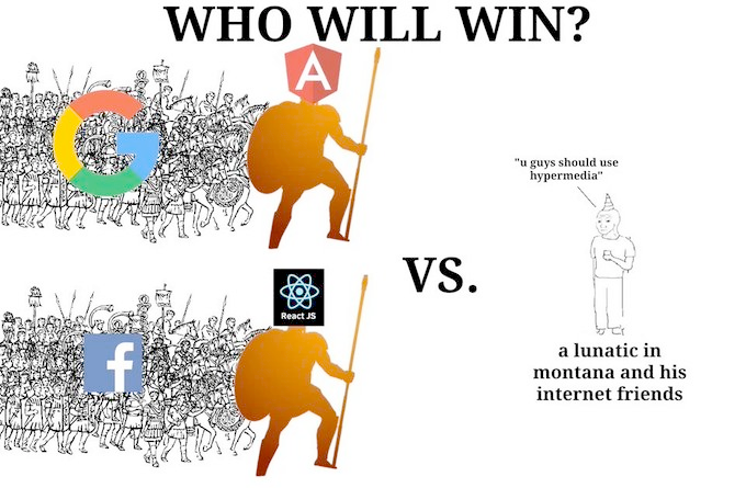
Angular v17.
The framework you love, with a fresh new look, and:
🦥 deferrable views
⚡️ up to 90% faster, intuitive built-in control flow
🏎️ up to 87% faster build times with hybrid rendering
🏗️ Vite + esbuild builds
+ more!
https://t.co/mBtYROh2u7
Future CSS Tip! 📜
You can use scroll-driven animations like JavaScript's IntersectionObserver to animate highlights ✏️
mark {
animation-name: highlight;
animation-timeline: view();
}
@keyframes highlight { to { --light: 1; }}
mark span {
background-position: calc((1 - var(--light)) * 110%) 0;
transition: background 1s;
}
The "trick" is to animate a custom property with a scroll-driven animation. These will flip in a binary fashion if not using @property. And that's what you want.
You can then use that value to set the style on the highlights (<mark>). What you see is the transition of a background-position to get the multi-line highlight. A technique posted on this account before 🤙
Added bonuses:
– Could use another element for the author initials of a highlight and animate that in too. Here the pseudoelement is being used. But another accessible span would do the trick.
– Highlight color is scoped inline via hue.
– View transition theme switch for a bonus that looks like a triangle. Been messing with Vercel docs so was the easiest thing to go with 😅
@CodePen link below! 👇
CSS Trick! 🎃
You can create a wavey border for elements by layering masks 🎭 Used to create this ghost! 👻
Check the video for an exploding view 🫶
.👻 {
--size: 20px;
mask:
radial-gradient(var(--size) at bottom,
transparent 97%, #000),
radial-gradient(var(--size) at 25% 50%,
#000 97%, transparent);
mask-repeat: repeat-x;
mask-size:
calc(2 * var(--size)) 100%,
calc(4 * var(--size)) calc(2 * var(--size));
mask-position:
50% calc(100% - var(--size)),
calc(50% - var(--size)) 99%;
}
That code looks kinda scary! 👻 This is one way you could do things.
Check the video again or explode in the demo. One mask cuts out circles from the bottom of the element. The other adds overlaid circles back. And that overlap creates the wavey line you want for the ghost 🤙
Using a custom property you can write once and not have to touch again. Update the custom property to update the wave size as shown in the video 🎬
The last piece of the puzzle is animating the mask-position to create that animation
@ keyframes flow {
to {
mask-position:
calc(50% + (var(--size) * 4)) calc(100% - var(--size)),
calc((50% - var(--size)) + (var(--size) * 4)) 99%;
}
}
If you play with the demo, you may find some Easter eggs! Shake the ghost and double-tap it 😉
Happy Halloween! 🎃
@CodePen link below! 👇
API architectural styles are one of key factors behind seamless applications.
Tomorrow thousands of subscribers will learn about the most prominent API architectural styles.
Join us to get the issue: https://t.co/pVm7JLY5Rf


