It’s more than a little daunting to set out to expand and improve the identity system for a company and brand like Stripe. But we knew we had to — the existing one had served us well, but wasn’t up to the task anymore. Our brand system required new and improved tools to scale with our ever growing audiences, new products, global footprint, and more.
This update introduces material improvements to infographics, advertising, type styles, and more. While the wordmark remains unchanged, we’re using the dot of the ‘i’ (called the “tittle”), a parallelogram pointing up and to the right, to serve as our identifying symbol. We’re also using it as an ever evolving storytelling device to use when talking about our many great users (you can see the latest brand campaign in SF and NYC doing just that).
Anyone who has ever worked on the refresh and expansion of an existing system for a large company knows that it is no small endeavor. Crafting impactful solutions, building alignment, creating extensible guidelines, building toolkits, and orchestrating rollout requires a ton of resilience. Here’s to the team that continually inspires me with their dedication, rigor, taste, and exceptional vibes.
Great work and thank you to the Brand Studio folks, and of course our many many amazing and invaluable friends and collaborators across the company who all helped shape the work. And a special thank you to a handful of creative agencies that helped us along the way.
Finally reading Dealers of lightning about Xerox PARC. I love that the first visual made programmatically on a personal computer was an image of Cookie Monster.
An interesting shift is occurring for in-house brand design teams:
Our job is becoming less about making every brand expression ourselves, and more about building the tools that let the company express the brand beautifully at scale.
The future brand designer is part designer, part product maker. It’s going to be fun to see what skills this unlocks, and the second-order effects it will have on the aesthetics of brands in an agentic era.
My team is already blowing my mind with the problems they’re solving alongside their best friend, Claude.
Every website you’ve ever used is broken in a way you never noticed and it’s been this way for 30 years...
A Midjourney engineer finally just fixed it.
It’s called Pretext:
A tiny library that lets websites lay out text the way magazines and newspapers do, with text flowing around images, wrapping into columns, and fitting perfectly into any shape, all at 120fps.
This has been basically impossible on the web for 30 years. Every website you’ve ever used relies on the same clunky system from the 90s to figure out where text goes on screen. Pretext bypasses it entirely. 500x faster.
The demos look like they shouldn’t be possible in a browser. Go look.
After @stewartbrand described rust as slow fire during our first call about the website, we had an idea: if you stay on the page long enough, rust consumes the background. And it becomes your job to scrape it off.
https://t.co/w4O5asfH0o has a new look! Congrats to the team that worked tirelessly to achieve such beauty. It's exciting to see how the brand refresh work is starting to take life across Stripe's core surfaces.
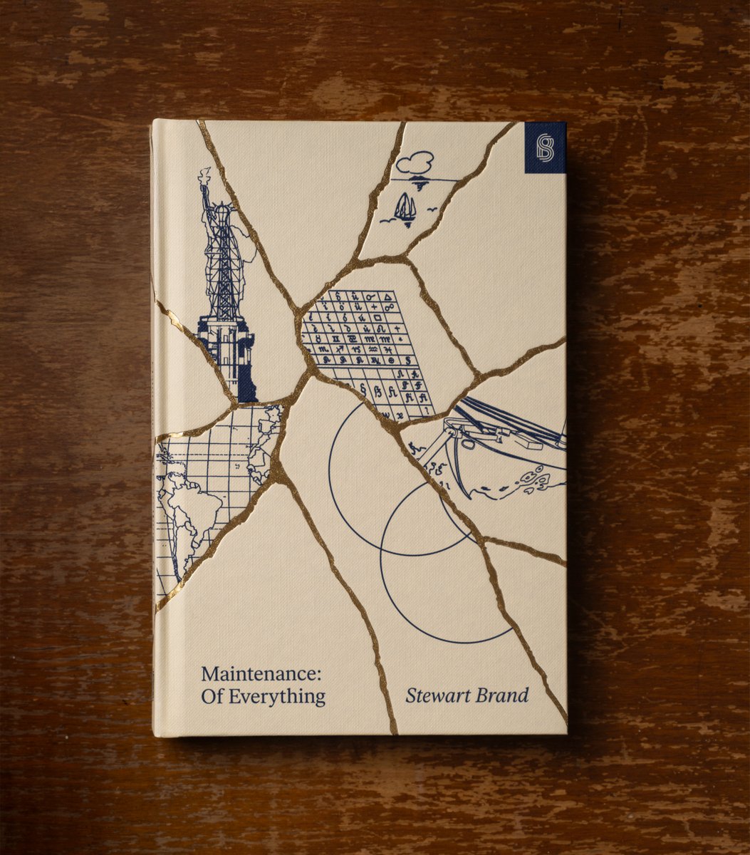
So many great ideas in here! What I think works so well for the kintsugi concept is that everyone could find their own meaning in it to make it their own.
Cover evolution for Maintenance: Of Everything, Part One.
“The cover of the book honors the idea of Kintsugi, the Japanese art of basically repairing broken pottery with a kind of a gold glue. And so it not only fixes it, but it makes it more beautiful. And you honor the mistake that broke it, and you honor the repair . . . So Kintsugi is a way of kind of just honoring the fact that things do break. But nobody actually wants things to break.”
—@stewartbrand
Design @pablodelcan, Art direction @devinjacoviello
This one is extra special. I'll never forget meeting you @stewartbrand when we first kicked off design. Hearing your impassioned takes on white space and the role of designers made my cheeks sore from smiling so hard. We hope you love the work as much as we loved designing it. It was an honor.
Congrats @pablodelcan, @devinjacoviello, @trv_mcl, and Kevin Wong. Y'all pushed hard on this one.
Out now: https://t.co/XDtvD94rCj
@stewartbrand's Maintenance: Of Everything, Part One—about the continuous repair work that keeps complex systems intact, spanning stories from a round-the-world sailboat race, to the restoration of the Statue of Liberty, to the Model T’s rise.
No matter what you think of the administration, or the details of this content, it is cool to see that the government is investing in design as a meaningful tool for communication. https://t.co/cDUtNJtGDL
Today we’re introducing Scribe v2: the most accurate transcription model ever released.
While Scribe v2 Realtime is optimized for ultra low latency and agents use cases, Scribe v2 is built for batch transcription, subtitling, and captioning at scale.