The unit is not really the page. It is the thinking, alignment, and execution required to make the page useful.
Curious how other designers and founders think about this. Do you think about website expansions by page, by scope, or some mix of both?
Pricing design work gets weird when the hardest part of the project is already done.
I was recently asked to quote a website expansion for a past client, and it reminded me how hard it can be to price “just a few more pages.”
That is why pricing by page can be a helpful starting point, but often a bad final answer. It also ignores the obvious question of why every page would cost the same when some are simple and others are doing much heavier lifting.
Introducing Contra Payments.
The first payments platform that lets you sell to AI Agents.
RT + Comment “Contra” and I’ll send you 100 products AI agents are looking for.
Framer Challenge complete! Set a goal of $20k and hit it in three months with my first few @framer website builds and an additional landing page.
A walkthrough of the work:
https://t.co/Pfvsc1zPt1
#FramerChallenge
@learnframer@framer I do. I find it so much faster to iterate on design concepts and not worry about how to actually build it. I keep everything is static and non-responsive while concepting.
Continuing work for the terrarium shop. I thought it would be fun to highlight other small businesses in the area. This will toggle between businesses in the same building and other nearby spots. Fun thing is the map will also switch to match. Built in Framer. #framerchallenge
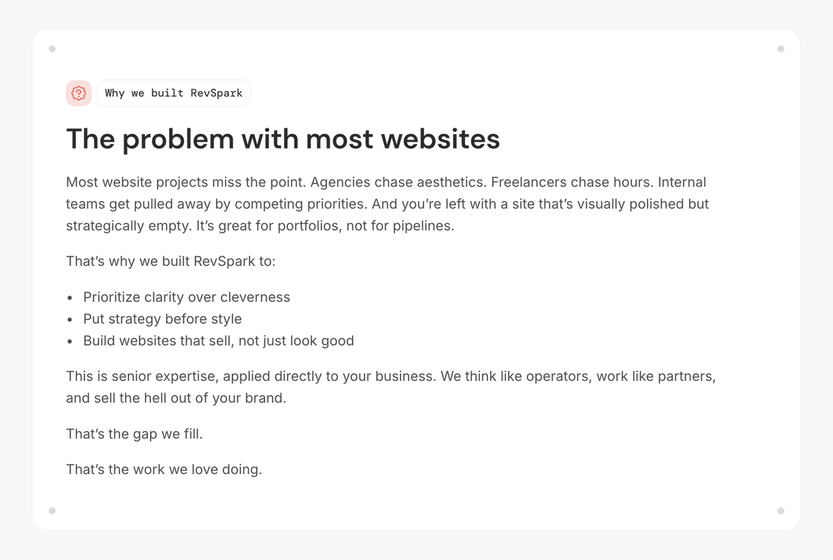
My workload often slows a bit during the holidays, so I'm taking advantage it by working on updating the portfolio. Part of that means dialing in messaging and why we do what we do in the first place.
Separate note, I managed to collect the last check needed to complete my #FramerChallenge this week!
It's a holiday week in this part of the world, so not a lot of work accomplished for the #FramerChallenge! Instead I'll simply share one of my favorite @Framer features compared to a lot of other builders: seeing all breakpoints at the same time!
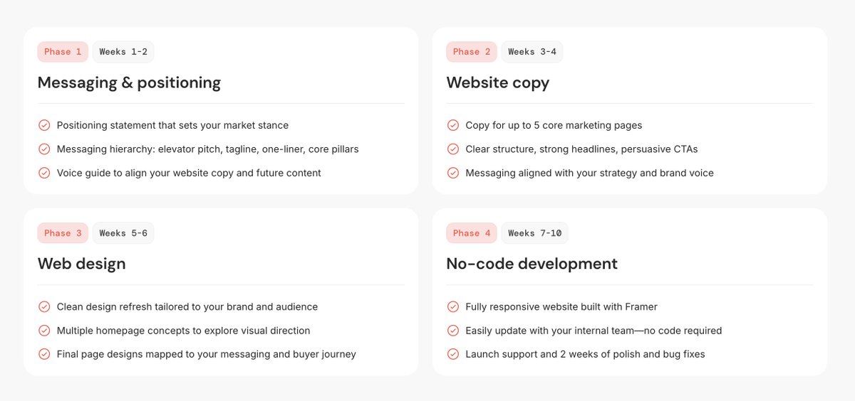
Experimenting with layouts to display our phased approach to building @framer websites. I typically find vertical stacks easiest to browse/read, but there's a lot of content here and considering a 2x2 grid. And we all know projects are never this linear IRL. 😉 #FramerChallenge
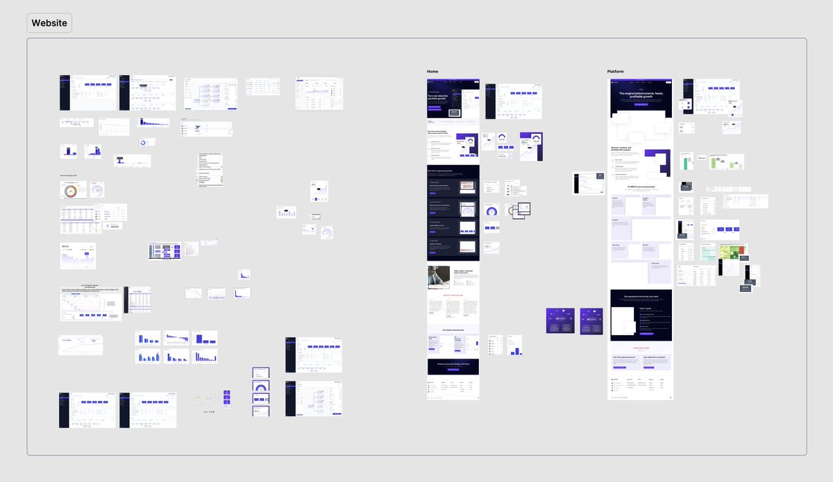
Anybody else's files get a little crazy sometimes? I'm working on a big website revamp for the #FramerChallenge, it's this site is a rush job, so I don't have the luxury of cleaning up as I go! These are a bunch of random notes and assets that will end up in final @framer site.