@vickytnz I’d add to that anything which involves content.
They are great at knowing if there is a label for instance, but rubbish at knowing if that content makes sense.
Similarly they can’t tell if the programmatic information matches the visual or conveys the intended meaning.
@PStanton@TheAA_UK Standard service. Unfortunately I've had the same from RAC and AA. Call centres and patrols have no communication. Got picked up yet?
@A11yLondon The U in UX doesn't stand for "users who aren't currently experiencing some kind of disability". If you aren't thinking about accessibility you aren't qualified to use the term "UX" to describe your role.
@semispeaking@ParadoxiKat9 NVDA screen-reader has a mouse-tracking option, so it will speak what is under your mouse cursor. But it depends what is best for you.
I have definitely met all of these. Part of the job of processes, patterns and education is to develop strategies to help or reduce the impact of all of them.
https://t.co/4TlvGWwquC
Bit of a dark pattern. Store has ratings for a product (1st pic). Click the stars to see the reviews and it registers that as a new rating (presumably increasing click-throughs from Google searches where it is highlighted (2nd pic)).
So likely none of those ratings are real.
Why just adding a click handler for preventing scroll on links with role="button" is not enough, and how native controls are always more complex than you might think.
https://t.co/HOH0atA9Vy
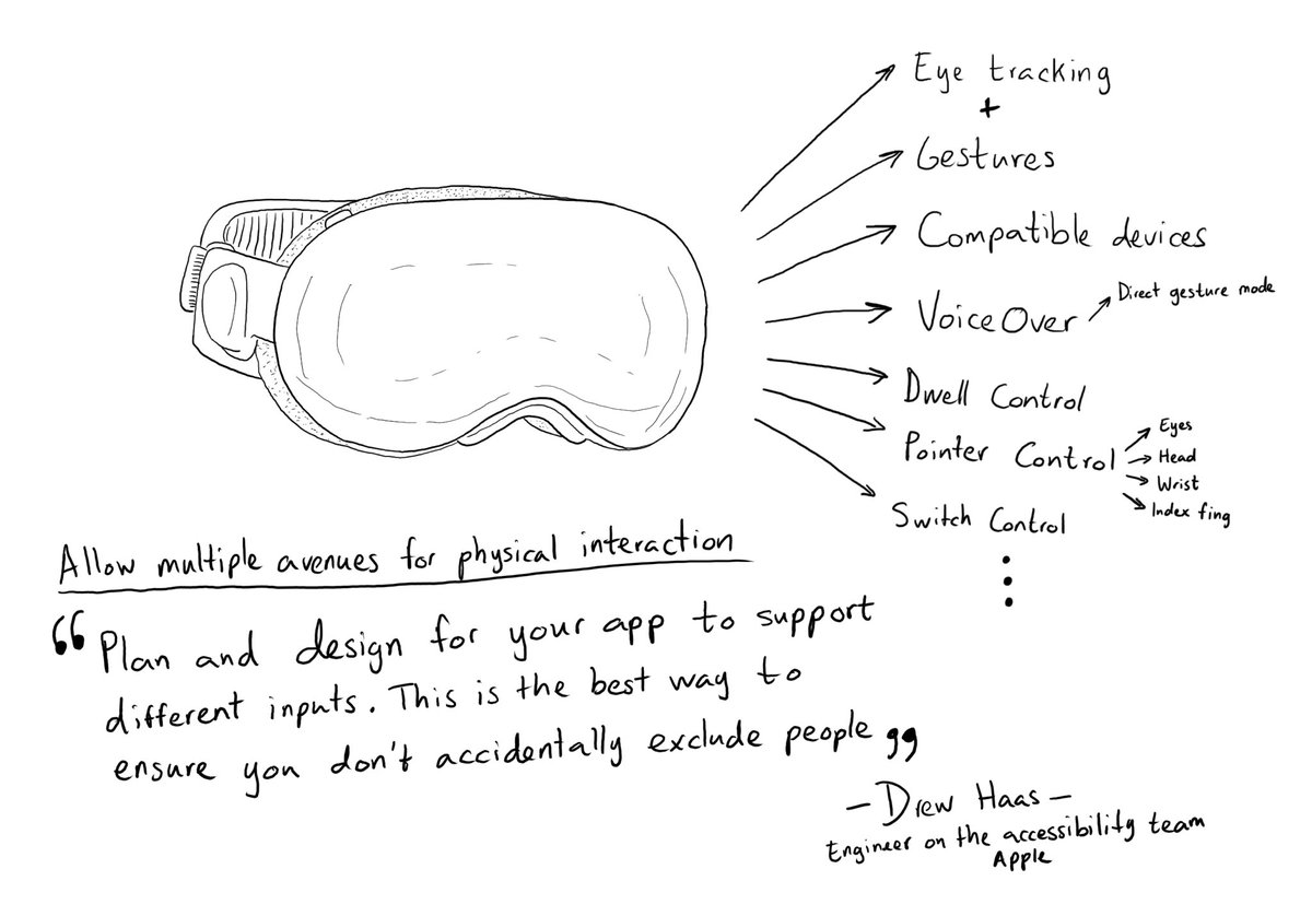
Day 228. Abstracting your interface in a way that can offer multiple input and output mechanisms is key when developing software with an accessibility mindset. Apple has brought this to the next level in visionOS.
https://t.co/cyBPG3S13l
#365DaysIOSAccessibility#WWDC23
And very poor from an accessibility point-of-view. Even if there were options for visually impaired, it is an awful challenge for those who have difficulties with maths such as dyscalculia.
This was a very weird “prove you are human” challenge.
Also, how can it be a dice *pair* when it needs four dice to make 14? It’s impossible to have a pair of dice whose top sides add up to 14!
Numerous studies have been done on the mobile menu (hamburger) display affordance.
A study by James Foster found a word menu with a border had a much higher conversion rate than a menu without a border - and no hamburger was involved!
Read more: https://t.co/cXTCO9x1Le
We've released a new update to the WAVE accessibility tools with numerous improvements and bug fixes. This version now informs users that accessiBe and UserWay overlays may manipulate page content to suppress detection of accessibility errors.
Another similarity between the high street and online shops is the lack of understanding between cause and effect.
“We don’t have any disabled customers” they say standing in front of a aisle clogged with point-of-sale.
My latest blog reflects on an experience trying to buy cocktail umbrellas on the high street - what can in-store accessibility teach us about digital content?
https://t.co/A9nuD4jowV
#Accessibility#ContentDesign