I’ve spent a lot of time working on our App Store creatives. Not just to make them look clean, but to make sure they communicate clearly. The screenshots, the layout, the way we present features... there’s a consistent approach across all our products.
The design language is similar on purpose. It helps users instantly understand what they’re looking at and builds familiarity across everything we build. Over time, that consistency improves clarity and conversion.
Here are our 5 products.
Which ones are you currently using?
@BoxBox_Club@goclub_app @PitWall_Club
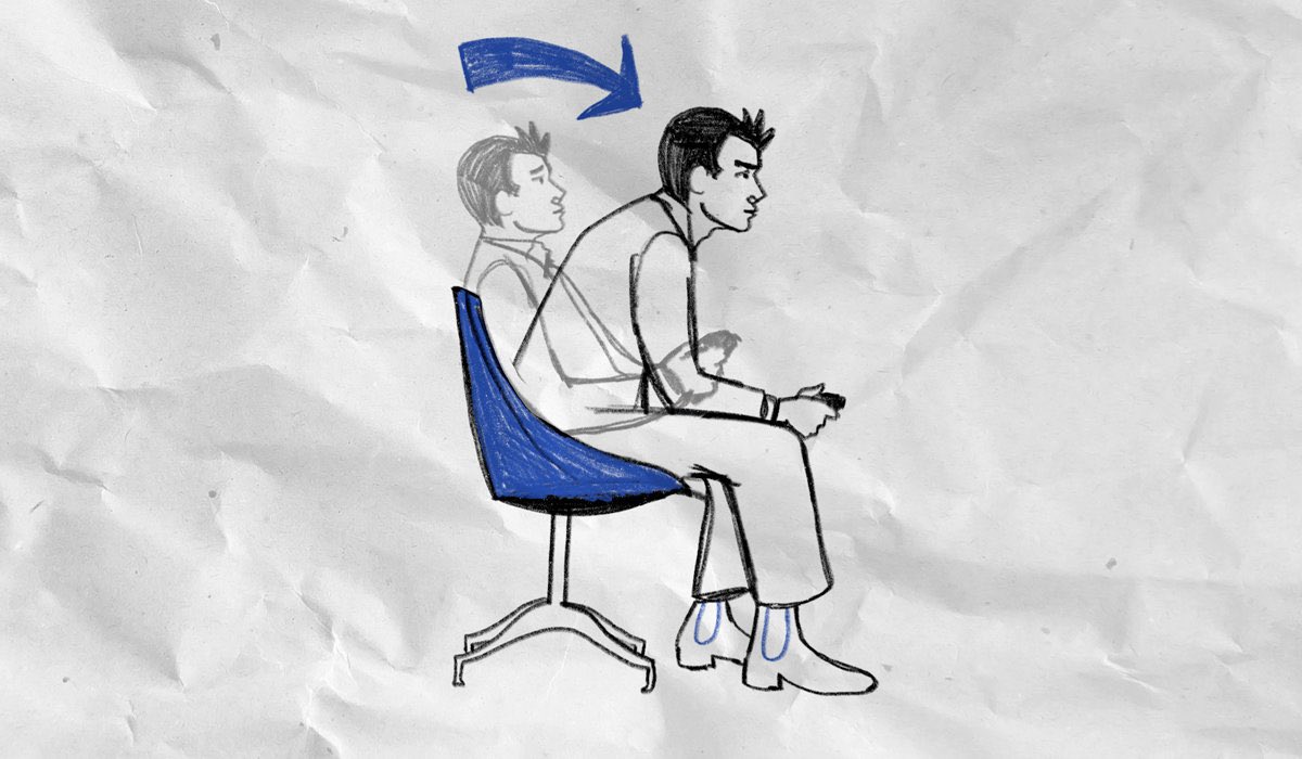
Here Just 5% of Clay
An all-in-one goal tracker for any goal.
we've recently implemented new features such as:
- integrated AI suggestion for even faster activity completions
- Liquid Glass across our UI
try it: https://t.co/3sbDJUTyL0
#ux#motionGraphics#GoalSetting
@thatuapgirl This is a Celtic Knot. It represents eternity and interconnectedness. This one has 4 knots with 4 side shape (square or diamond). Could mean the 4 seasons, four elements, or four directions. Overall I think this could be a message that everything is interconnected or infinite
Build 6 of Clay 1.5 includes a new feature and multiple improvements:
- Feature wishlist: is a page where your can make requests of features or ideas, report issues. Keeping development open to you the users as well
- fixes: multiple AI improvements for goal planning