The Housing for Health Incubator has released a new infographic summarising the findings of the AHURI report Sustainable Indigenous Housing in Regional and Remote Australia. We’d like to thank @alanapirrone for her expert design work. Download it here: https://t.co/gywywAiyQu
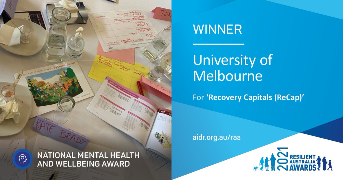
Congratulations to @UniMelb - Joint Winner of the 2021 Resilient Australia National Mental Health and Wellbeing Award!
Read about their winning project here: https://t.co/GxDJd8RbaW
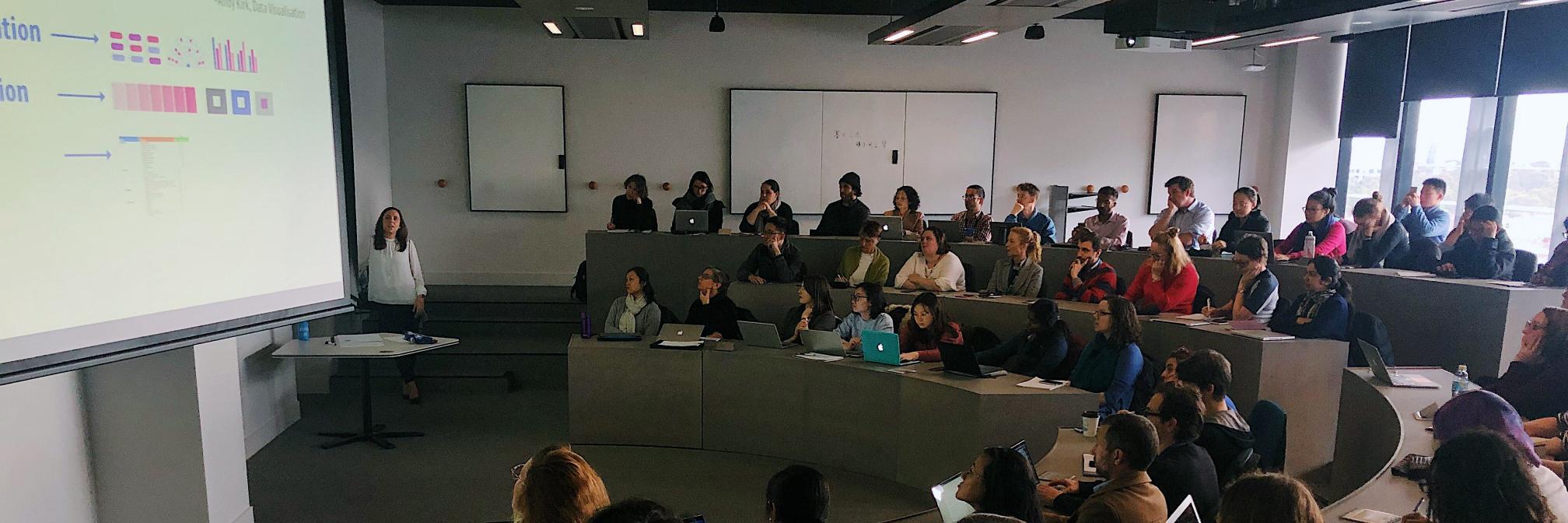
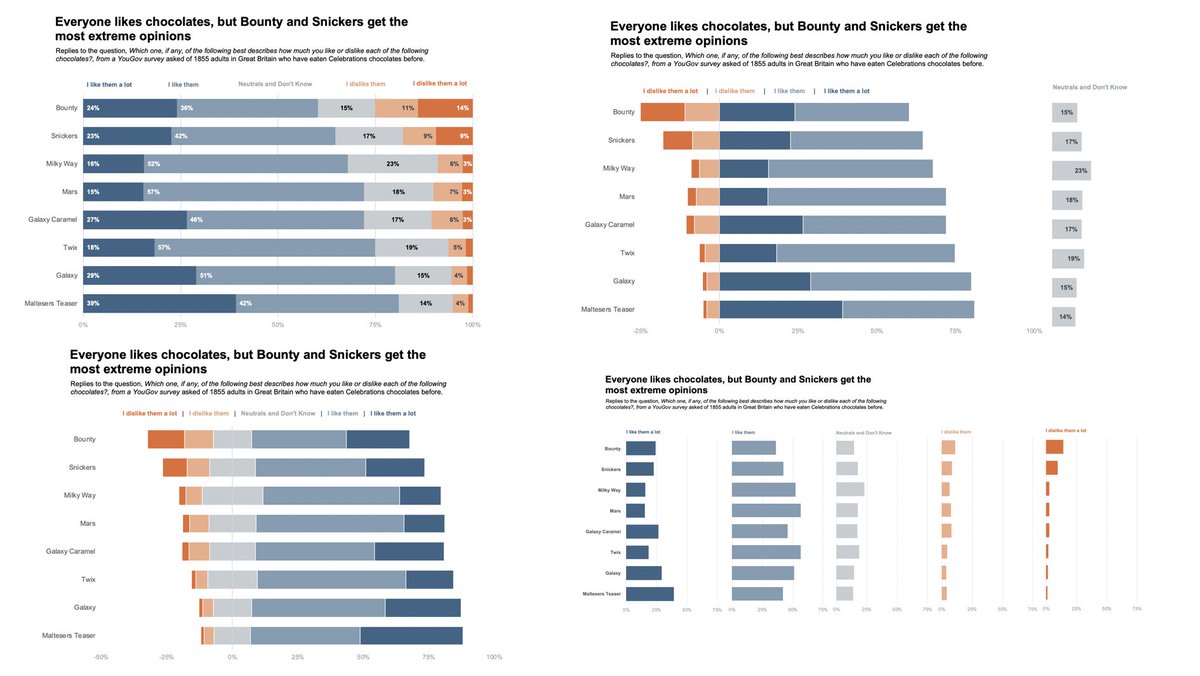
#FromTheArchives : Reposting one of our top 5, most-read articles @alanapirrone challenged herself to take the same data, from a 5-point Likert scale, and display it in several different ways. Let her walk you through the options and the considerations https://t.co/DhWmmu5cYr
Over the next years, our focus shouldn’t be to rapidly return schools to the old ‘normal’, but to provide students with adequate time & support to enjoy learning & retain knowledge and skills https://t.co/n9PpWlLQC5
@HlthEquityMDHS@unimelbMSPGH@PatsKarvelas#lockdownextension
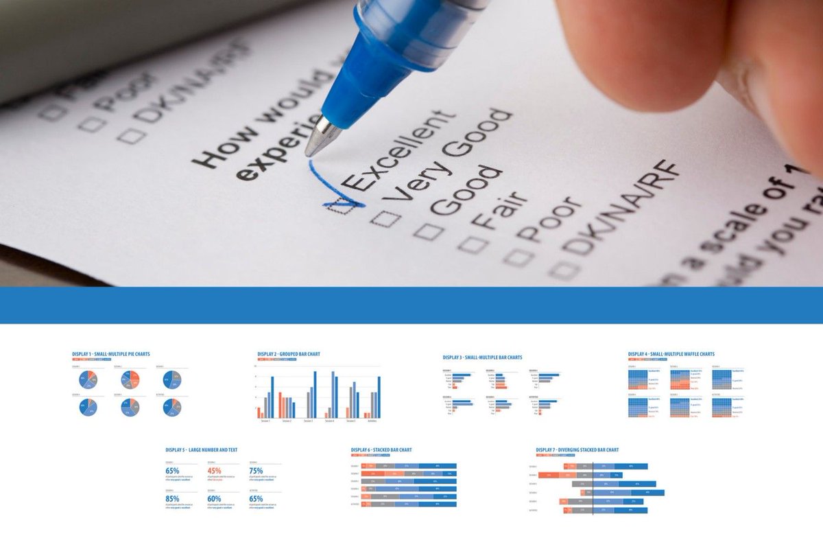
I've recently worked on visualizing #NPS / Likert analyses
Starting from nowhere, here is a chance to thank @DataRevelations, @storywithdata, @alanapirrone, @danz_68, Stephen Few for sharing their thoughts on this subject
(blogs/posts/articles in thread)
How often do you find yourself needing to display and compare data over two time periods? @alanapirrone shares six different ways to compare the same data from an improved clustered bar chart to small multiple slope charts https://t.co/xfRhohJFj1 #DataVisualization#dataviz