Working on this app, Tab. It lets you create Apple Watch complications and iPhone widgets of whichever health metric you want, create goals, charts, etc and see them as a widget.
This is my first ever app.
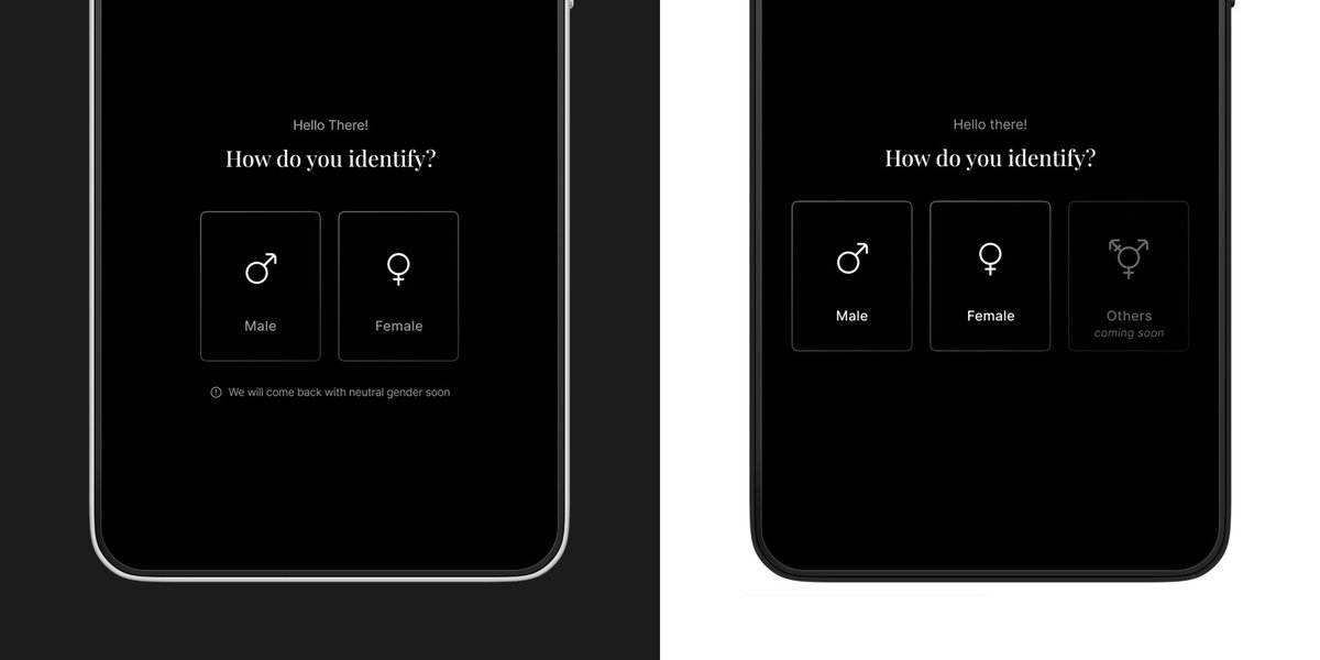
A simple message— “Your identity matters. We’re working on it.”—changes the experience from exclusion to acknowledgment.
Tiny details like this build trust. It’s not just about showing what’s coming, but making people feel seen.
What do you think? Would you do it differently?
Which one is better—left or right? 🤔
Both inform users that more gender options are coming, but they do it differently. One is a quiet note, the other is a visible placeholder.
Let’s break it down. 👇 #UX#Design
It’s crazy how much @figma has grown since I first started using it! I wanted to create this simple card flip animation and was sure I’d need After Effects. But after a quick YouTube search, I realised it’s just a 5-10 min job in Figma!
@rehanxahmed@Airbnb@ProtoPieApp Figma is good to start with, but for more intricate and detailed interactions, Protopie is much better.
For instance, the delayed scaling up of the smaller cards in this post will require multiple components and frames to achieve on Figma, which can be quite tedious.