If you want something, go all in for it. 50%, 75%, 99% don't cut it. Stomp on the accel and you might be surprised how long that car goes. https://t.co/bItYa1ZDZd
Stanford just hosted a hackathon. Over 1000 students from around the world came to build for 36 hours straight.
The reward? $100k+ in prizes.
Here are the winners and crowd standouts we saw at TreeHacks ‘24 @hackwithtrees (🧵):
Every great technological product brings the best memes and strange use cases.
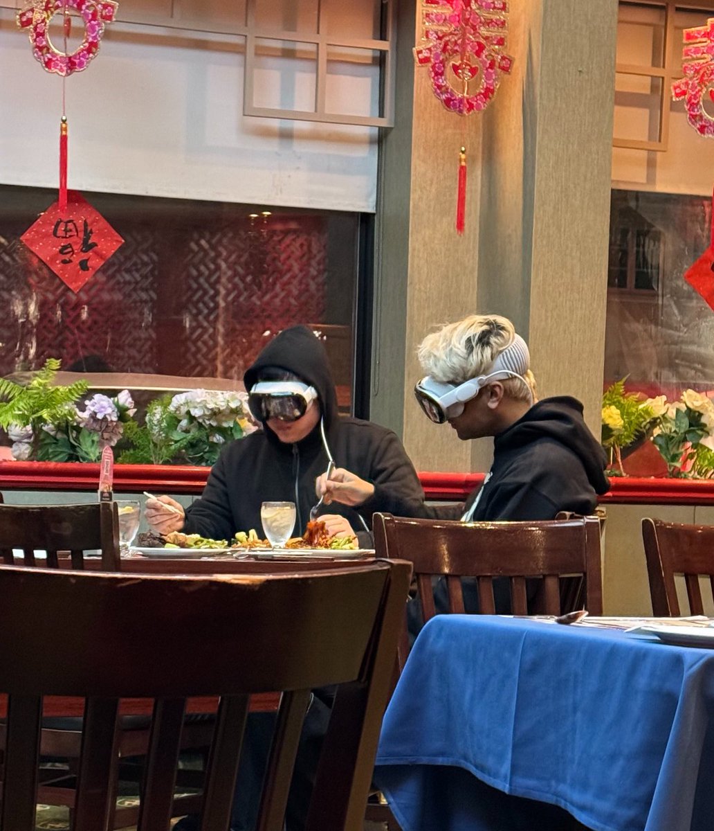
These are the 10 best ones about the new Apple’s Vision Pro:
1. Not a phone in sight (but at what cost)
CSS Tip! 🎠
You can create a responsive infinite marquee animation with container queries and no duplicate items 🤙
li{ animation: slide; }
@keyframes slide {
to { translate: 0% calc(var(--i) * -100%);}}
The trick is animating the items, not the list 😎
More tricks 👇
To get this one working, you need to animate the items and not the list (Watch the video first?). Each item needs to know its row index (--i) in the list and the parent needs to know how many rows are in the list:
ul { --count: 12; }
li:nth-of-type(1),
li:nth-of-type(2) { --i: 0; }
li:nth-of-type(3),
li:nth-of-type(4) { --i: 1; }
Once you have that, translate each item based on its row index in the list
li {
translate: 0% calc((var(--count) - var(--i)) * 100%);
}
Now for the animation. The key here is that each row has an animation-delay calculated from its index (--i). That number is offset to make it negative so the animation start is offset ✨
ul { --duration: 10s; }
li {
--delay:
calc((var(--duration) / var(--count)) * (var(--i) - 8));
animation:
slide var(--duration) var(--delay) infinite linear;
}
Make sure to wrap that animation in:
@media (prefers-reduced-motion: no-preference) { ... }
Lastly, the fun parts! 🤓
To create the "vignette" mask. Use a layered mask on the container 😷
.scene {
--buff: 3rem;
height: 100%;
width: 100%;
mask:
linear-gradient(transparent, white var(--buff) calc(100% - var(--buff)), transparent),
linear-gradient(90deg, transparent, white var(--buff) calc(100% - var(--buff)), transparent);
mask-composite: intersect;
}
To create the 3D skewed effect, use a chained transform (Try toggling it in the demo ⚡️):
.grid {
transform:
rotateX(20deg)
rotateZ(-20deg)
skewX(20deg);
}
As for the responsive part, use container queries! 🔥
article { container-type: inline-size; }
When the article (card) is narrower than 400px update the grid and animation settings 🤙 Double the rows means double the duration!
@container (width < 400px) {
.grid {
--count: 12;
grid-template-columns: 1fr;
}
li:nth-of-type(1) { --i: 0; }
li:nth-of-type(2) { --i: 1; }
li:nth-of-type(3) { --i: 2; }
li:nth-of-type(4) { --i: 3; }
li {
--duration: 20s;
}
}
CSS has the magic to be able to update those animations at runtime based on your custom property values 😎
An added bonus in this demo is that it doesn't require any JavaScript at all, for any of it 🤯 We can use CSS :has() for those toggles that update the styles, even the theme toggle! 🫶
Any questions, let me know! Make sure to check out the video. Will do a walkthrough one to follow-up 🤙
@CodePen link below! 👇
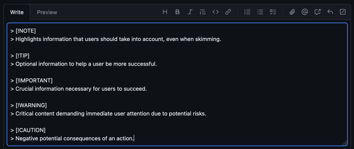
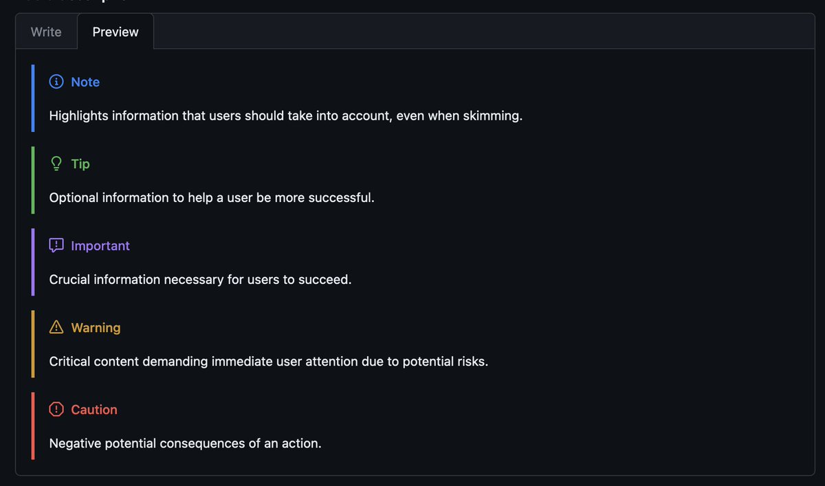
TIL — GitHub's custom markdown syntax for notes and highlights supports Note, Tip, Important, Warning, and Caution.
When did this happen?
Side note: still not a fan of their non-standard blockquote syntax. 😅
CSS Tip! 🤙
You can create this magnetic :hover effect with CSS anchor positioning, :has, and zero JS 🔥
article { anchor-name: --develop; }
ul:has(li:hover) { --anchor: --develop; }
ul::after {
inset:
anchor(var(--anchor) top)
anchor(var(--anchor) right)
... ;
}
How do you keep it clean when entering/exiting the list? Use transition-delay ⭐️
ul:has(li:hover) { --active: 1; }
ul::after {
opacity: var(--active, 0);
transition: opacity 0.2s, inset 0.2s 0.2s;
}
ul:hover::after {
transition: opacity 0.2s 0.2s, inset 0.2s;
}
This is a cool trick you can use. Delay the opacity on enter and then delay the position on exit. That way you don't get a weird effect on enter/exit 🙏
This one's a "Future" CSS tip 🔮 But, the demo will work in all browsers in some way. The idea is to progressively enhance it.
1. No JavaScript and no Anchor Positioning? Highlight on hover ✏️
2. No Anchor Positioning? Use JavaScript with a single event listener to update the inset values using elementFromPoint and .closest 🫶
3. If there is Anchor Positioning support, use that and don't fire the JavaScript. You can check with CSS.supports('anchor-name: --anchor') ✨
That's it!
@CodePen link below! 👇
Explaining 9 types of API testing. The method to download the high-resolution PDF is available at the end.
🔹 Smoke Testing
This is done after API development is complete. Simply validate if the APIs are working and nothing breaks.
🔹 Functional Testing
This creates a test plan based on the functional requirements and compares the results with the expected results.
🔹 Integration Testing
This test combines several API calls to perform end-to-end tests. The intra-service communications and data transmissions are tested.
🔹 Regression Testing
This test ensures that bug fixes or new features shouldn’t break the existing behaviors of APIs.
🔹 Load Testing
This tests applications’ performance by simulating different loads. Then we can calculate the capacity of the application.
🔹 Stress Testing
We deliberately create high loads to the APIs and test if the APIs are able to function normally.
🔹 Security Testing
This tests the APIs against all possible external threats.
🔹 UI Testing
This tests the UI interactions with the APIs to make sure the data can be displayed properly.
🔹 Fuzz Testing
This injects invalid or unexpected input data into the API and tries to crash the API. In this way, it identifies the API vulnerabilities.
Subscribe to our newsletter to download the 𝐡𝐢𝐠𝐡-𝐫𝐞𝐬𝐨𝐥𝐮𝐭𝐢𝐨𝐧 𝐜𝐡𝐞𝐚𝐭 𝐬𝐡𝐞𝐞𝐭. After signing up, find the download link on the success page: https://t.co/Zx9BH4M3Qm
CSS Tip! ✨
You can use background-attachment to fix backgrounds to the viewport 🤙
card {
background:radial-gradient(circle at var(--x) var(--y), ...);
background-attachment:fixed;
}
JS to get the cursor position but use the same bg for a spotlight 🔦
@CodePen link below 👇
One thing I struggled with the most when learning React was project organization and structure.
When to create new folders?
How to group views, components, hooks etc.?
Tomorrow I'll share a video example that addresses most of these questions.
Prototyped a little app that allows you to take frames from @figma and 'pull them into space'.
The frames stay linked to the canvas and update on any changes
This is what I keep talking about. Social media makes it seem SO EASY to land a job in 3 months.
There are TONS of factors at play here and the vast majority of people will NOT land a job that quickly.
Give yourself time!
Don't get discouraged.
It isn't easy BUT IT IS POSSIBLE!
Tailwind CSS Tip ✨
You can create a pure css carousel in @tailwindcss using scroll snap.
Live demo ↓
https://t.co/7SwB0ps1Yc
(21/30) follow for 9 more tips 🔔
Last week I asked PMs on Twitter and LinkedIn why they have rejected candidates during an interview, and their answers are an eye-opener list of 🚩🚩 to avoid in your interviews!
Check out these 9 tips and keep them in mind as you go into your next interviews!
🧵