📊🧵 Collection of tweets featuring open-access materials that I have shared over the last years:
Talks, seminars, blog posts, hands-on notebooks, codes, and more!
#rstats#ggplot2#tidyverse#dataviz 🧙♂️
#dataviz is a long, iterative process.
If you want to learn the required steps to create a great graph with R and ggplot2,
we are building something for you with @CedScherer !
https://t.co/HxJb2xar9Z
🚀 New content coming soon to our interactive #ggplot2 workshop!
“Principles of ggplot2” includes fun interactive widgets to explore plot components 🖥️
💸 Early-bird discount still on – check it out:
https://t.co/oW304UazAk
#rstats#dataviz
Our ggplot2 [un]charted course is live! 🎉
Lesson 1, “Why R and ggplot2?”, is free to explore — short, thoughtful & a bit different.
Get the early-supporter price!
👉 https://t.co/Hug50eKeDz
Follow along as new content drops and learn while running your code in the browser 👩💻
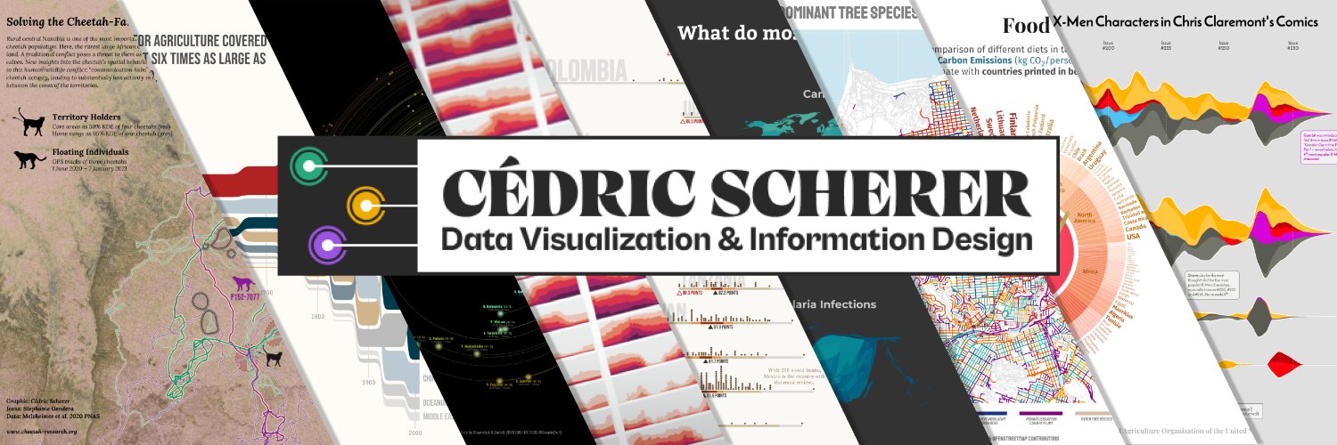
Excited to launch "ggplot2 [un]charted" with
@R_Graph_Gallery! 🎉
An online course to master #DataViz with #ggplot2 with exercises, quizzes, modules—and hands-on #Rstats code running in your browser!
Still WIP—sign up now for a limited discount!
👉 https://t.co/lTiqp9VuSL
⏰ Last call!
If you want to create stunning charts with Python, there are a 8 hours left only to join Matplotlib Journey!
https://t.co/6zVs07hJA6
Thanks so much to the 414 people who joined already! 🙏
Graph by the awesome @CedScherer, python repro by @joseph_barbier
@mdancho84@Farid76808744 Most codes are on my GitHub. The coffee, X-men, and astronaut visualizations are contributions to TidyTuesday, source codes here: https://t.co/YK0XPPyxdn
@mdancho84 Thanks Matt 👐 For the stream graph in the original tweet ggplot2 was only used from the basic plotting, but all others are (mostly) #rstats only 🖥️
Measuring streamflow droughts can be a statistical challenge! Recently, I stumbled upon an interesting project in this field.
The analysis of "100 Years of Streamflow Droughts," shared in a recent post by @CedScherer, highlights a significant project in collaboration with the U.S. Geological Survey (USGS) Viz Lab. This project examines long-term data on streamflow levels in the US over the past century, revealing key patterns and trends.
This map showcases the 1,000 most severe streamflow droughts from 1920 to 2020, using data from 3,196 gages with reliable and continuous records. This visualization is instrumental in understanding how streamflow droughts have evolved over time.
Additionally, the small multiples graph provides a decade-wise breakdown of streamflow droughts, categorized by climatic hubs and severity. This detailed visualization helps us comprehend the regional impacts and trends in drought severity.
#statistics #datascience #geology #dataanalysis
@SteveFranconeri Hi Steve, unfortunately, the link seems to have expired. I'd love to include this resource, preferably in PDF format, during my workshops.
Is there any chance you could upload it again? Or perhaps there's an existing link that I may have overlooked?
@BrunoHMioto@TeunvandenBrand @ClausWilke It's similar but not the same. One downside of the treemap is that you loose the visual encoding of the different group ranges. One needs to read the labels carefully.
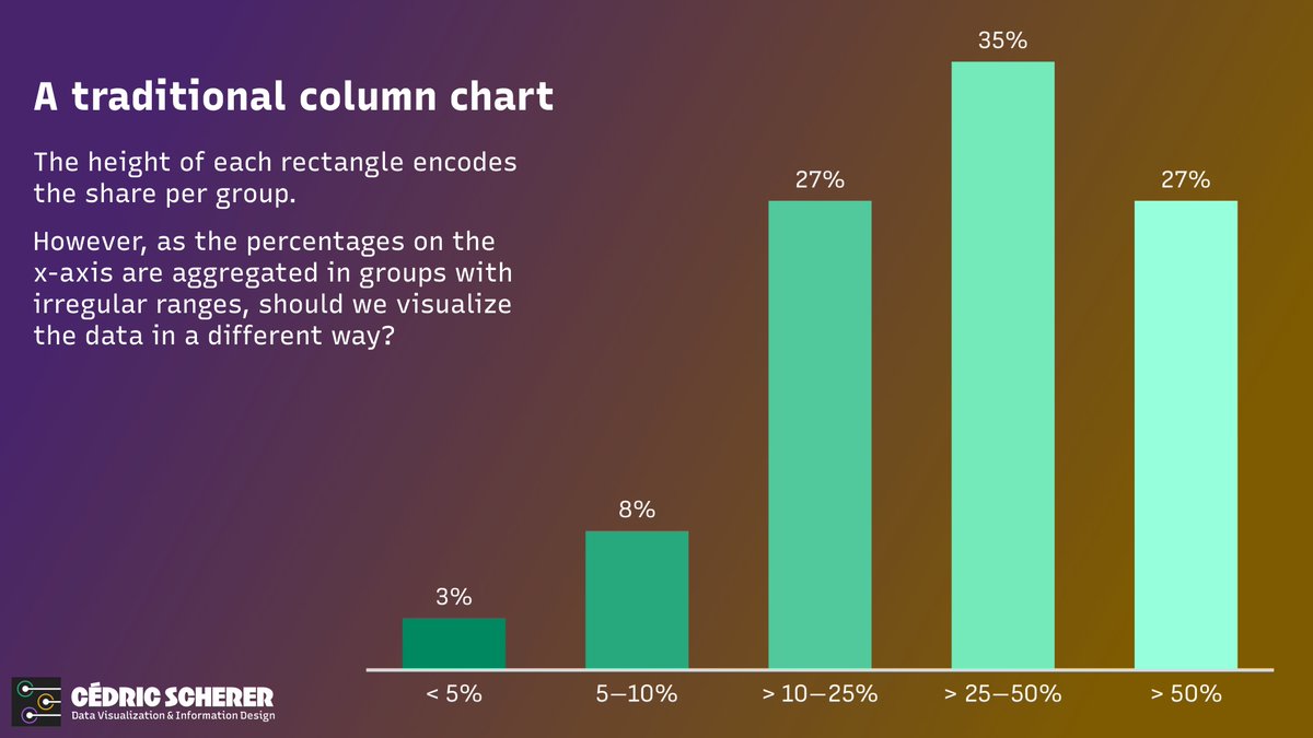
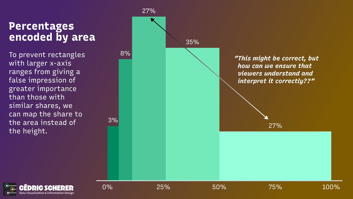
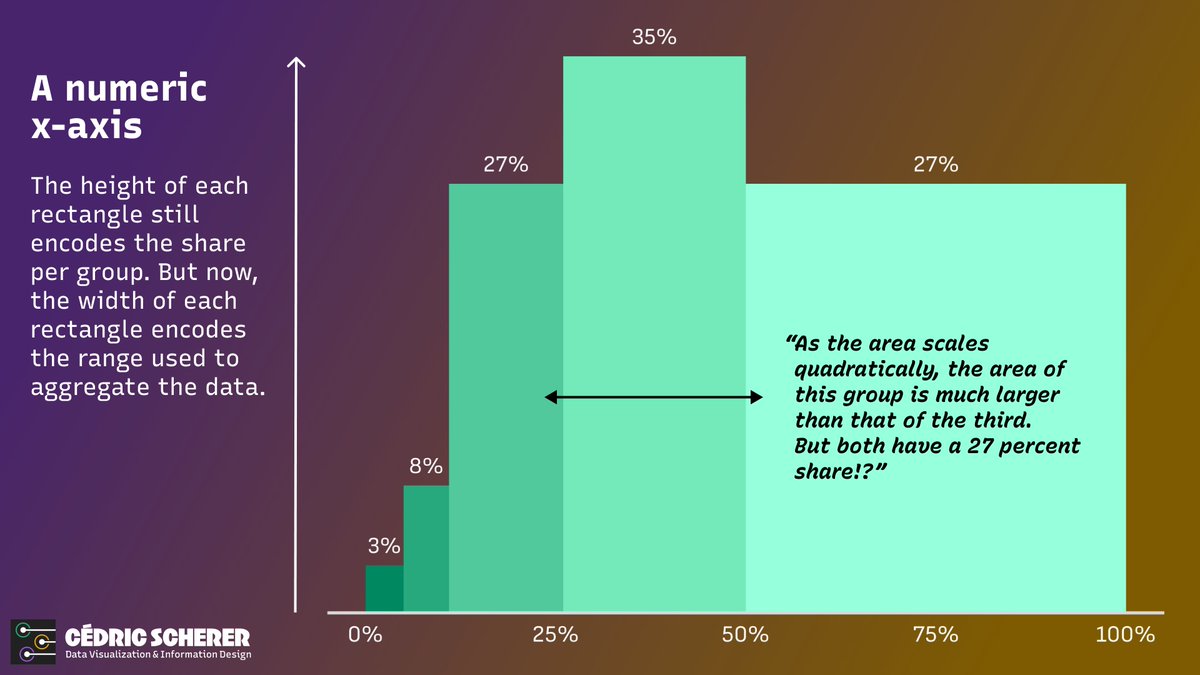
📊 Have you ever needed to create a bar chart when data is aggregated in groups of different ranges? #dataviz
While researching the pros and cons, I couldn't find a consensus on what the "best" approach is. "It depends" is, as often, the best recommendation I could find.
@TeunvandenBrand @ClausWilke Yeah, placing the labels inside sohnds like a great idea. I'd never use an y-axis in that case, that would be very confusing and misleading.
@GoatShipMate The term histogram is still in use 🤓 But as this has irregular bins, it's not a traditional histogram. And usually those represent frequency by height, or am I wrong? (Well, it's the same if bin width is equal anyway)








![CedScherer's tweet photo. Excited to launch "ggplot2 [un]charted" with
@R_Graph_Gallery! 🎉
An online course to master #DataViz with #ggplot2 with exercises, quizzes, modules—and hands-on #Rstats code running in your browser!
Still WIP—sign up now for a limited discount!
👉 https://t.co/lTiqp9VuSL https://t.co/3M9OXOS0bT](https://pbs.twimg.com/media/Gqwq_mzXsAInfcM.jpg)