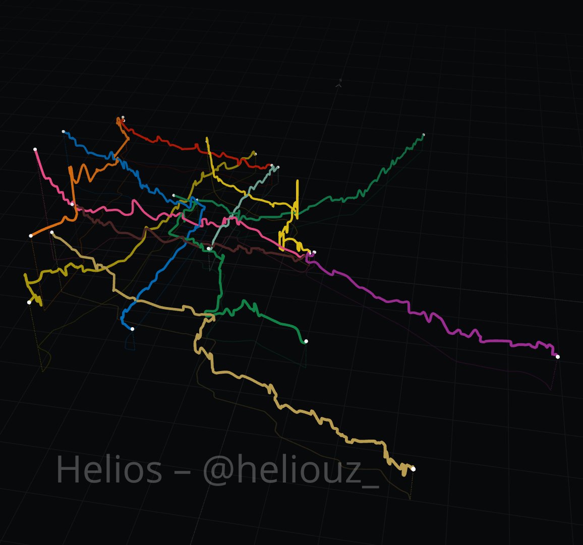
Hice esta visualización del metro de la CDMX en 3D y me gustó mucho. No es tan lineal como imaginamos.
Las estaciones más elevadas están todas al poniente de la ciudad: la más alta es Observatorio a 2,310m, luego Tacubaya a 2,288m y después Constituyentes a 2,282m.
If you didn't train as a UI designer but you want to get better at Design, this little site has games to learn AND practice the notions of size, spacing and hierarchy :))
https://t.co/cXPxjzblTK
Give it a go to level up you UI Design!
I've been away for a while, but I've been working on creating a UI/UX Principles course to teach you the basics of EVERYTHING that I learned in Design School.
Every-time I have contact with the @Aeromexico brand I always wonder why they "refreshed" the logo to it's current version (2024-present).
I find it fascinating how we think logos "have to be refreshed", but I personally think that some -good- logos do not need it.🤷♀️
From Aztec Symbol to Modern Brand: A Designer’s Bold Vision.
Raúl Pérez Duarte Viesca was a Mexican graphic designer recognized for shaping modern corporate identity in Mexico, most notably through his 1989 redesign of the Aeroméxico logo. His work introduced a cleaner, more contemporary interpretation of the airline’s iconic “Caballero Águila” (Eagle Knight), a symbol rooted in Aztec heritage. Pérez Duarte Viesca streamlined the figure into a bold, geometric profile, emphasizing strength, motion, and national identity while making it adaptable for global branding. The redesign balanced tradition with modernity, helping Aeroméxico present itself as both proudly Mexican and internationally competitive during a period of industry change. His approach reflected a broader shift in late twentieth-century design toward simplicity and recognizability. The 1989 logo endured for decades with only minor refinements, demonstrating the lasting impact of his vision and his ability to create a timeless visual identity.
#logodecks
Lithuanian composer and conductor Mindaugas Piečaitis, directs his orchestra on the notes of Nora the cat playing the piano.
She earns a standing ovation.
We give a lot of credit to Apple for making minimalist designs mainstream in the early 2000s
But we must never forget to pay homage the GOAT Dieter Rams
@BaldieAndBaldie@Florianrival@VicSlavy Hey! Happy to have a helping hand if you want to give a go to updating the Object-type icons!
I can provide information regarding their canvas size as well as GDevelop's official color palettes.
We do not have a grid for them so feel free to come up with one if you want!
Engineering: the machine is technically limited to run at this speed. There is no way can make it faster.
Designer: I... think that I might have an idea...
@ScubaDever The profile pic got my eye, the "data/ocean" got me interested and your tweets (yes, I will call them this to the day I die) made me go "yes". 🖱️
Sure, you can argue that this can also be automated by AI, but as a fellow member of the human race I am still on the fence about automating the delicious/interesting/forward parts of the creative process.
I still prefer to save galons of water by doing the visual testing by hand
When I was in Design school, teachers made us work in physical materials (paper, wood, acrylic) and I always wondered why they did this, where we were already trained to use design softwares that could do what they asked us to do 10 times faster.
But as a trained visual Designer I can tell you: testing things the "slow way" (trying color combinations, shapes, odd or rigid alignments) is as crucial as thinking about your system's architecture.