Putting CSS Anchor Positioning to the test by throwing dropdown menus around 💪
[popover].dropdown {
top: anchor(bottom);
right: anchor(right);
position-try-options: flip-block, flip-inline;
}
That's all 👆 Keeps the menu tethered to the button
CSS Trick 📜
You can trigger text highlights on scroll with scroll-driven animations 😎
mark {
animation: highlight;
animation-timeline: view();
}
@keyframes highlight { to { --lit: 1; }}
mark span {
background-position: calc(var(--lit) * -110%) 0;
transition: background 1s;
}
The trick is using a scroll-driven animation to flip a custom property on a <mark> element 🎚️
You flip the value between 0 and 1, and that transitions the background position of the <mark> element
mark {
--lit: 0;
animation: highlight steps(1) both;
animation-timeline: view();
animation-range: entry 100% cover 10%;
}
The background has to be applied on a child of the mark to see the change in the custom property 👀
mark span {
background: linear-gradient(
120deg, yellow 50%, transparent 50%)
110% 0 / 220% 100% no-repeat;
background-position: calc(var(--lit) * 110%) 0;
transition: background-position 1s;
}
The trick is to set the background-size so that it's bigger than the element and then split the background-color in the middle using a linear-gradient 🤙
And the property flips fills in the color 🫶 That's it!
If there isn't support for scroll-driven animations, use JavaScript's IntersectionObserver API. The code for this is in the demo 😎
Cool example of using CSS as an IntersectionObserver!
@CodePen link below 👇
Tailwind CSS Tip ✨
You can create a gooey effect in @tailwindcss using SVG gaussian blur.
Live demo ↓
https://t.co/0gy2zlpdUd
(22/30) follow for 8 more tips 🔔
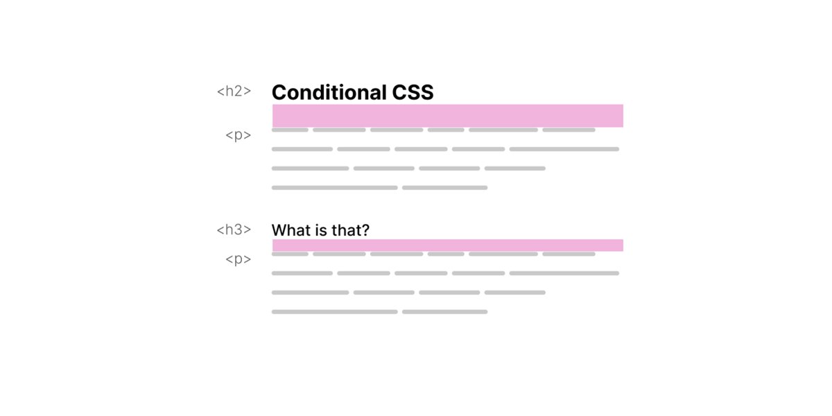
🌟 New: Conditional CSS
I wrote about my thoughts on why I think CSS is conditional in many ways, and how I enjoy writing CSS with that mindset. Happy reading!
🔗 https://t.co/iBKXDldl6g
Little CSS Christmas tree for the holidays 🎄
Powered by CSS custom properties 💪
~100 lines of CSS
The trick is in the animation-delay ✨
For example;
<div class=🔴 style="--index: 2;">
.🔴 {
animation-delay: calc(var(--index) * -0.2s);
}
@CodePen link below! 👇
🪄 CSS Blending Decompilation 🪄
Here is how @linear created a cool animated component with 10 (!) blending functions and just a couple lines of JS.
👨🏻💻Codepen to play: https://t.co/4kfokvlZj0
Enjoy original at https://t.co/Hzt8Jm9CN9
#css#animation#linear
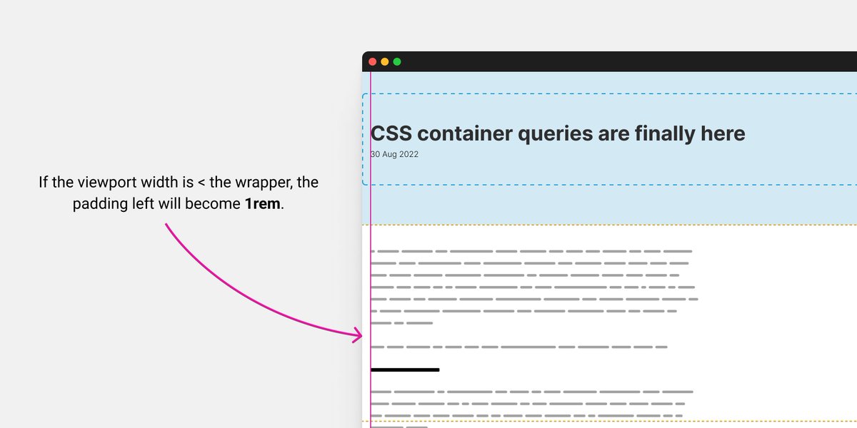
Container queries are finally here. This is a big day for CSS 🎉
To celebrate that, I'm starting a new lab to try all things container queries at https://t.co/QJcwq2r9iU. This is inspired by @jensimmons's amazing CSS grid lab.
Article: https://t.co/fGMrHqqGpy
We just released v0.4.0 of Color.js 🚀
https://t.co/pj6NwJZ9Gj
Major new feature: @svgeesus implemented a bunch of different contrast algorithms, including APCA
I made a demo that shows how different algos perform for picking between white and black text: https://t.co/PxzeSH6TA0
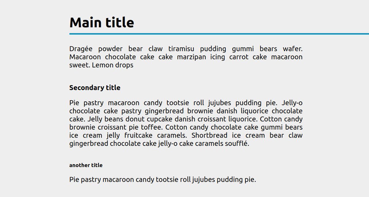
💡 CSS Tip!
Add an underline to your title and extend it to the right edge of the screen whatever the element/container size
✅ No extra element
✅ No pseudo-element
✅ No overflow issue
✅ Only 1 CSS property
Demo: https://t.co/GXSqFPrdrm via @CodePen#CSS


