𝐈 𝐤𝐧𝐞𝐰 𝐬𝐨𝐦𝐞𝐭𝐡𝐢𝐧𝐠 𝐡𝐚𝐝 𝐭𝐨 𝐜𝐡𝐚𝐧𝐠𝐞 𝐭𝐡𝐞 𝐦𝐨𝐦𝐞𝐧𝐭 𝐈 𝐜𝐚𝐮𝐠𝐡𝐭 𝐦𝐲𝐬𝐞𝐥𝐟 𝐚𝐬𝐤𝐢𝐧𝐠, “𝐎𝐤𝐚𝐲… 𝐰𝐡𝐞𝐫𝐞 𝐝𝐨 𝐈 𝐠𝐨 𝐟𝐫𝐨𝐦 𝐡𝐞𝐫𝐞?”
And that question became the starting point for how I reworked the first-time experience for @OurFamilyWizard
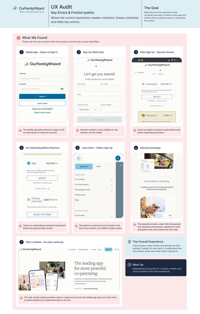
Yesterday, I shared what I discovered while experiencing the product as a first-time user.
The problem wasn’t that the journey had too many requirements.
It was that, at different points, 𝐈 𝐡𝐚𝐝 𝐭𝐨 𝐬𝐭𝐨𝐩 𝐮𝐬𝐢𝐧𝐠 𝐭𝐡𝐞 𝐩𝐫𝐨𝐝𝐮𝐜𝐭 𝐚𝐧𝐝 𝐬𝐭𝐚𝐫𝐭 𝐟𝐢𝐠𝐮𝐫𝐢𝐧𝐠 𝐨𝐮𝐭 𝐰𝐡𝐚𝐭 𝐭𝐨 𝐝𝐨 𝐧𝐞𝐱𝐭.
And that’s where the redesign began.
I started with the very first decision a new user has to make:
𝐀𝐦 𝐈 𝐜𝐫𝐞𝐚𝐭𝐢𝐧𝐠 𝐚𝐧 𝐚𝐜𝐜𝐨𝐮𝐧𝐭 𝐨𝐫 𝐬𝐢𝐠𝐧𝐢𝐧𝐠 𝐢𝐧?
That distinction needed to be clear from the beginning.
Then I looked at the transition between web and mobile.
If registration needs to happen on the web, the user shouldn’t have to discover that on their own.
The experience should tell them where to go, why they’re going there, and what happens when they come back.
That led me to one simple thought:
𝐃𝐨𝐧’𝐭 𝐦𝐚𝐤𝐞 𝐭𝐡𝐞 𝐮𝐬𝐞𝐫 𝐮𝐧𝐝𝐞𝐫𝐬𝐭𝐚𝐧𝐝 𝐭𝐡𝐞 𝐬𝐲𝐬𝐭𝐞𝐦 𝐛𝐞𝐟𝐨𝐫𝐞 𝐭𝐡𝐞𝐲 𝐜𝐚𝐧 𝐮𝐬𝐞 𝐢𝐭.
I also rethought what happens after registration.
Instead of asking a new user to commit before they’ve really experienced the product, the experience should give them a reason to understand it first.
So onboarding became more than an introduction; 𝐢𝐭 𝐛𝐞𝐜𝐚𝐦𝐞 𝐩𝐚𝐫𝐭 𝐨𝐟 𝐭𝐡𝐞 𝐞𝐱𝐩𝐞𝐫𝐢𝐞𝐧𝐜𝐞.
The Calendar, Communication, Expenses, Documents.
These are the things that make the product useful.
So why should users have to go looking for them?
𝐓𝐡𝐞 𝐞𝐱𝐩𝐞𝐫𝐢𝐞𝐧𝐜𝐞 𝐬𝐡𝐨𝐮𝐥𝐝 𝐬𝐭𝐚𝐫𝐭 𝐬𝐡𝐨𝐰𝐢𝐧𝐠 𝐭𝐡𝐚𝐭 𝐯𝐚𝐥𝐮𝐞 𝐚𝐬 𝐭𝐡𝐞 𝐮𝐬𝐞𝐫 𝐦𝐨𝐯𝐞𝐬 𝐭𝐡𝐫𝐨𝐮𝐠𝐡 𝐭𝐡𝐞 𝐣𝐨𝐮𝐫𝐧𝐞𝐲.
And that also made me look differently at where the subscription step sits in the journey.
I wasn’t trying to remove the commitment, I was looking at how the experience could help users arrive at that step with more context.
There’s a difference between asking someone to pay and helping them understand what they’re paying for.
So instead of:
𝐂𝐨𝐧𝐟𝐮𝐬𝐢𝐨𝐧 → 𝐍𝐚𝐯𝐢𝐠𝐚𝐭𝐢𝐨𝐧 → 𝐂𝐨𝐦𝐦𝐢𝐭𝐦𝐞𝐧𝐭 → 𝐃𝐢𝐬𝐜𝐨𝐯𝐞𝐫𝐲
I reshaped the journey around:
𝐔𝐧𝐝𝐞𝐫𝐬𝐭𝐚𝐧𝐝 → 𝐒𝐞𝐭 𝐮𝐩 → 𝐄𝐱𝐩𝐞𝐫𝐢𝐞𝐧𝐜𝐞 → 𝐁𝐮𝐢𝐥𝐝 𝐜𝐨𝐧𝐟𝐢𝐝𝐞𝐧𝐜𝐞 → 𝐂𝐨𝐦𝐦𝐢𝐭
So every screen became part of that progression.
Not just a screen that looks better, not a cleaner interface, but another opportunity to answer the user’s next question before they have to ask it.
𝐖𝐡𝐞𝐫𝐞 𝐚𝐦 𝐈, 𝐰𝐡𝐚𝐭 𝐚𝐦 𝐈 𝐝𝐨𝐢𝐧𝐠 𝐡𝐞𝐫𝐞, 𝐰𝐡𝐚𝐭 𝐡𝐚𝐩𝐩𝐞𝐧𝐬 𝐧𝐞𝐱𝐭, 𝐚𝐧𝐝 𝐰𝐡𝐲 𝐝𝐨𝐞𝐬 𝐭𝐡𝐢𝐬 𝐦𝐚𝐭𝐭𝐞𝐫 𝐭𝐨 𝐦𝐞?
That was the thinking behind the redesign.
Because a product can have legal requirements, privacy considerations, security measures, subscriptions, and multiple platforms but the user shouldn’t have to carry all of that just to get started.
And that became the real focus of the redesign.
𝐍𝐨𝐭 𝐰𝐡𝐚𝐭 𝐭𝐡𝐞 𝐩𝐫𝐨𝐝𝐮𝐜𝐭 𝐝𝐨𝐞𝐬, 𝐛𝐮𝐭 𝐡𝐨𝐰 𝐜𝐥𝐞𝐚𝐫𝐥𝐲 𝐭𝐡𝐞 𝐞𝐱𝐩𝐞𝐫𝐢𝐞𝐧𝐜𝐞 𝐠𝐮𝐢𝐝𝐞𝐬 𝐭𝐡𝐞 𝐮𝐬𝐞𝐫 𝐭𝐡𝐫𝐨𝐮𝐠𝐡 𝐢𝐭.
And here’s where it led. 🤍🩵
Some products solve simple problems.
Others are built around situations that are much more complex.
@OurFamilyWizard has been helping families navigate co-parenting since 2001, bringing communication, scheduling, and important family information into a shared digital space.
That alone made it an interesting product for me to explore from a UX perspective.
So I decided to experience it as a first-time user.
And while the product itself addresses a very real need, 𝐦𝐲 𝐟𝐢𝐫𝐬𝐭-𝐭𝐢𝐦𝐞 𝐣𝐨𝐮𝐫𝐧𝐞𝐲 𝐫𝐚𝐢𝐬𝐞𝐝 𝐚 𝐟𝐞𝐰 𝐪𝐮𝐞𝐬𝐭𝐢𝐨𝐧𝐬 𝐚𝐛𝐨𝐮𝐭 𝐡𝐨𝐰 𝐜𝐥𝐞𝐚𝐫𝐥𝐲 𝐭𝐡𝐚𝐭 𝐞𝐱𝐩𝐞𝐫𝐢𝐞𝐧𝐜𝐞 𝐠𝐮𝐢𝐝𝐞𝐬 𝐚 𝐧𝐞𝐰 𝐮𝐬𝐞𝐫 𝐟𝐫𝐨𝐦 𝐨𝐧𝐞 𝐬𝐭𝐞𝐩 𝐭𝐨 𝐭𝐡𝐞 𝐧𝐞𝐱𝐭.
For instance, after opening the mobile app, I was taken straight to Sign In. There wasn’t an obvious path to create an account.
That led me to the website, then back to the app, and back to the website again.
I found myself asking:
𝐖𝐡𝐞𝐫𝐞 𝐚𝐦 𝐈 𝐬𝐮𝐩𝐩𝐨𝐬𝐞𝐝 𝐭𝐨 𝐫𝐞𝐠𝐢𝐬𝐭𝐞𝐫? 𝐈𝐬 𝐭𝐡𝐞 𝐚𝐜𝐜𝐨𝐮𝐧𝐭 𝐈 𝐜𝐫𝐞𝐚𝐭𝐞 𝐨𝐧 𝐭𝐡𝐞 𝐰𝐞𝐛𝐬𝐢𝐭𝐞 𝐭𝐡𝐞 𝐬𝐚𝐦𝐞 𝐨𝐧𝐞 𝐈 𝐮𝐬𝐞 𝐢𝐧 𝐭𝐡𝐞 𝐚𝐩𝐩? 𝐖𝐡𝐚𝐭 𝐞𝐱𝐚𝐜𝐭𝐥𝐲 𝐬𝐡𝐨𝐮𝐥𝐝 𝐈 𝐝𝐨 𝐧𝐞𝐱𝐭?
The issue wasn’t that the product had different platforms or required certain information from users.
𝐓𝐡𝐞 𝐢𝐬𝐬𝐮𝐞 𝐰𝐚𝐬 𝐭𝐡𝐞 𝐥𝐚𝐜𝐤 𝐨𝐟 𝐜𝐨𝐧𝐭𝐢𝐧𝐮𝐢𝐭𝐲 𝐛𝐞𝐭𝐰𝐞𝐞𝐧 𝐭𝐡𝐨𝐬𝐞 𝐬𝐭𝐞𝐩𝐬.
As a first-time user, I shouldn’t have to understand how the system is structured to figure out where I am supposed to go next.
There was another moment that stood out during the journey.
After completing registration, I reached the subscription step before I’d really had the opportunity to explore the product itself, understand its core experience, or see how its features could support my needs.
The challenge wasn’t simply that payment appeared early.
It was the gap between:
“𝐂𝐨𝐦𝐦𝐢𝐭 𝐟𝐢𝐧𝐚𝐧𝐜𝐢𝐚𝐥𝐥𝐲” 𝐭𝐨 “𝐍𝐨𝐰 𝐝𝐢𝐬𝐜𝐨𝐯𝐞𝐫 𝐭𝐡𝐞 𝐞𝐱𝐩𝐞𝐫𝐢𝐞𝐧𝐜𝐞.”
That made me step back and look at the journey as a whole.
How can the experience help a new user move from:
𝐖𝐞𝐥𝐜𝐨𝐦𝐞 → 𝐂𝐫𝐞𝐚𝐭𝐞 𝐚𝐧 𝐚𝐜𝐜𝐨𝐮𝐧𝐭 → 𝐒𝐞𝐭 𝐮𝐩 → 𝐄𝐱𝐩𝐥𝐨𝐫𝐞 → 𝐔𝐧𝐝𝐞𝐫𝐬𝐭𝐚𝐧𝐝 𝐭𝐡𝐞 𝐯𝐚𝐥𝐮𝐞 → 𝐂𝐨𝐦𝐦𝐢𝐭
with less uncertainty along the way?
That became the focus of my redesign.
I wanted to create a clearer path for both new and returning users, while keeping the product’s purpose and the complexity of the problem it solves in mind.
Because sometimes good UX isn’t about adding more.
𝐈𝐭’𝐬 𝐚𝐛𝐨𝐮𝐭 𝐦𝐚𝐤𝐢𝐧𝐠 𝐭𝐡𝐞 𝐧𝐞𝐱𝐭 𝐬𝐭𝐞𝐩 𝐞𝐚𝐬𝐢𝐞𝐫 𝐭𝐨 𝐮𝐧𝐝𝐞𝐫𝐬𝐭𝐚𝐧𝐝.
So, what happens when we rethink that journey from the very first step?
𝐓𝐡𝐚𝐭’𝐬 𝐰𝐡𝐚𝐭 𝐈 𝐞𝐱𝐩𝐥𝐨𝐫𝐞𝐝 𝐧𝐞𝐱𝐭, 𝐚𝐧𝐝 𝐈 𝐜𝐚𝐧’𝐭 𝐰𝐚𝐢𝐭 𝐭𝐨 𝐬𝐡𝐨𝐰 𝐲𝐨𝐮 𝐰𝐡𝐚𝐭 𝐈 𝐜𝐚𝐦𝐞 𝐮𝐩 𝐰𝐢𝐭𝐡.✨
Your business deserves more than just a social media page.
A professional website builds trust, showcases your brand, and makes it easy for customers to choose you.
I design clean, modern websites that don’t just look good. They help your business grow.
📩 Send me a message today and let’s bring your website to life.
🔥 Exciting news!
The YADDS Machines website is officially LIVE! 🌐🚀
A big shoutout to the developer @akin_bola23 for bringing the vision to life and the logo designer @PAULTIMILEHIN1 for crafting the brand’s identity. 🙌
Check it out 👇
https://t.co/gK6sI52UNP 🎉
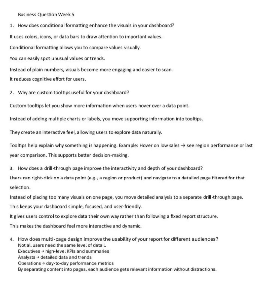
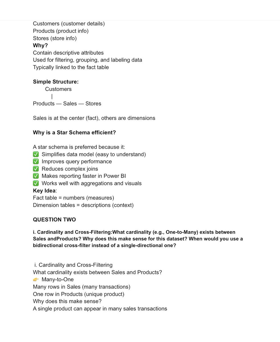
Just wrapped up my Week 5 Power BI dashboard project—took it further with drill-through, tooltips, and multi-page design.
Learning never stops 🚀
#TDI#PowerBI#DataAnalysis