@ispykenny I work hybrid and it is perfect for my hybrid personality 😄
But yes, being around people is important. Changing environments from time to time also.
In these times when there are so many beautiful websites generated with AI, the editorial scroll-heavy semi-3D fly-overs, the sexy grainy flowy gradients, the super creative full-screen effects... The thing that will differentiate your website and you as a company is realism.
I've said this 15 years ago about stock photography when every website had the same people in their photos and same cute little illustrations.
You. Need. To. Show. You.
Do that photoshoot. Ask your clients to snap your product. Gather those video testimonials. Capture the process. Take a photo of the office and the people.
It's OK it's not perfect. It's OK it's snapped on your phone.
The real has a big advantage in today's times.
The reality will be the winner.
By a large.
@ehsanshares@bynneh@jornvandijk@framer@aandreug Another aspect of a "fair chance" to everybody is that everybody has to come throught the same watchful eye of the review team, so that the same level of quality is assured. Otherwise the system literally made itself unfair – by allowing any quick and dirty products in.
@hxmzaehsan@julian_kalume@iremgeldry@hxmzaehsan Hamza thank you for your honesty. I have been waiting for an update on sales from one of the "big guys". You have played the game so well and inspired many of us, so it is truly reassuring - hearing from you - to see how much that update crushed everyone.
@_Zeets Extrapolation was crazy emotional for me. Sienna Miller's episode stuck with me the most. Scientists learnt to communicate with the whales, but there was only one last one because of the rising temp of oceans and she talked with her. Heartbreaking...
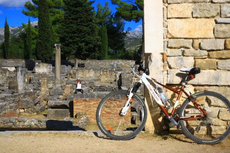
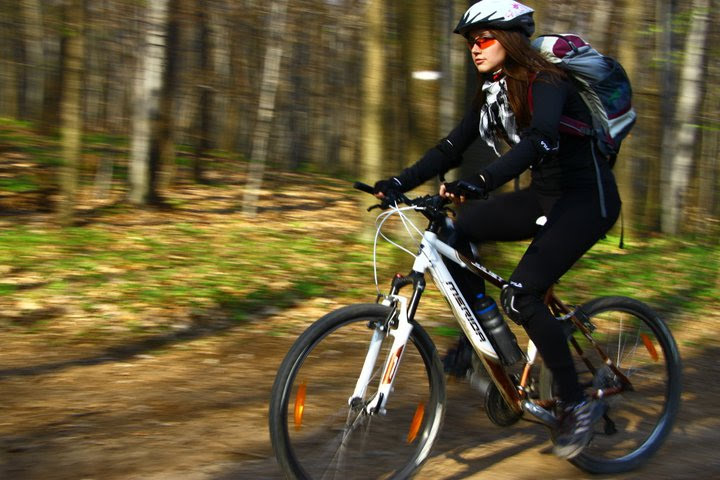
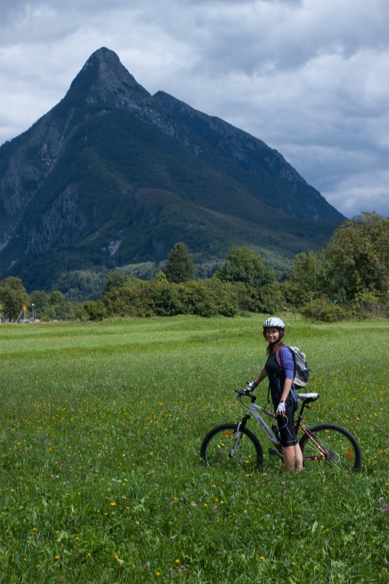
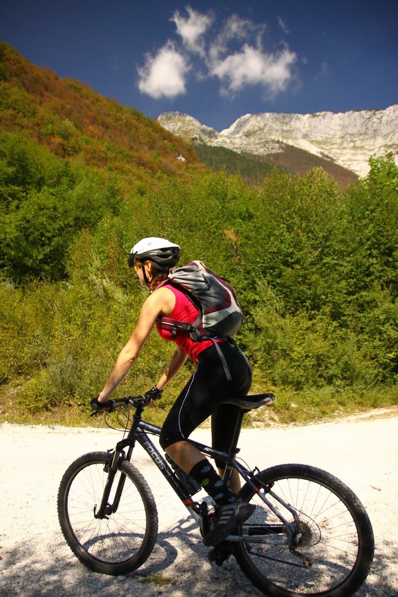
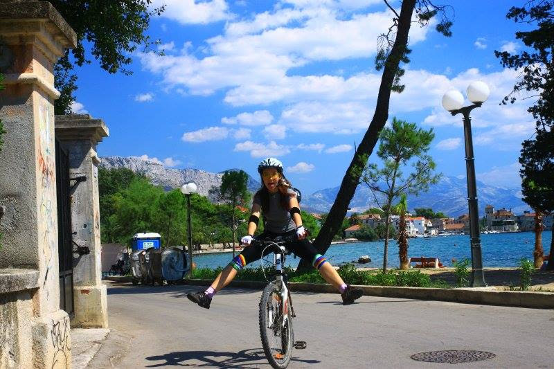
I just realised I never ever want to part with my bike. She has been with me through mountains and along seas. I will never give her up. I'm sorry but this bike aquired a SOUL.
@ciguleva I did this for my daughter and it is super hard! But I took it as an opportunity to instill some of my values into the stories, and so they became about kindness, about overcoming difficulties, starting again, self-reflection, resourcefulness, etc etc 😊
When discussing AI and how it steals our clients, I always revert to the idea of comparing it to fast fashion:
There will always be those who choose to wear polyester and those who wear a tailored suit.
Who do you want to work with?
Clients will now internally create their own websites.
Maybe they will hire designers to create an initial inspiration or design system to feed the AI. But if they do not have an internal design team, I doubt they will be able to even well-prompt their AI to create a reasonably good design (wheter it's for branding, website, social media, ...). They however will be perfectly able to create a perfectly acceptable slop. Acceptable for them.
Now, if this will be good enough for their customers is a different story. Those companies who still want a high-quality, carefully designed products and marketing, will win the market.
The shortcuts were always here. People experiment with the new toy and they have to go through the process.
What I learned from years of my experience both in design and life is that when you do things fast, they always produce less. Care always takes time. Time given equals the level of results.
We will see if the demand will be there for quality work that takes time and care. In the meantime, let's position ourselves as the people that can help deliver quality or turn the slop into class.
Hi Jason!
Both options have similar design qualities. They feel a bit outdated. I couldn't choose any of them.
Here are the things that make the designs feel 2010 or "AI generated":
— the fonts, all of them (headlines and body), the use of purple accents (the solid color and the gradient) the line-spacing and the font-weights combinations (they feel mis-matched in both designs). These definitely need an upgrade
— the use of purple in the background of the modules is exactly that AI-generated style that downgrades both designs. This can be done nicely in modern designs, I am not against purple or gradients, just in a different, much more subtle way
— the card designs, the border radius, the tilted phone graphic, all these big little details feel like dribbble 10 years ago
Overall, the designs are completely acceptable. But if you want to build trust with your customers and exude care (the time and care you put into your product and its marketing), I would not recommend using any of them.