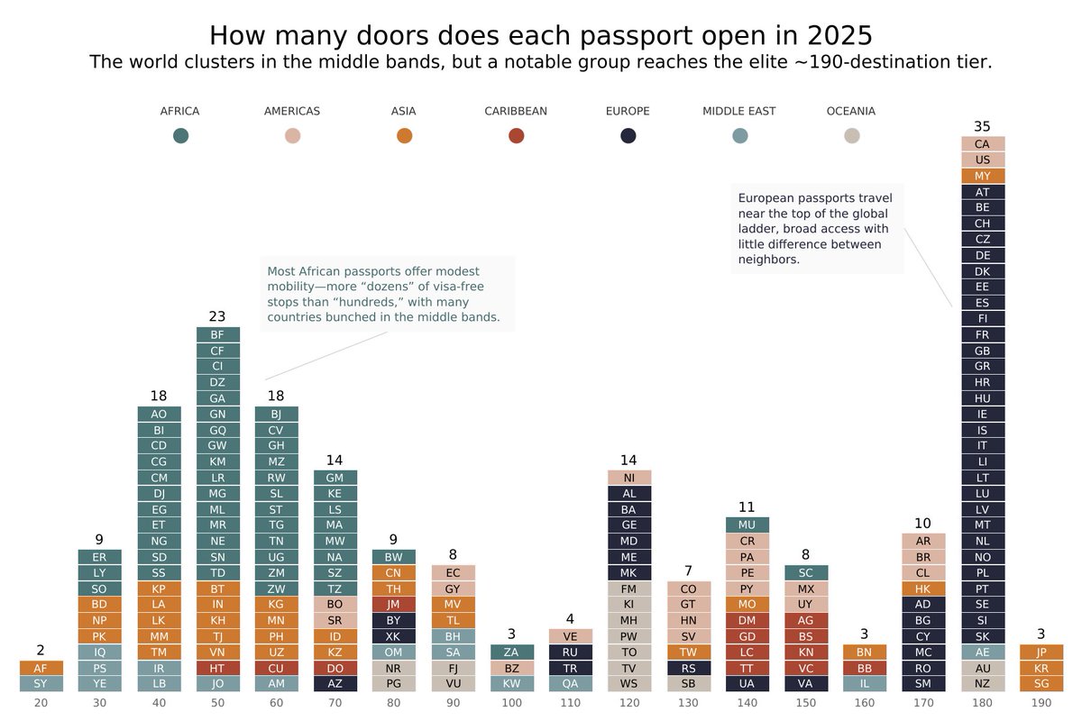
#TidyTuesday week 36 - Henley Passport Index Data. This one created in #Tableau each column is a visa-free count; height = how many countries sit there.
Tableau Public: https://t.co/UR4jrylg58
#DataViz
#TidyTuesday week 27 - The xkcd Color Survey Results. I used the data to create an artistic explosion of colors using #p5js. This dataset was the perfect playground for a little creative exploration.
#dataviz
For this week's #TidyTuesday dataset, I explored India's journey toward measles elimination. The visual layout draws inspiration from newspaper format. Charts were created in R using #ggplot2
Layout designed in Figma.
#DataVisualization#RStats
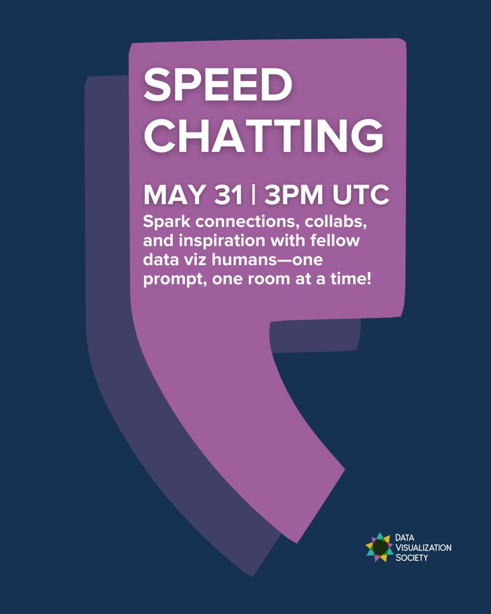
✨ Connect with fellow #dataviz humans—four minutes at a time!
Join us for Data Viz Speed Chatting, a fast-paced, friendly event where you’ll rotate through small-group conversations guided by creative prompts. Each round is just 4 minutes—enough to spark ideas, swap stories, and leave inspired.
📅 May 31 at 3pm UTC
📍 Sign up here: https://t.co/ZLAn4XFARu
For #VizChitra2025, meet speaker @Da_Pacific, Dataviz Developer, @reutersgraphics
🎙️Talk: “The Eyes Have It: Understanding Perception-Driven Data Visualisation”
Learn how simple design choices make charts
Catch this session and more: https://t.co/bsds0dDyDu
I am part of a community of Indian data communicators, developers, designers, researchers and others organising India's first data visualisation conference in June this year. We have 25 fully-funded places for people who would like to attend but face barriers. Deadline: tomorrow.
New Shiny app for this week's #TidyTuesday dataset featuring the upcoming useR! 2025 conference sessions!
🛠️ I built this using {shiny} and some custom styling , with help from AI along the way for troubleshooting and design nudges.
https://t.co/84xZNSLoZY
#Rstats#DataViz
📊 Day 3 – Circular | #30DayChartChallengeA bit more on the art side today, visualizing Act I dialogues of Hamlet, Macbeth, Romeo, and Juliet as spirals. I’ve never created text spirals before, so this was a fun little challenge and a great learning opportunity. #Rstats#D3js
#30DayChartChallenge Day 1 - Fractions, I decided to take that quite literally. What better way to show fractions of time than by visualizing Dhoni’s lightning-fast stumpings. I created a set of stopwatch-style dials to show the dismissals.
#DataViz#Rtsats#MSDhoni
#TidyTuesday week 12 - Text data from Amazon's annual reports. Created this proportional streamgraph of the positive and negative words with {ggstream} and also added the word cloud.
#rstats#DataViz#Figma
Happy to share that both of my submissions for the 2024 Information is Beautiful Awards made it to the longlist! 📊✨
🟣 Fragrance of data
🟣 Data Art
#Dataviz#Rstats#DataArt
#TidyTuesday week 9 - Long Beach Animal Shelter.
I took a creative approach to data visualization by analyzing the primary colors of animals at the Long Beach Animal Shelter (2017–2024) using #Rstats#RawGraphs and #Figma#dataviz
#TidyTuesday week 8 - Academic Literature on Racial and Ethnic Disparities in Reproductive Medicine in the US. Created this chart using {ggbrick}and edited in Figma.
#Rstats#dataviz
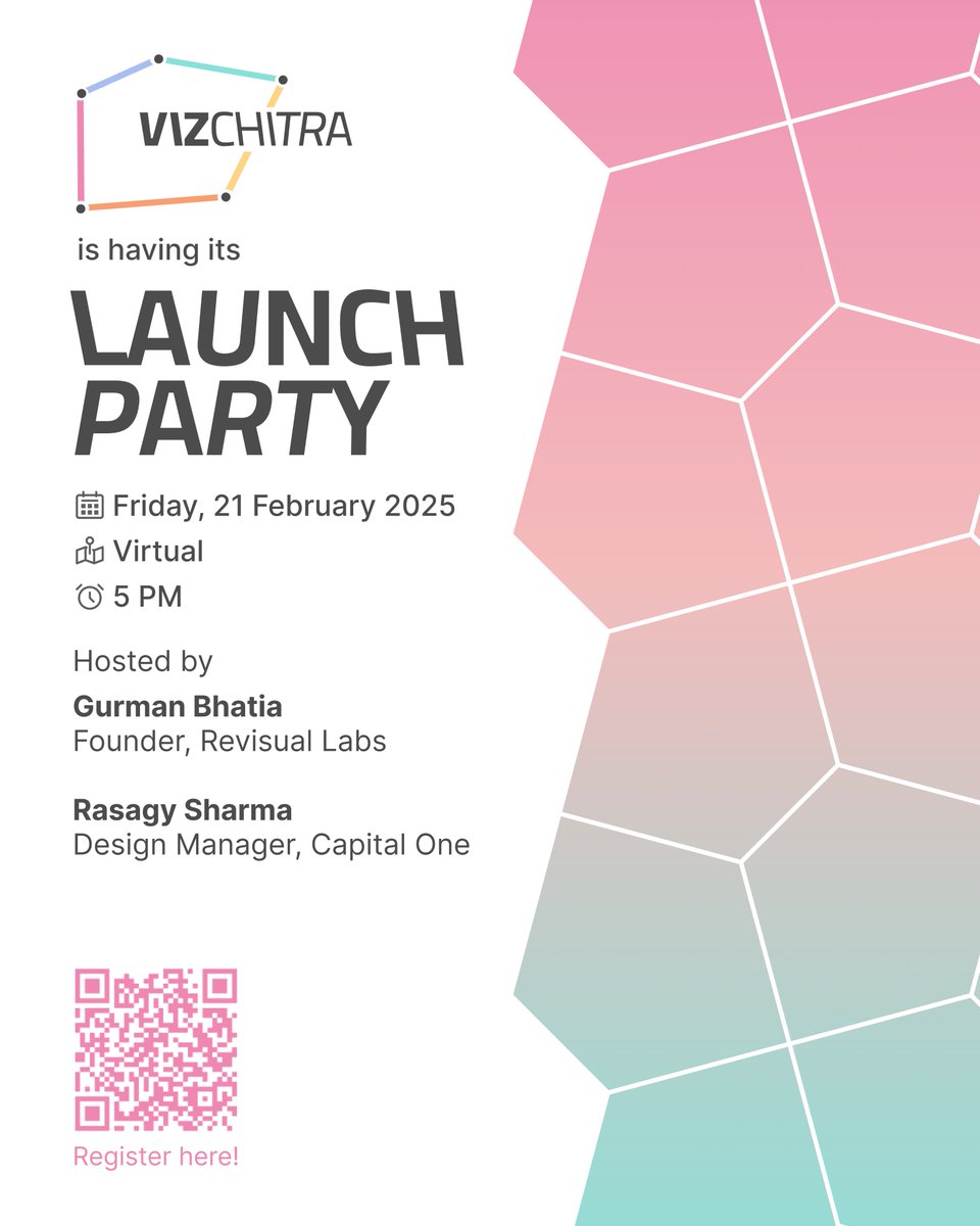
🎉VizChitra Launch Party!🚀
Are you a data storyteller or aspiring to be one?
Join our first virtual hangout with @chartwaali & @rasagy to connect, create & chat about data, design & innovation!
Register here: https://t.co/UieE1ThccW
We can't wait to see you there!✨📊🎨