I work in #edtech and it is a very humbling experience. 6 yrs in learning how harmful archaic, beaurocratic tech practices in public schools can be detrimental to progress in education - makes me realize i can't sit back + design for just any industry. I need to make an impact.
@veranmiller totally overwhelmed. I'm Russian born US raised and it is near impossible to find anything from the old country :( . Where does one start?!
They also have a set of beautiful spray bottles that have no ugly ads on them, so you can display them in the home. Go check out https://t.co/hO3Ix7af0u and make the world a little less plastic.
Shameless plug about Blueland cleaning products. Some of you may know ive been slowly striving for a zero-waste home and a generally eco-friendly home. This is especially challenging in the COVID era because reusable stuff becomes a liability when so many surfaces can be harmful.
Anyway, each pill is $2, is shipped in a recyclable paper envelope. Think about it. water you have at home, and most cleaners cost more. For the majority of the cleaning needed at home, the cleaners are ideal. I can't stress enough how mindblowing this revelation is to me.
@radicallyrach i'm very fortunate that i do not use email for anything except signing up for stuff :D working internally allows me to communicate thru slack + others only
@PavelASamsonov just had the most #coldhardfacts convo abt how aesthetics is overrated & incredibly subjective. that design =abt objective evidence-informed problem solving. visual design that dsnt solve a problem (& usually instead creates one) is not design but decoration. i feel attacked.
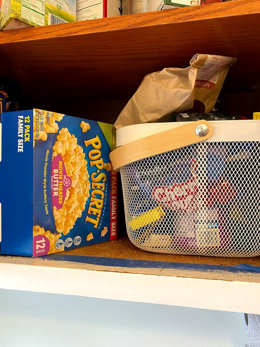
@conniechiiiwa mmmm love that stuff. Like i know we're in quarantine but thats some serious snackage. I'm indoors alot and i should probably be more conscious of the eating habits #facepalm
@DougCollinsUX i work in edtech. Clearly right now schools are closed, but we are reminding our customers that shit will hit the fan if they don't prep for when schools reopen. I want to make their experience going back to schools seamless!
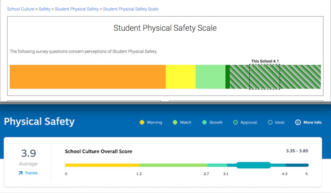
as my colleague told me, the graphic looks like " a snake ate a hamster". She's not wrong, but i'm struggling to find a better visual for this particular type of graphic while maintaining our usual colorful, bubbly style. Thoughts?
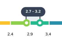
hey #UI#UX#design friends, help me make this #dataviz graph understandable. What isn't shown is that upon hovering on any of the sections in the original version, you get a description and values of range. I decided to move that to the legend as shown below.
now imagine there are 200 of these range charts, each one having different 'ranges' for the color bands. This is why i have the numbers explicitly written below the colors.