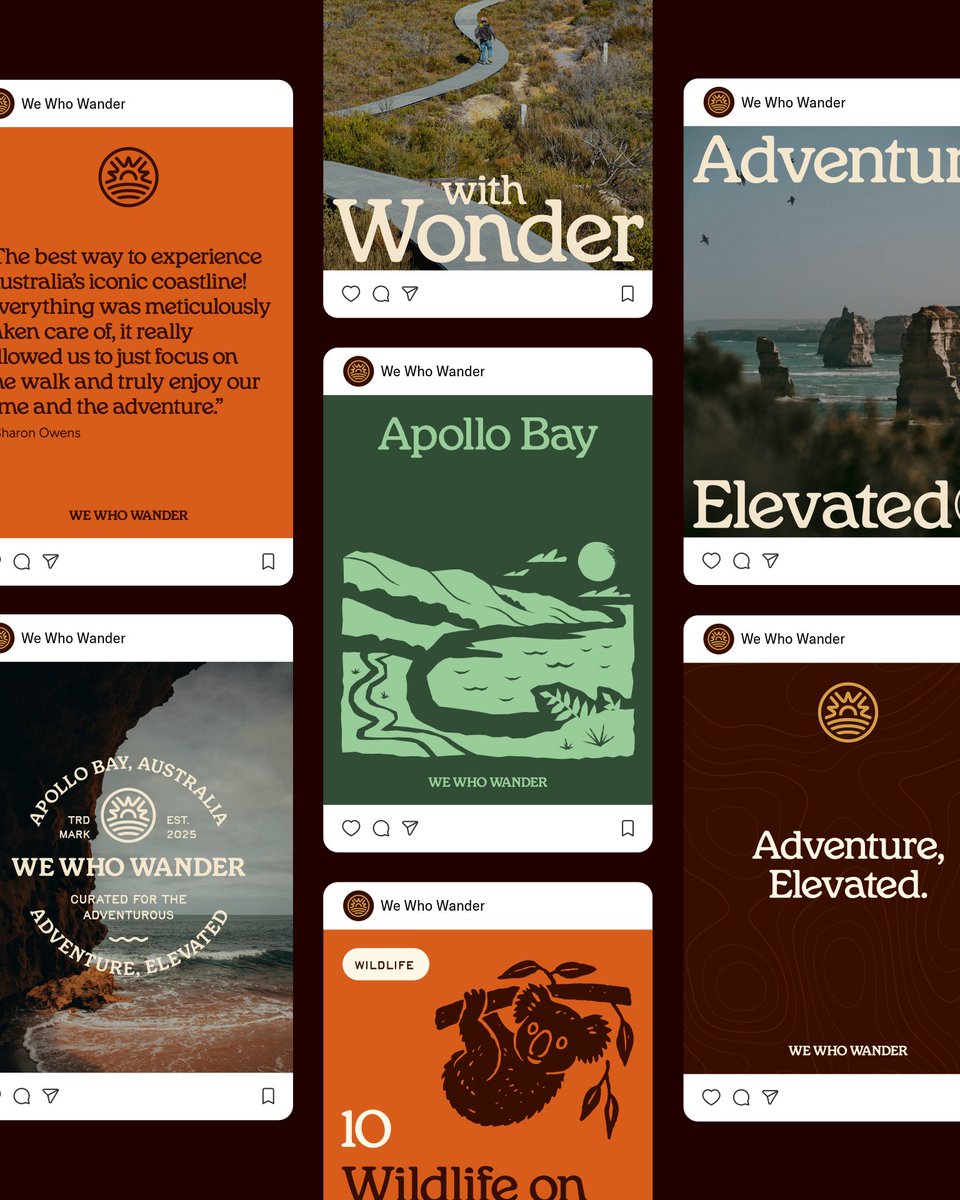
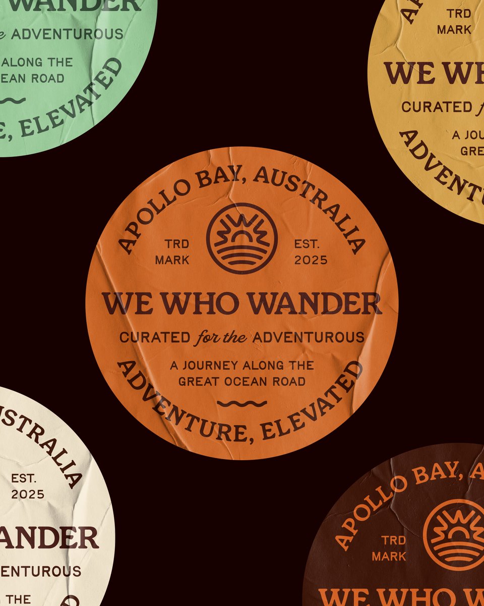
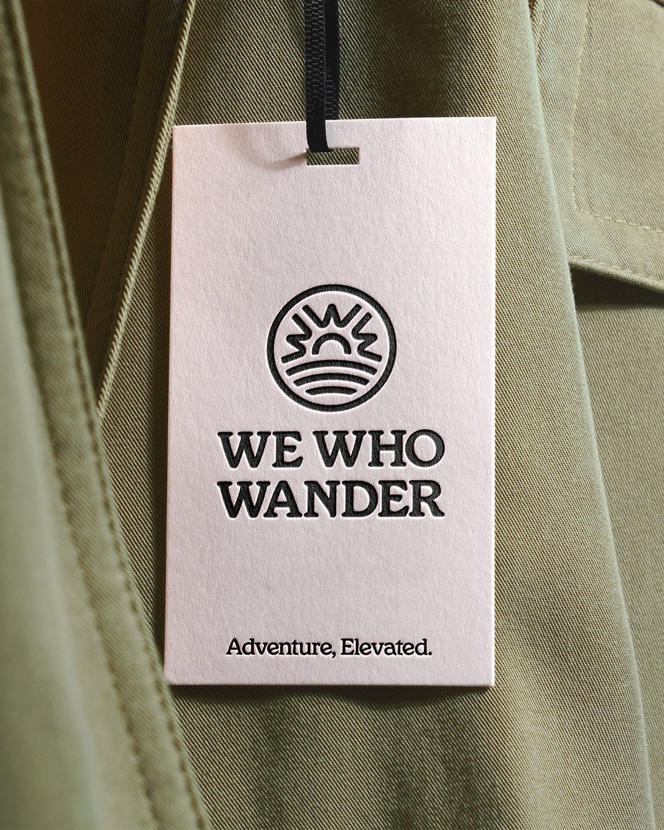
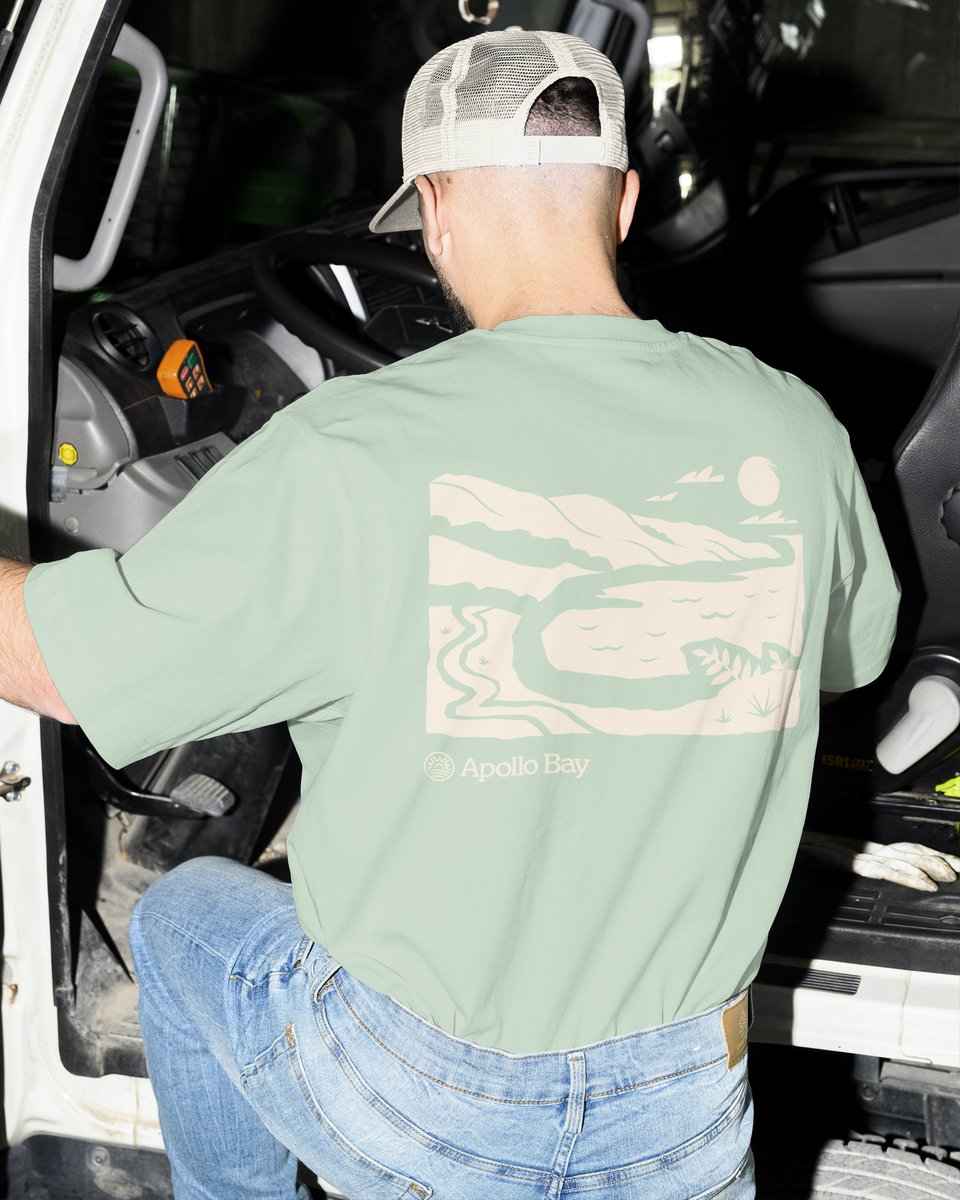
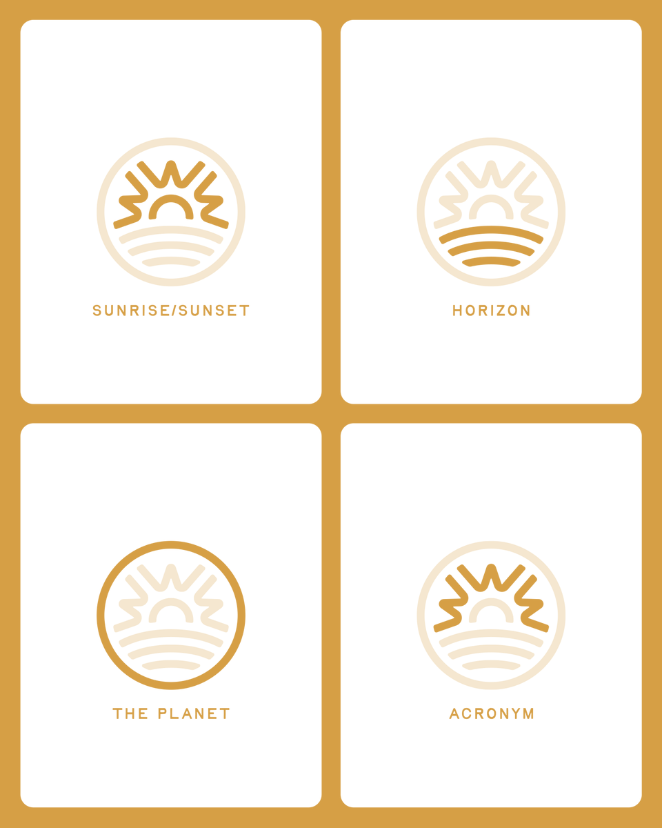
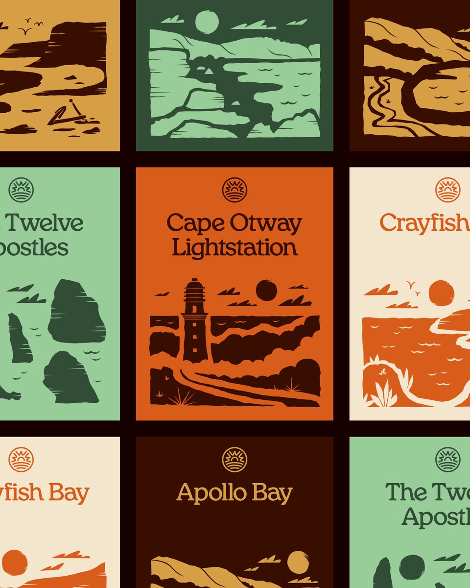
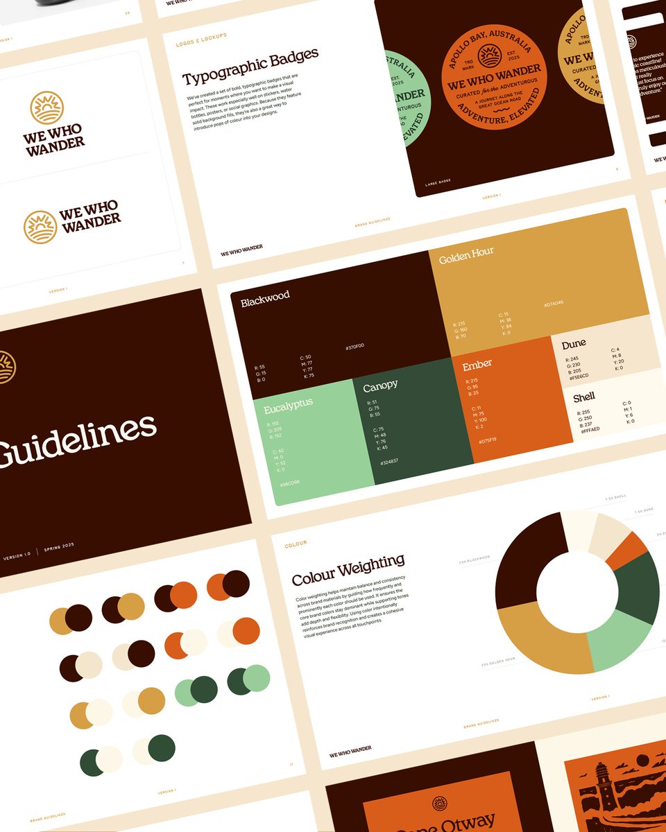
Here’s a look at the visual identity we created at @diverdotstudio for We Who Wander, a premium hiking tour operator on Australia’s Great Ocean Walk. It’s designed for travellers who value adventure, quality, and a genuine connection to nature. We worked closely with the founder to define the audience and brand pillars, then built an identity that pushes past hiking clichés and the usual Australian motifs.
man i was so stoked when our branding co @diverdotstudio landed this work for backland expedition gear, and now that it's out in the world, i just love it so much 🔥
Back in December, we were hired by an agency overseas to sketch logo concepts for a cooking app. They wanted to see doodle-y explorations of characters, animals and blobs wearing chef hats…
Say no more! 👨🍳👨🍳👨🍳
We set up an asset library and templates in Figma that the team could use, remix and build on, as they pulled the graphics together. As one of our first studio projects, it couldn’t have been a better fit - building illustrative identities with great people 🔥🏕️
Earlier this year we worked with the wonderful folks at Bonfire on the visual identity for Campout, their new digital community space for creative marketers.
We introduced new type, refined the color and produced logo variations. We made cut paper shapes, hand-drawn doodles, and created a collage treatment that brought a DIY handcrafted energy we all resonated with.
Next up: translating it all into a website experience that brings the brand to life online. Building out the website is one of our favorite parts of the process; we're excited to share more of that work once we get into it.
This marks our first full-from-scratch brand at the studio, and honestly, it couldn’t be a better showcase for the kind of work we love doing – thoughtful & illustrative identities.
Naming is so hard... We initially explored ~150 different options while trying to figure out what to call our studio. (shortlist 🟡)
We’d find a name we loved, only to discover it was taken by other design studios or had no good domains available. Rinse and repeat.
We did some extensive searching and couldn’t find any mentions of other studios in our industry named Diver. It’s short, memorable, easy to pronounce, and isn’t too obvious or expected—It’s a bit offbeat which we love. Most importantly it’ll look rad embroidered on a dad hat.