React in 2023 is like the Honda Accord.
✅ Proven.
✅ Popular.
✅ Flexible.
✅ Reliable.
✅ Well documented.
✅ Easy to find related components.
✅ Easy to find people to work on it.
However:
🚫 It’s not the fastest.
🚫 It’s not the simplest.
🚫 It’s not the most modern.
🚫 It’s not “cool”.
But chances are, it will reliably get you where you want to go.
Tech twitter topics in a nutshell:
0. Wow check out this AI thing I built
1. Sorry but Nextjs sucks
2. React is dead. Use Nextjs
3. Check out all this MRR *insert screenshot*
4. Use Tailwind, you dont understand CSS
5. PHP is NOT dead, here's my Laravel million dollar business
6. pgvector databases are the future, dang it.
7. indie hacking is dead
8. boohoo someone cloned my idea
9. I just sold my side project, here's how I did it
10. I learned SEO, here's a graph
11. If you're not using Rust, dont talk to me
12. Help! I suck at marketing
13. 73 reasons why nocode sucks
14. 74 reasons why nocode rocks
15. Something something, a thread.
Ok - that's all I can remember.
What did I miss?
CSS Trick! 🤙
I got you! You can create this Disney-inspired loading animation with a single element and some CSS ⚡️
The "trick" is to create the ring part with a pseudo-element and offset it against the element 😎
Start with the element, this creates an offset white dot
.loader {
width: var(--size);
aspect-ratio: 1;
background: white;
border-radius: 50%;
position: absolute;
/* Rely on transform order to spin it */
--y: calc(var(--size) * -4.5));
transform:
rotate(0deg)
translateY(var(--y));
animation: spin 1s infinite linear;
}
@ keyframes spin {
to { transform: rotate(-360deg) translateY(var(--y);
}
The ring part is an offset circle that gets masked 😷
.loader::after {
content: "";
width: calc(var(--size) * 10);
aspect-ratio: 1;
position: absolute;
top: 0%;
left: 50%;
translate: -50% 0px;
/* Create a conic-gradient */
background: conic-gradient(
white,
hsl(var(--hue), 100%, 70%),
hsl(var(--hue), 100%, 10%),
transparent 65%
);
border-radius: 50%;
/* Mask it to leave a border. That 1px difference helps with making it look less rough */
mask: radial-gradient(transparent 39px, white 40px);
}
The last piece is the "glow". Use the other pseudo-element and set the offset to -50% and give it a blur filter 😎
.loader::before {
content: "";
position: absolute;
inset: -50%;
border-radius: 50%;
background: white;
filter: blur(10px);
z-index: -1;
}
Why didn't we create the ring with the main element? We didn't want to mask out the blur of the ::before element so we had to work around that limitation and use the offset ✨
Happy animating!
@CodePen link below! 👇
I don’t get the hate towards Electron.
eats a lot of RAM
low quality
doesn’t feel "native"
when’s the last time you had problems because of RAM?
and do you enjoy the MacOS system prefs?
you can make shitty apps with any tech.
If you solve someone’s problem, you’ll be just fine
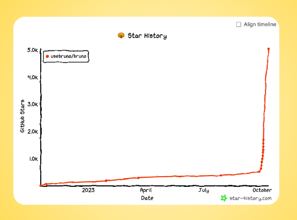
Bruno has hit 5000 GitHub stars! 🥳🥳
🌱 2 years to go from 0 to 500
🚀 10 days to go from 500 to 5000
Thank you to our amazing community for your incredible support. 🙌 We couldn't have done it without you.
Github: https://t.co/D4psScnp6J