@Melissita1204@munaype Por favor ayudemos a este perrito que está en mal estado, tiene una herida expuesta en la cabeza que está en estado de putrefacción, el se encuentra en la entrada del aeropuerto de Tarapoto, lamentablemente estoy de regreso a Lima, solo he podido 1/2
How Rune Monö Created One of Sweden’s Most Recognizable Brands.
Rune Monö, a pioneering Swedish graphic designer, created the iconic ICA logo in 1963, officially introduced across Sweden in 1964. At the time, ICA operated through several regional organizations with differing visual identities, creating inconsistency in stores and marketing. Monö was commissioned to develop a unified brand image that could represent the entire ICA organization with clarity and modernity. His solution was a bold red logotype featuring a soft, rounded “C” paired with a sharp, dynamic “A,” crafted from modified grotesque typography. The contrast gave the logo both warmth and energy, helping it stand out in Swedish retail culture. Beyond the logo itself, Monö’s design firm developed ICA’s broader visual identity system, including storefront signage, packaging, and printed materials. Remarkably unchanged for decades, the ICA logo became a symbol of trust, unity, and recognition, cementing Monö’s influence on Scandinavian graphic design history worldwide.
#logodecks
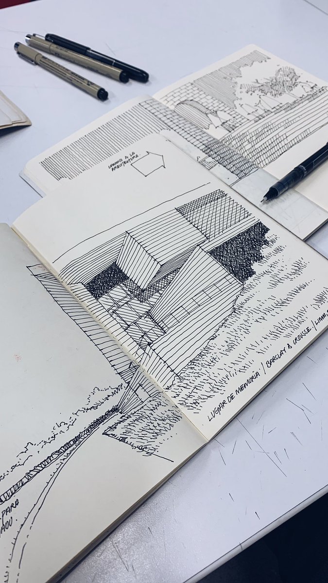
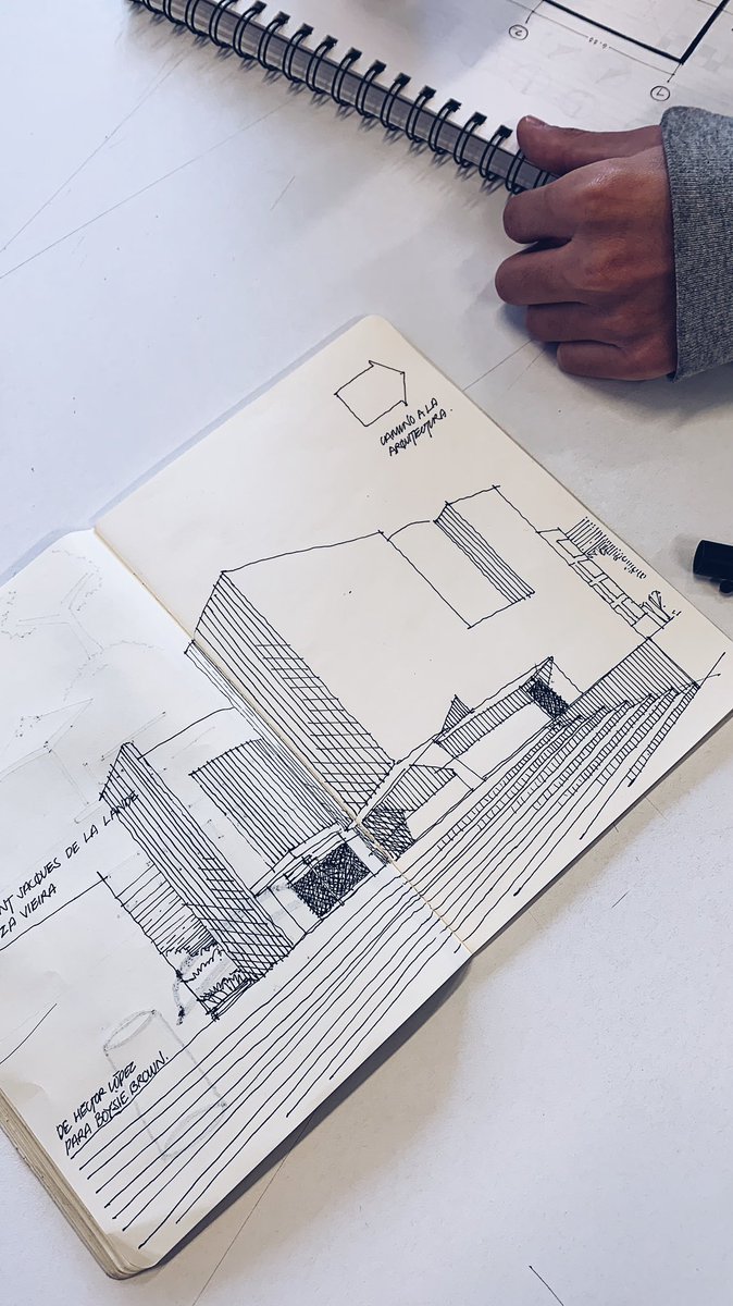
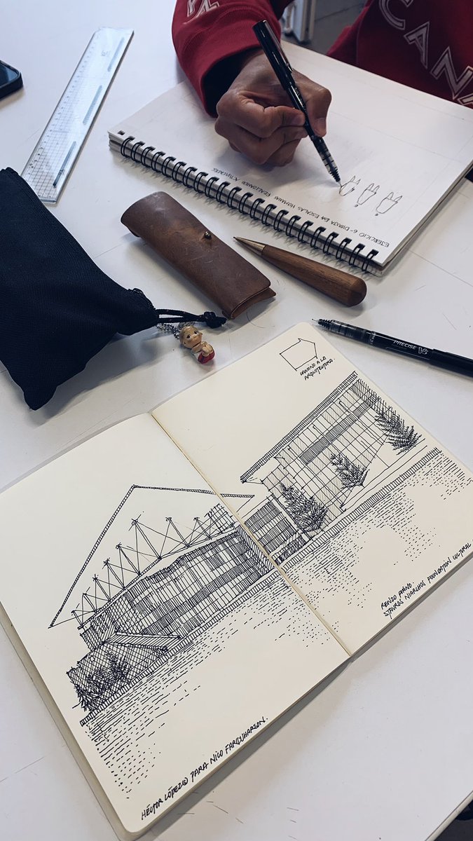
Creo que es un bello regalo (y una buena idea) para un arquitecto.
Sin embargo, me trajo a la mente los modelos cerámicos que hacían los habitantes precolombinos de estos lares, las casas hechas en barro que enriquecen nuestro patrimonio.
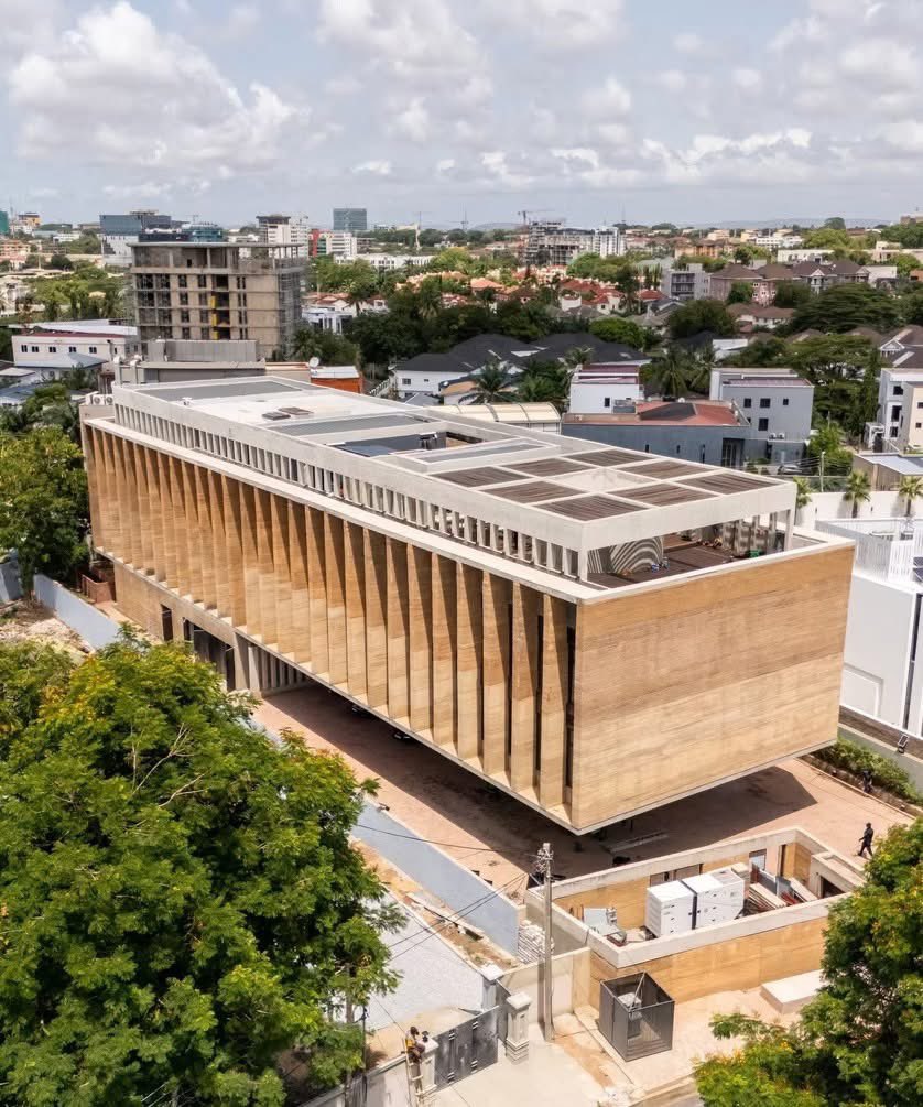
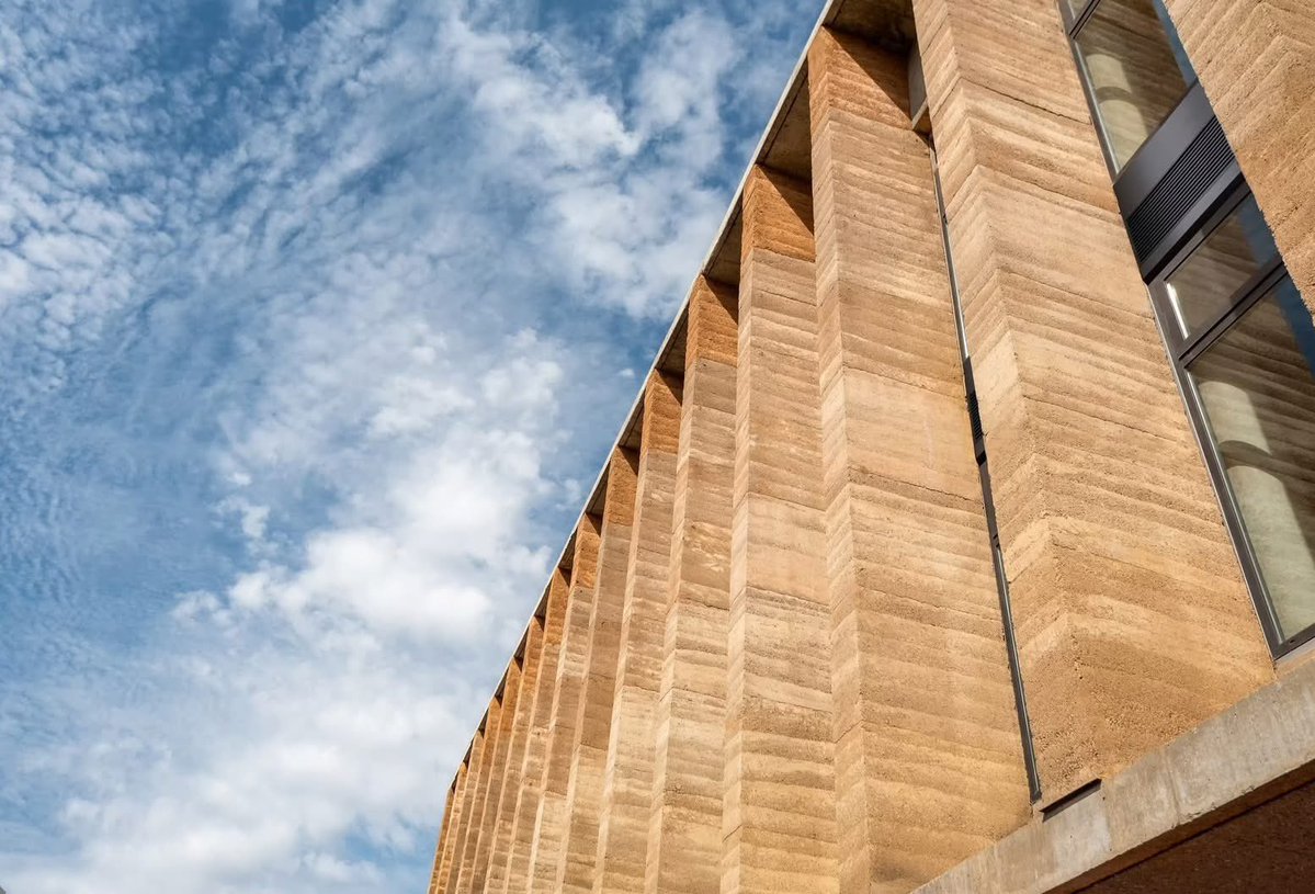
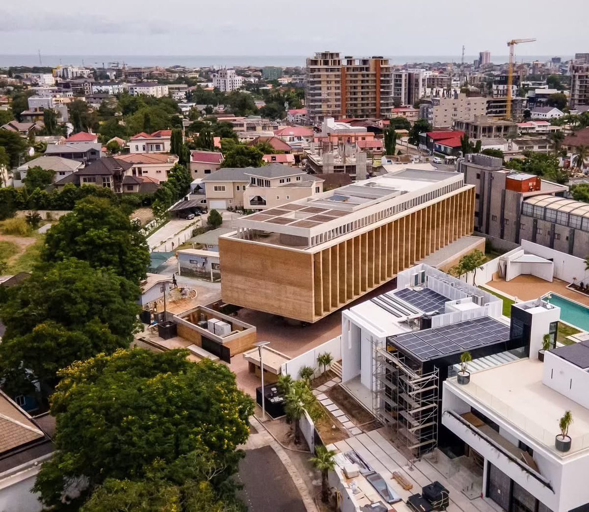
Chequen cómo en Ghana la tierra apisonada dejó de ser “experimental” para convertirse en arquitectura de clase mundial
Fachada de tierra apisonada local, 1,300 m² libres de columnas, regulación pasiva de temperatura y humedad, un voladizo de 26 m, se convierte en espacio público
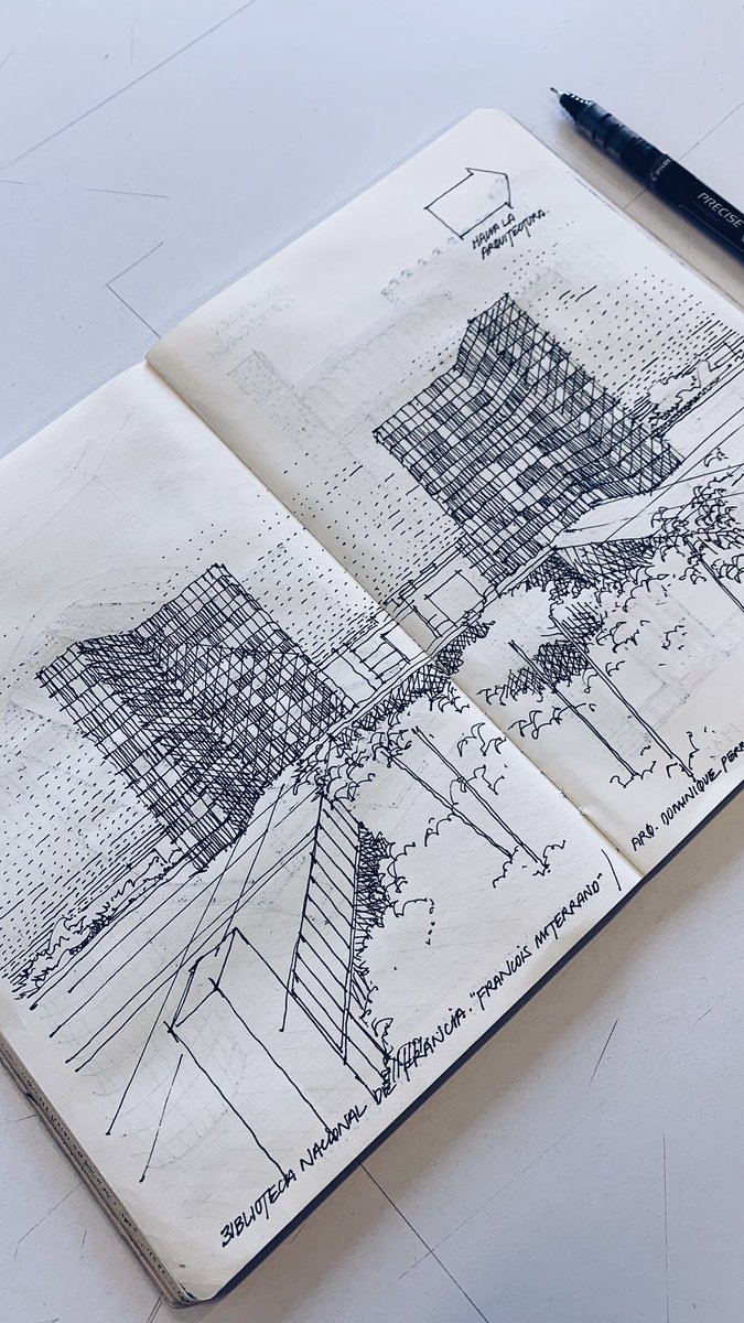
Uno de mis temas favoritos: Torre y Plataforma, esa mezcla de densidad vertical y extensión horizontal para llevar usos y servicios a su entorno.
En este caso, para un colegio.
Chartier Dalix Architectes.
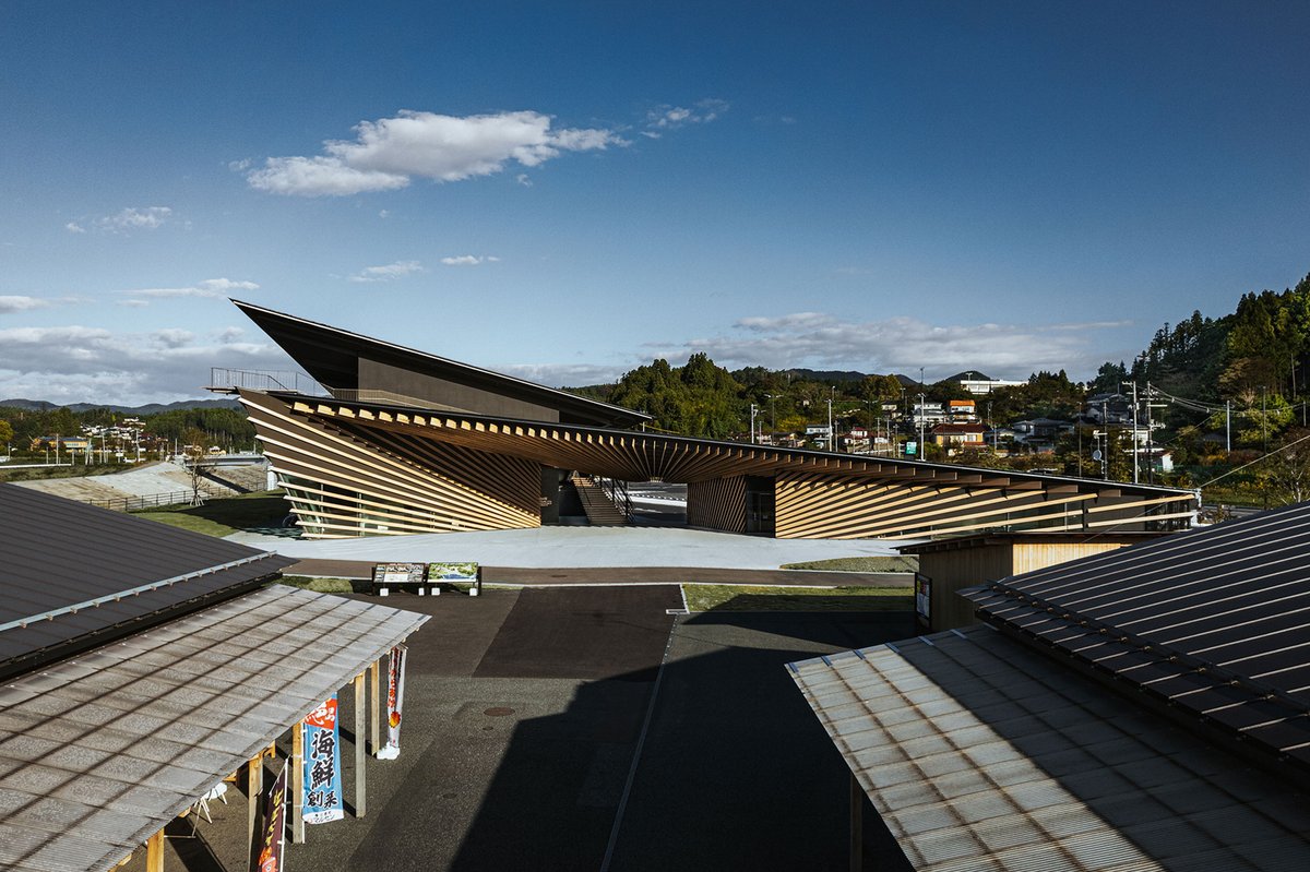
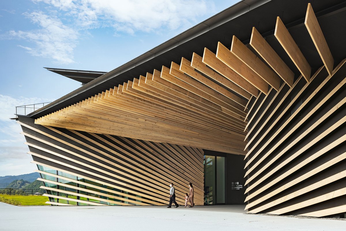
El estudio de arquitectura de Kengo Kuma & Associates (KKAA) ha proyectado el Memorial Minamisanriku 311, un edificio que forma parte del plan de reconstrucción de Minamisanriku, una ciudad que sufrió graves daños durante el Gran Terremoto del Este de Japón de 2011.
https://t.co/MKzflGckLy
Absorbing perspective. Minamisanriku 311 Memorial by Kengo Kuma
https://t.co/xetZGxzswp
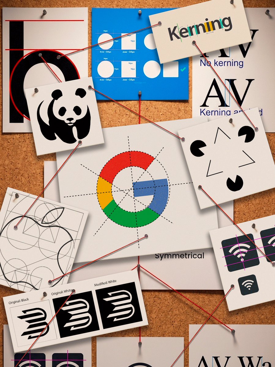
¿Sabías que los diseñadores engañamos a tus ojos para que vean las cosas "geométricamente perfectas" cuando en realidad no lo son?
Hoy les voy a hablar de los ajustes ópticos y como fueron parte de la conspiración visual más grande de la historia (???).
🔥👇👁️🔍
From Imperial Airways to British Airways: A Logo’s Journey.
Theyre Lee-Elliott was a versatile British artist whose influence on aviation branding is still felt today. In 1932, he designed the iconic “Speedbird” for Imperial Airways, distilling the excitement of early flight into a clean, aerodynamic form. The logo’s flowing lines and forward motion reflected both technological progress and a sense of optimism about global travel. Rooted in Art Deco principles, it balanced elegance with clarity, qualities essential for a symbol meant to be recognised at a distance and across cultures.
When BOAC was established in 1939, the Speedbird became its defining visual identity. It wasn’t just a logo; it was a statement of reliability, speed, and British innovation. Seen on aircraft fuselages, tickets, and crew uniforms, it built trust with passengers during a transformative era in aviation. Even after BOAC merged into British Airways in 1974, the design’s DNA endured, evolving into modern branding elements. Lee-Elliott’s work proves that simplicity, when executed with precision and intent, can achieve timeless global recognition.
#logodecks
La arquitectura que emociona no siempre grita. A veces susurra. Ponemos el foco en la obra de Álvaro Siza Vieira, maestro de la sensibilidad, el contexto y la simplicidad poética. Su arquitectura nos recuerda que el espacio no solo se habita… se siente.
https://t.co/QhXEBYEpo8
CPN: The Brilliant 1967 Logo That Mastered Negative Space.
The Centrala Produktów Naftowych (CPN) logo, introduced in 1967, stands as one of Poland’s most celebrated graphic design classics. Created by Ryszard Bojar in collaboration with Stefan Solik and Jerzy Słowikowski, the emblem places the letters “CPN” within a clean, minimalist square. Its standout feature is the ingenious use of negative space to form the letter “N,” demonstrating remarkable typographic creativity and simplicity.
Rendered in a bold, vibrant orange, the logo was engineered for maximum visibility on fuel station signage across the country. As the official mark of Poland’s state-owned petroleum products distributor during the socialist era, it became deeply embedded in everyday Polish life. Its timeless, modern aesthetic has ensured its enduring appeal, transcending the political changes of the late 20th century.
In 2018, the logo experienced a brief revival when PKN Orlen reintroduced it on select products and stations, evoking nostalgia among Poles. Today, the CPN emblem remains a beloved symbol of Polish industrial heritage, representing both functional design excellence and a significant chapter in the nation’s economic history.
#logodecks
The Red Sun That Redefined the Olympics: Kamekura’s Minimalist Masterpiece.
Yusaku Kamekura’s emblem for the Tokyo 1964 Games is a masterpiece of minimalist modernism that redefined Olympic identity. Unveiled in 1961, the design features a bold red circle representing the Japanese sun, positioned above the five Olympic rings and the "TOKYO 1964" wordmark in gold sans-serif typography. Kamekura’s use of geometric precision and vibrant symbolism signaled Japan’s post-war re-emergence as a modern, peaceful global power. By eschewing traditional illustrative styles for stark, impactful abstraction, he established a new standard for graphic design, creating an enduring visual legacy that remains one of the most celebrated symbols in sporting history.
#logodecks
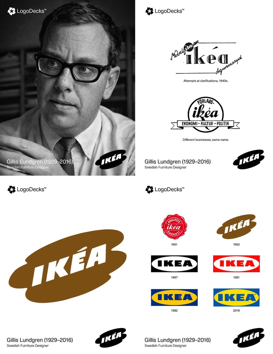
Why IKEA’s 1954 Cloud Logo Was Brown — And How One Employee Shaped the Brand Forever.
In 1954, Gillis Lundgren, IKEA’s fourth employee, transformed the company’s visual identity by designing a logo that became known as the "Cloud." This version moved away from the original wax-seal style and introduced an abstract, puddle-like shape that framed the brand name. Lundgren’s vision for the "Cloud" featured the IKEA wordmark set in bold, all-caps lettering, positioned at a dynamic diagonal angle to convey a sense of modern movement. While the original palette utilized cream and brown tones, the brown specifically reflected the hardwood furniture IKEA was selling at the time, hardwood being a quality hallmark in the early 1950s. This warm, natural wooden association was deliberately transferred to the logo’s color to signal solidity, reliability, and premium craftsmanship. The structural foundation, the authoritative font and the framing, was entirely Lundgren’s creation. He focused on "democratic design," ensuring the logo remained legible across diverse media, from catalog corners to massive warehouse signs. This "Cloud" served as the essential embryo for the brand, eventually evolving into the symmetrical oval used today. His work turned a small mail-order business into a globally recognized symbol of functional, affordable design.
#logodecks
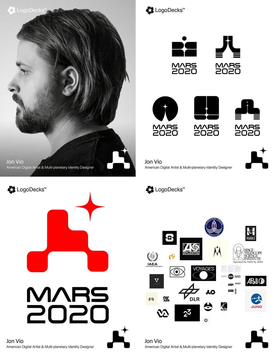
From Earth to the Red Planet: Jon Vio’s Iconic Logo for NASA’s Mars 2020 Mission.
Jon Vio, a multi-planetary designer and 3D visual artist, created the iconic logo for NASA’s Mars 2020 mission while working with House of van Schneider. The minimalist design features a sleek custom wordmark inspired by the classic NASA “worm” logo, paired with a dynamic symbol that cleverly condenses the Perseverance rover, distant Earth, and the red planet into a single, energetic mark. Clean lines and abstract forms capture the thrill of space exploration, evoking legacy, engineering excellence, and humanity’s drive to reach new worlds. Versatile enough to appear on rockets, mission patches, and digital assets, Vio’s logo became a bold emblem of perseverance that traveled aboard the Atlas V rocket and now adorns the rover exploring Mars.
#logodecks @jondotvio