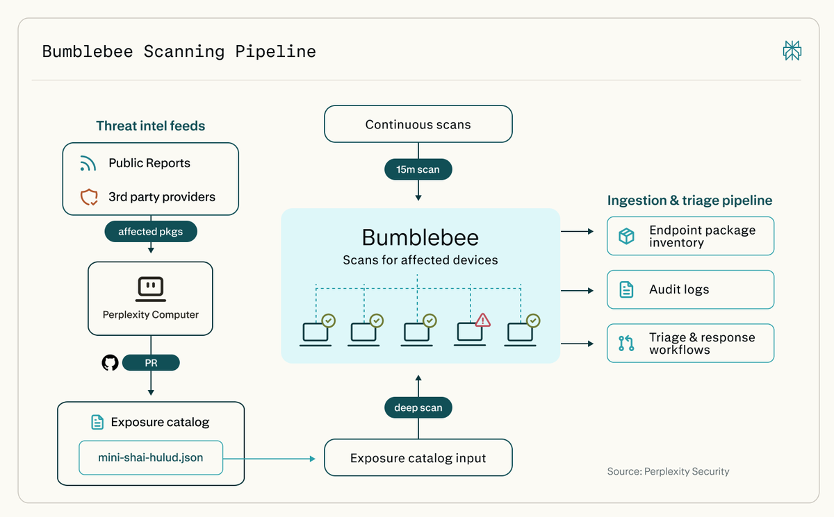
Today we're open-sourcing Bumblebee, a read-only scanner for macOS and Linux.
It checks developer machines for risky packages, extensions, and AI tool configs.
Connected to Computer, it can trigger deeper scans whenever a new supply-chain risk emerges.
https://t.co/FOaWnF1yQy
We paid $1 million to hackers to harden our firewall defenses.
Today we're telling the story of how we strengthened our WAF, disclosing a runtime mitigation layer for the first time, and how we partnered with
@Hacker0x01 to defend against React2Shell.
https://t.co/O3DWCVnGU7
Check out this Excellent Design System Component Checklist / Cheatsheet 🚀🔖
Add to your favs and refer back to it when you need to 🙌
A component is considered stable if it has met all of the requirements for both design, engineering, & documentation.
Design
Accessibility
- This component leverages the accessible color palette, has considerations for keyboard interaction, and has appropriate typescale.
Interaction
- This component has a defined interaction definition, which clarifies how it responds to user input or interaction.
Context
- This component has a defined context defintion which clarifies how and when this component should be used.
Completion
- This component has defined states for neutral, active, hover, focus, and disabled states.
Content
- The content has been approved by a UX editor, if necessary.
Customization
- This component has defined aspects which are customizable, if applicable, as well as the corresponding values.
Resolution
- This component has defined how it scales across varying viewport sizes and screen resolutions.
Engineering
Accessibility
- This component includes all of the accessibility features for keyboard navigation, screen reader compliance, color contrast, and high-contrast mode
Responsiveness
- This component responds gracefully to different viewport sizes.
Completion
- This component includes all of the neutral, hover, focus, and disabled states as defined in the design.
Customization
- This component includes all of the defined customization which is defined in the design.
Error Handling
- This component handles errors gracefully.
Browser Compatibility
- This component has been tested in supporting browsers and provides polyfills for newer technologies that are not readily accessible.
Documentation
Properties
- The properties for this component have been documented with the property name, it's valid values, and whether or not it's required.
Code Snippets
- The code for this component has been provided in all of the available states.
Interactive Example
- The component has been embedded in the style guide to show its interactivity.
Context Definition
- The context definition has been included to inform designers and engineers where and when to use this component.
Follow @UXlinks to Massively increase your UX skills and knowledge 🎯
#ui #uidesign #ux #uxdesign #design #productdesign #designsystems #uikit #sketch #figma #adobexd #google #apple #ibm #airbnb #audi #shopify #ecommerce #atlassian #webdev #ios #materialdesign #iphone #react #js #css #business
Learn the Fundamental Design Principles in UI to improve your UX/UI Designs 🔥🔥
What are Fundamental Design Principles?
Fundamental design principles are the rules that designers should follow to achieve a good result and composition in their user interface designs. Here are a few major principles.
Summary:
Emphasis / Dominance
Create a focal point on the screen that will intentionally draw user’s attention.
Unity / Rhythm
Create a pattern from the elements to achieve harmony and visual rhythm.
Hierarchy
Arrange the elements in order to define their importance and role by size, font, color, and other properties.
Balance
Arrange the elements on the screen to achieve even distribution of shape and space.
Proportion / Scale
Create a baseline for the viewer to compare the size of elements.
Contrast
Emphasize the difference between elements using color, shape, or size.
Similarity
Use color, shape, size, or other property to make the user perceive multiple elements as belonging to the same group.
Download PDF: https://t.co/fVXJZ1I7gA
#ux #uxdesign #ui #uidesign #uxlaws #ocamsrazor #productdesign #uxprocess #userexperience #design #designthinking #research #userresearch #uxresearch #usertesting #usability #usabilitytesting #prototyping #agile #mvp #startup #digital #visualdesign #graphicdesign #business
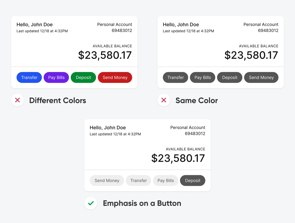
Grouped buttons that use different colors or the same color make users think too much.
Emphasis on the most beneficial button decreases their cognitive load.
Someone may be very rich and powerful but without any trusted friends they will never be happy. Someone else may be poor but if they are surrounded by trusting friends they’ll be happy. Therefore, taking care of others is the best way to fulfil our own interests.
We've announced our final event for this year.
Come and join us for an evening on the topic of chronic health conditions and how design can help — with Matthew Farrar (@mattfarrar) on the story of his company LovedBy.
https://t.co/vshFPcsvE4
https://t.co/I8EJ9CcICX