[ Nano Banana Pro 数据可视化] 跑了一个财报桑基图
例如最近很火的美团三季度财报给淘宝、京东干亏损了
输入财报,就能生成这样的桑基图看清楚美团各业务模块的收入,以及钱都花在了哪、亏在了哪?
提示词:
```
[Subject]: A professional financial Sankey diagram visualizing the Income Statement of a major corporation, in the style of "App Economy Insights" and US corporate financial reports.[Visual Style]: High-fidelity vector infographic, clean minimalist aesthetic, flat design. The background is a clean, very light grey or off-white.[Color Strategy - CRITICAL]:
Analyze the [Insert Brand Name Here] logo. Extract its primary brand color (e.g., if Nvidia use neon green, if Meta use blue, if Tesla use red).
Use this primary color as the dominant theme for the main revenue flows and profit blocks.
Create a harmonious color palette based on this primary color: use saturated shades for the vertical nodes (bars) and semi-transparent, lighter opacity gradients for the flowing paths to ensure a cohesive and professional look. Avoid clashing colors.[Composition & Structure]:
Flow: A horizontal flow from Left (Revenue Sources) to Right (Net Profit).
Texture: The connecting paths (flows) must appear "silky smooth" with elegant Bezier curves, looking like liquid ribbons, not jagged lines.
Iconography: On the left side (Revenue sources), include specific, minimalist flat vector icons representing the business segments (e.g., a car icon for automotive, a cloud icon for services, a chip icon for hardware).
Branding: Place the official [Insert Brand Name Here] logo clearly at the top center or near the central revenue bar.[Details]: High resolution, 4k, sharp typography (sans-serif), professional data visualization layout. The chart clearly distinguishes between Revenue, Gross Profit, Operating Expenses, and Net Profit.
```
I interviewed Rajiv Sinclair about his team's new project, VERDAD - an outstanding piece of data journalism that tracks 48 US talk radio stations (many in Spanish), transcribes the audio and uses Gemini 1.5 to help identify potential misinformation
https://t.co/jZguXsq4Ii
https://t.co/ZZcJ8VviUc
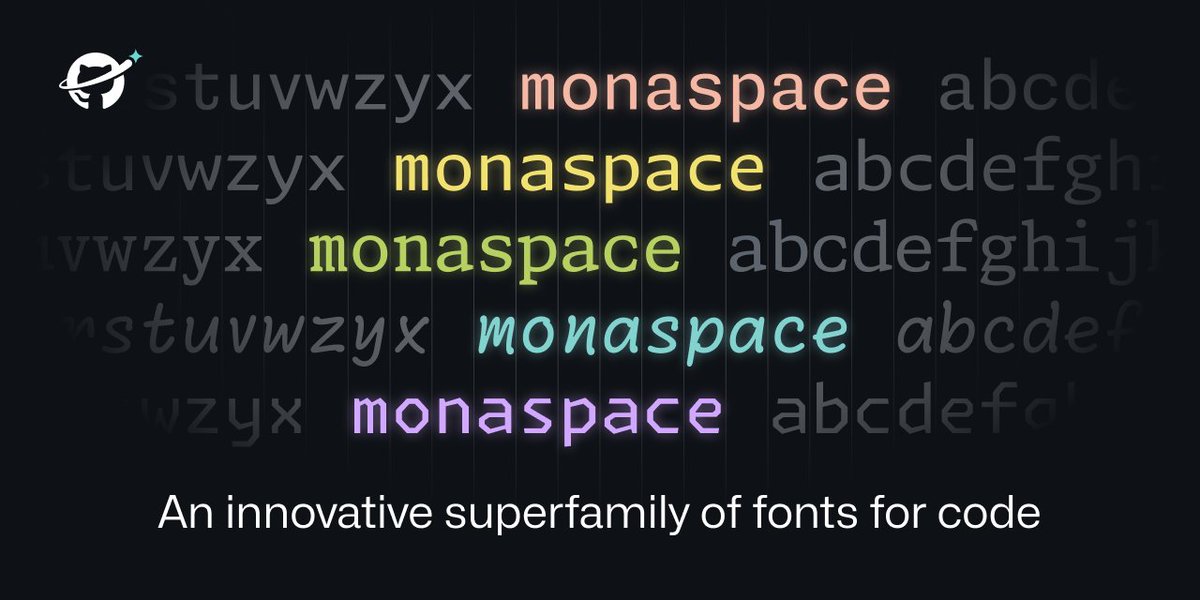
All code has been letters, on a grid, since the days of the teletype machine. How can we advance the state of the art to make code itself more expressive and powerful? How can we layer more meaning onto code?
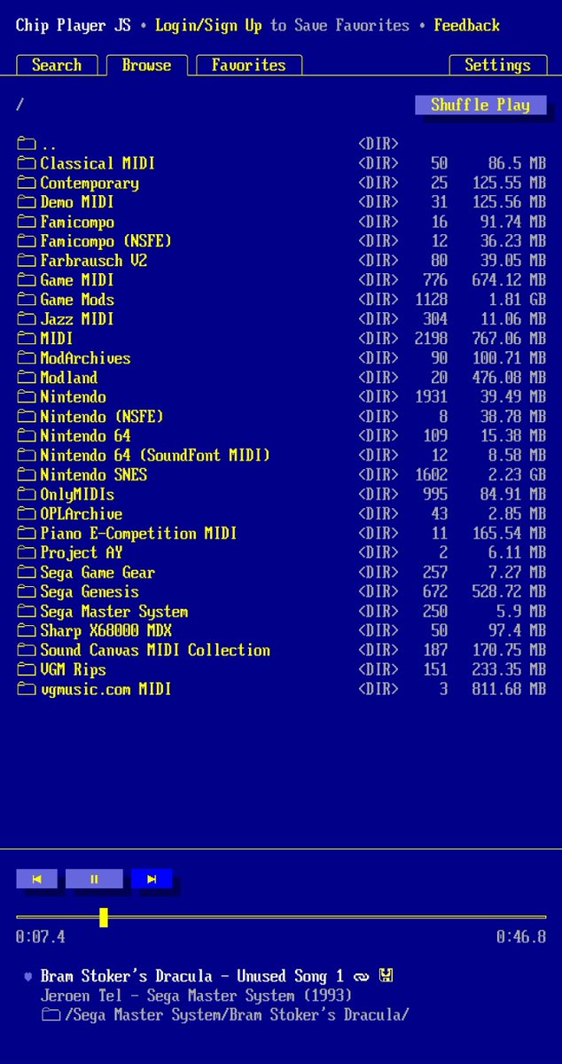
Okay, this is brilliant if you love your chiptunes. Chip Player JS is loaded with thousands of pieces of music from tonnes of systems. Definitely one to get lost in.
https://t.co/YEozK2EMr1
As a classically trained cellist, composer, former Apple employee, and CEO of a design studio that specialized in icon and UI design, I am ~uniquely qualified~ to comment on the Apple Music Classical app.




![bggg_ai's tweet photo. [ Nano Banana Pro 数据可视化] 跑了一个财报桑基图
例如最近很火的美团三季度财报给淘宝、京东干亏损了
输入财报,就能生成这样的桑基图看清楚美团各业务模块的收入,以及钱都花在了哪、亏在了哪?
提示词:
```
[Subject]: A professional financial Sankey diagram visualizing the Income Statement of a major corporation, in the style of "App Economy Insights" and US corporate financial reports.[Visual Style]: High-fidelity vector infographic, clean minimalist aesthetic, flat design. The background is a clean, very light grey or off-white.[Color Strategy - CRITICAL]:
Analyze the [Insert Brand Name Here] logo. Extract its primary brand color (e.g., if Nvidia use neon green, if Meta use blue, if Tesla use red).
Use this primary color as the dominant theme for the main revenue flows and profit blocks.
Create a harmonious color palette based on this primary color: use saturated shades for the vertical nodes (bars) and semi-transparent, lighter opacity gradients for the flowing paths to ensure a cohesive and professional look. Avoid clashing colors.[Composition & Structure]:
Flow: A horizontal flow from Left (Revenue Sources) to Right (Net Profit).
Texture: The connecting paths (flows) must appear "silky smooth" with elegant Bezier curves, looking like liquid ribbons, not jagged lines.
Iconography: On the left side (Revenue sources), include specific, minimalist flat vector icons representing the business segments (e.g., a car icon for automotive, a cloud icon for services, a chip icon for hardware).
Branding: Place the official [Insert Brand Name Here] logo clearly at the top center or near the central revenue bar.[Details]: High resolution, 4k, sharp typography (sans-serif), professional data visualization layout. The chart clearly distinguishes between Revenue, Gross Profit, Operating Expenses, and Net Profit.
```](https://pbs.twimg.com/media/G7P3UgNaYAAd1HN.jpg)