They've had 8 years to make a map showing 16 labels and nothing else. One of the worst labelling jobs I've seen in a long time. You can decide which label annoys you the most. Sloppy @FIFAcom@FIFAWorldCup merch #WorldCup
This beautiful map was created by Charles Joseph Minard a round 1860s. He is one of the fathers of modern infographics. Here he visualises the vast German migration streams heading to the US via Hamburg and Bremen. Looking at it, it's no surprise that so many North Americans trace their roots back to German-speaking Europe. Australia received Brits in large numbers.
Apropos of nothing I asked AI to create a map of 100 Aker Wood as if that community had suffered a significant outbreak of cholera. The result is bordering on brilliant, and clearly establishes the cause of the outbreak as Pooh in the water source near Piglet's house.
This world map reminds us of the multitude of languages that humans created to communicate with each other. Today we estimate that about 25 languages die every year. Fewer modes of human expression...
New #StoryMaps update: I recently helped the Hong Kong Bird Watching Society turning their research project on local night birds into a website
Explore the piece, listen to the bird calls and see the map here: https://t.co/998sRPisl1
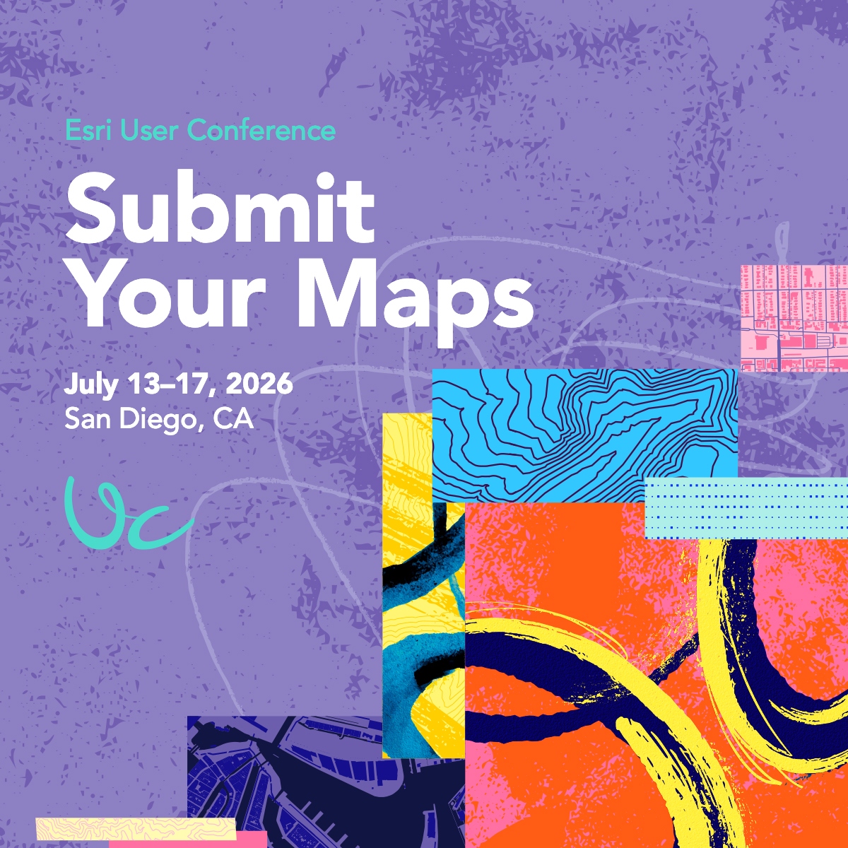
Show off your best maps! 🗺️ 🙌
Got a map that tells a powerful story? Submit it by May 29 for a chance to be featured in the Map Gallery.
🔹Submit here: https://t.co/vVCHyq6mGX
#EsriUC2026
🎨Alternative text. Color contrast. Headings and repeatable structure.
Little choices have big impacts on a story's #accessibility. Learn the basics in this NEW tutorial series—Foundations of accessible storytelling with #maps. https://t.co/QUeuQhS2Vo
#GAAD#StoryMaps
#MapsInTheWild map of Canadian universities, spotted in the library at the Embassy of Canada in Tokyo
Nothing beats the classic cartography method for showing provinces with “an inner tint band (Buffalo tint) under a thicker semitransparent wash”
What do Italy’s “boot,” Florida’s “panhandle,” and animal-shaped coastlines have in common? They are examples of cartopareidolia, the tendency to see familiar people, animals, and objects in maps.
#cartography#geography
https://t.co/XxIpKKvltk https://t.co/XxIpKKvltk
@CharlesRobbins@amazon I hate it when they place packages right outside my garage door, inline with my tire tread marks, ensuring that if I don't notice the package, it gets run over.
@BrilliantMaps It would be nice to represent them by hexbins symbolized by population density or proportional symbols sized by total population and centered on the census block with the highest population density in the MSA.