CASE STUDY: How I helped my client brand YouGlam scale from struggling WordPress sales to €112,559 in just 30 days with a custom Shopify build, CRO-focused layout, and bundled offers
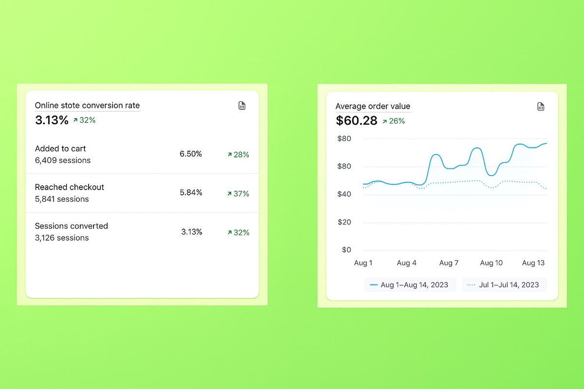
📈 Increased their conversion rate by 32% and AOV by 26% in under 30 days
/// A THREAD 🧵👇
comparison charts are the most wasted section on shopify product pages.
not because they don't work. because most brands build them backwards.
they start with "how do we look better than competitor x" and fill in rows until the checkmarks line up. the customer reads it in two seconds, clocks that you wrote it about yourself, and scrolls.
what actually works is starting from the objection.
what's the one thing stopping this person from buying. price, effort, trust, or "i already have something that sort of works." pick that, build the chart around it, and the rows write themselves.
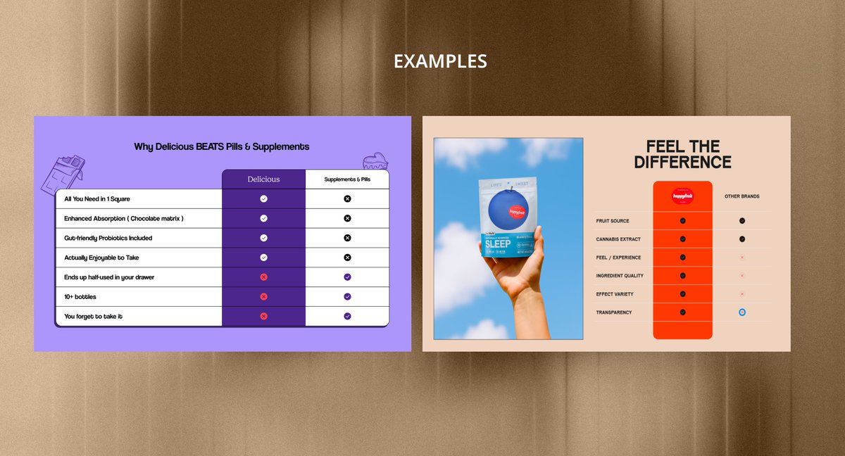
look at the two attached.
the first one isn't comparing brands at all. it's comparing against the entire pill category, and the rows are things people actually do. ends up half used in your drawer. 10+ bottles. you forget to take it. nobody argues with those because everyone's lived them.
the second one is better designed. cleaner type, better colour, nicer layout. but the rows are ingredient quality, transparency, feel, effect variety. every brand in that category claims all four. it looks like proof and functions as decoration.
that's the whole difference. one names a real behaviour, the other names a virtue.
specific rows that have moved numbers for me:
total cost over 6 months, not unit price
how many products this replaces
minutes per use
full ingredient list side by side
what the refund actually covers, in plain terms
two more things people get wrong.
placement. below the reviews section is where charts go to die. if the comparison is the reason someone converts, it needs to sit near the buy box.
and the opponent. it's often not a competitor brand. it's the customer's current routine, or the option of doing nothing at all. those are much harder to beat and much more worth addressing.
compare the decision, not the product.
i've built agent systems for clients this year and i use claude daily
so i'm not anti ai
BUT
i've stopped letting it write the first version of anything strategic
the audit, the offer, the section order on a pdp
i write that cold, badly, by hand
then i bring the model in to sharpen it
when i skip that step the output is fine. always fine. never sharp
fine doesn't convert
do the ugly first draft yourself
I didn't open Figma once.
7 App Store screenshots for my new app:
→ Codex planned the panel order, headlines, and what each screen had to prove
→ GPT generated every image
→ I approved and shipped
Designers, tell me these look AI-made 👇