

Top Tweets for #PlotlyCommunity

#PlotlyCommunity member Austin (Pip Install Python) K just dropped a packed Dash video showing how to make Dash apps AI-friendly, discoverable, and easier to document, plus an early look at a powerful new node-based Dash component.
Highlights you’ll want to check out:
🤖 Making Dash apps readable by LLMs (no more “Loading…” screens for AI)
🧠 Real-world tooling for app architecture, callbacks, and summaries
🧩 dash-flows: a pre-release React Flow integration for building interactive, node-based diagrams in Dash
Watch the video, explore the projects, and join the discussion in the Plotly Community: https://t.co/6MfrfvRsMK

A brand-new open-source resource is here! 🎉 #PlotlyCommunity member Dialid Santiago created the Plotly and Dash Cookbook. It is packed with 100+ hands-on recipes to help you build stunning, interactive data apps and visualizations with Plotly & Dash. 👩🏽🍳📕
The first five chapters are live! Check out the repository: https://t.co/jZZPYJMepR

📊 Transform bad charts into clear, compelling data visualizations!
In his latest article, #PlotlyCommunity member Joram Mutenge breaks down how to fix misleading graphs using #Plotly. From improving readability to adding context, see how small tweaks can make a big impact.
🔗 Read now: https://t.co/MB6eCelYiE

New York, are you ready? 🍕📊
Join us on March 5 at 6 PM EST for an evening of #Python, #Plotly, and data exploration — NYC-style! We'll work in small groups to build creative data apps using this month’s NYC dataset.
Whether you're a beginner or a pro, #PlotlyCommunity Manager Adam Schroeder will kick things off with a quick workshop to get you started.
RSVP now! https://t.co/HPcvJRUHLU

🌟Have you signed up for our first Plotly Hangout of the year?
Join long-time #PlotlyCommunity member Mike Purtell as he shares:
• A comparison of two top data manipulation libraries, @DataPolars vs. Pandas
• Tips for building impactful, growth-ready visuals with #Plotly
• Strategies to leverage visualization tools to enhance testing workflows
Register now! https://t.co/T68Wfz1p3F

Introducing the latest Dash component: Dash MUI! 🤩This new component, built by #PlotlyCommunity member edub, brings the awesome features of MUI 5 into Dash, and implements key components including:
• Button, Button Group
• Grid (for layouts)
• Accordion
• And many more!
Check out the live demo: https://t.co/Myyuri7NaS
Learn more about the new component:
https://t.co/LE3i8Gzpkz
📈 Looking to optimize sales strategies? #PlotlyCommunity member Mouhamadou Moustapha Fall built an interactive sales dashboard using #Python, #Dash, and #Plotly.
Some key features include:
📅 Year Slider: Analyze year-over-year performance (2015-2018)
📊 YOY Growth & Data Table: Monitor growth and dive into detailed records
🌎 Sales by Location & Bubble Chart: Visualize sales across cities and states
See the full dashboard 👇
https://t.co/oH0GQfaPje
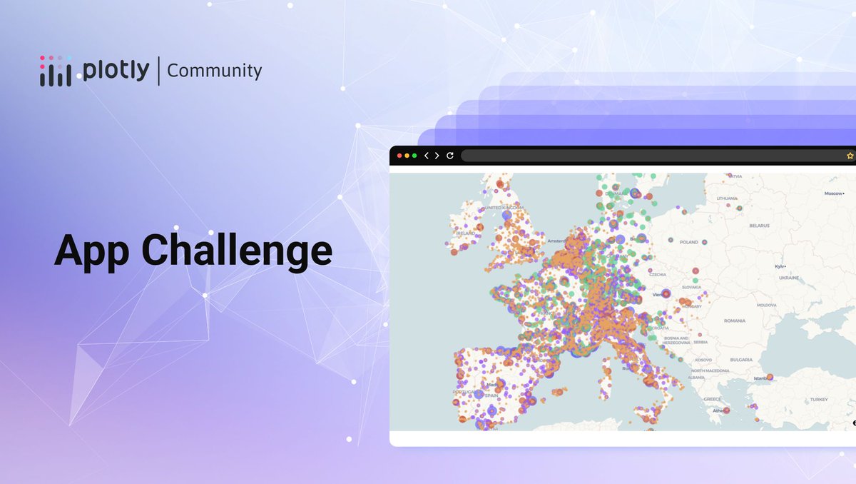
Ready to showcase your #Dash app skills? In our latest app challenge, Plotly Community Manager Adam Schroeder is asking the #PlotlyCommunity to build an app using Plotly’s latest @MapLibre update.
Your mission: create a Dash app around the @Michelin Star Restaurant Guide dataset, shared by Jerry Ng on @kaggle.
Apps will be judged according to the following categories:
• Data insights revealed from the data set
• App UI/UX Design
• Creative usage of #Plotly maps
• Bonus points for integration of LLMs to gain more data insight
The submission deadline is November 3, 2024 and the top three app winners will receive rewards. https://t.co/Gahr8FYBw2
🔥 The #PlotlyCommunity has been on fire this last week! Check out some of the amazing content shared by our talented community members:
📊 A great article by @pysquad_info comparing https://t.co/L5Fr6bb1wC to Plotly.js — perfect for those looking to choose the right tool for their data visualization needs. https://t.co/ibcDFrpl3l
📈 Venkatasubramani Karthikeyan created a stunning #Dash app showcasing insights about the UK labour force. https://t.co/wlccGEoswk
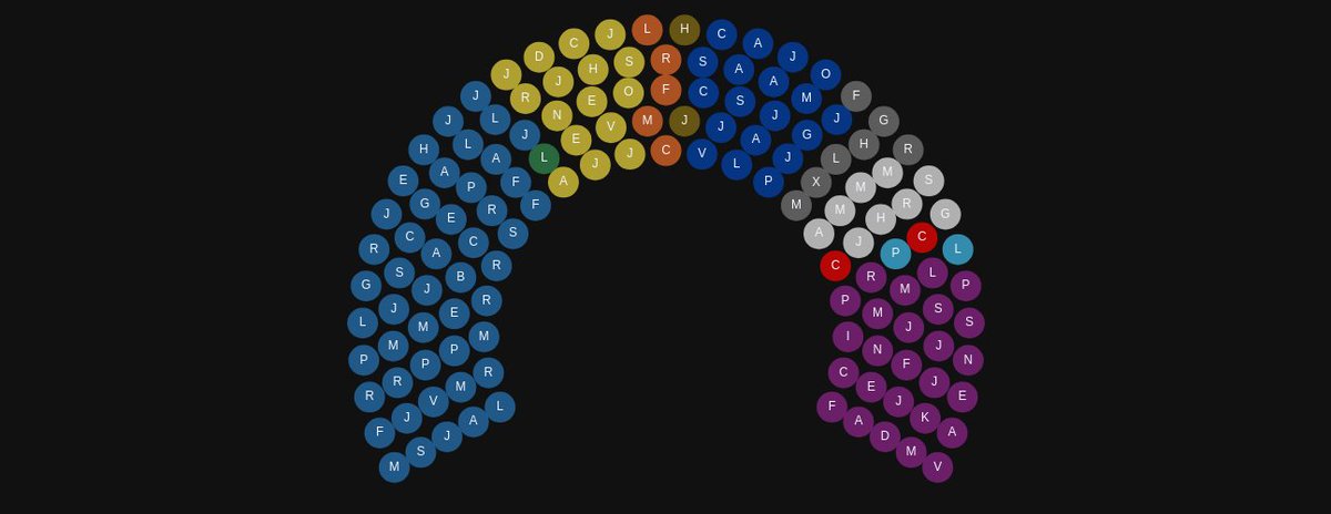
🏛️ Community member U-Danny wrote a tutorial on how to create a Parliament chart. https://t.co/41vKlFOTJA
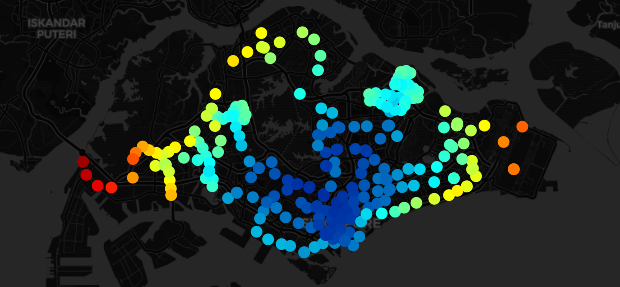
🚇 Tingfeng W. evaluated the Singapore transit system using #Plotly graphs. https://t.co/Iy5GANqCDp
These are just a few examples of the incredible work happening in the Plotly community. We always love to see the amazing projects everyone is working on so keep it coming!

🎉 We’re thrilled to announce that https://t.co/L5Fr6bb1wC, our graphing library for #Python, has surpassed an incredible milestone: 500 million downloads!
A huge thank you to our amazing #PlotlyCommunity, whose contributions and support have made this possible. Since 2013, we’ve had 298 releases, over 240 contributors, and some game-changing features, including the launch of #Plotly Express in 2019, making data visualization easier than ever.
Recently, we’ve rolled out new mapping capabilities with @maplibre integration, and we’re not stopping there!
To our contributors and users: we couldn’t have done it without you. Here’s to the next 500 million!
Read all the details in our latest blog by Nathan Drezner, Technical Product Manager at Plotly: https://t.co/Atxm1tZbsT
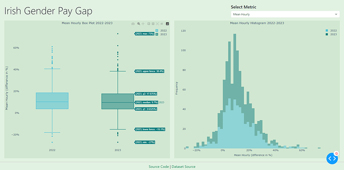
Today we’re spotlighting some amazing professional visualizations and #Dash apps from Week 32 of #FigureFriday. 📊 These apps focused on the 2022 to 2023 gender pay gap in Ireland. Thank you Jennifer Keane for providing the data.
#PlotlyCommunity members have found that women are underrepresented across all pay quartiles, with the gender gap becoming more pronounced in the upper-middle and top quartiles.
See all the apps: https://t.co/wE4GNBxj3R
Participate in this week’s Figure Friday:
https://t.co/SH3va8Dn7z
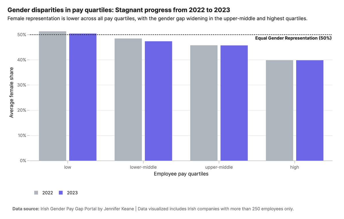
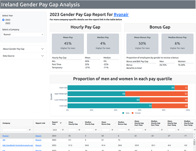
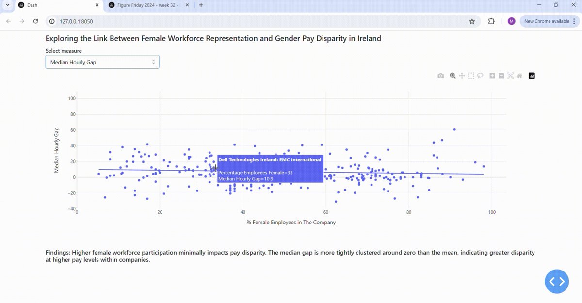
Our first Figure Friday was a huge success! 🙌 Thank you so much to all the #PlotlyCommunity members who joined us. We received so many cool #Plotly visualizations and #Dash apps showcasing your creativity and skills. Your participation and enthusiasm made this new initiative a blast. Plotly Community Manager Adam Schroeder is excited to see what you come up with next and looks forward to more amazing contributions.
See all the amazing creations here: https://t.co/GsUlHpiEgw
Join this week’s #FigureFriday: https://t.co/3ehXLobFjB
Looking to unleash actions and interactivity with your #Dash apps? 📊 #PlotlyCommunity member Austin K (Pip Install Python) created a video tutorial where he shares 5 new incredible community components created for #Plotly and Dash. If you're a data visualization enthusiast or a developer working with Dash, this video is a must-watch.
You’ll learn:
• Key features and functionalities of each package
• Practical examples and use cases to get you started
• Tips and best practices for integrating these components into your existing Dash projects
Components include: Dash Blueprint Components, Dash Pydantic Form, Dash MDXeditor, Dash Socketio, Dash Standalone Boilerplate
Check it out! https://t.co/uxFBOd1Uxb
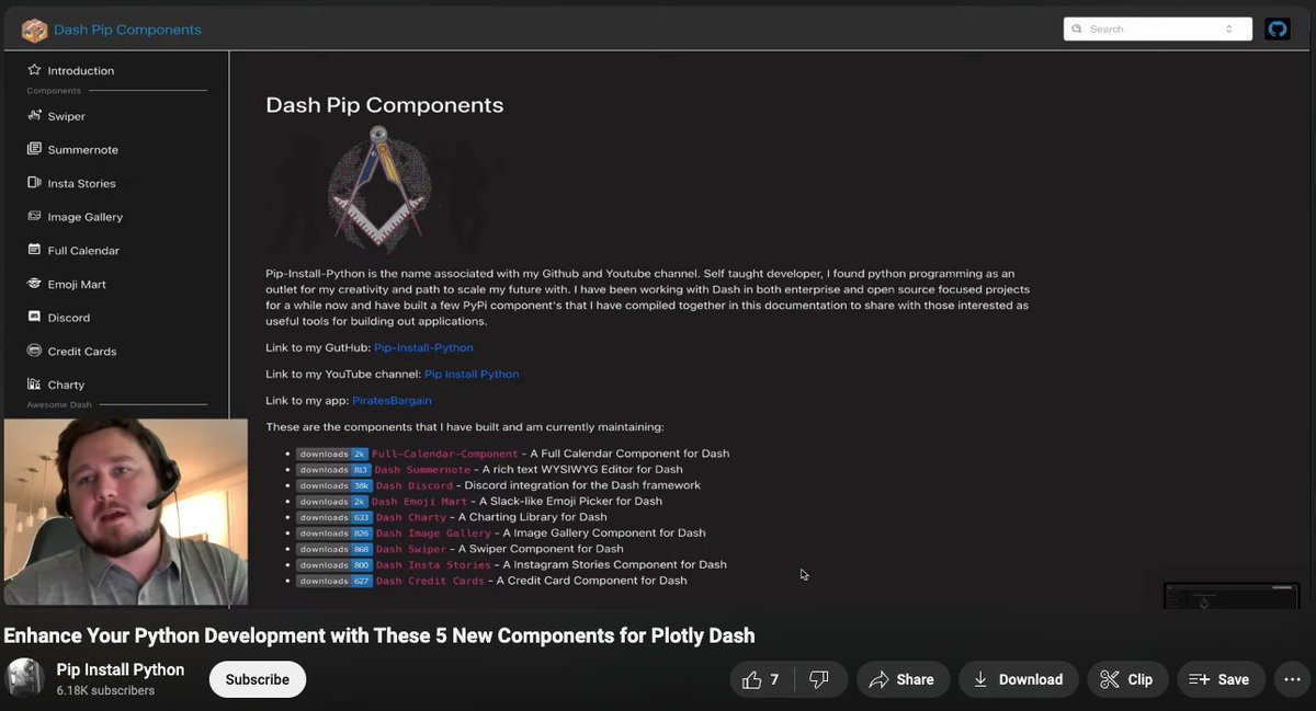
Plotly Ships is happening next Wednesday! 🛳️ Adam Schroeder, Plotly Community Manager, will be joining as one of the speakers. Adam plays a critical role in engaging and supporting the #PlotlyCommunity. He has led the growth of #Dash to over 2 million monthly downloads and co-authored "The Book of Dash" to provide another learning method for people who want to build apps with Dash.
It’s not too late to register! Hear from Adam at our launch event as he shares exciting community updates and programs. https://t.co/Udrgb8F1b9
Announcing #Plotly Figure Fridays! 🌟 Every Friday, Community Manager Adam Schroeder will be challenging the #PlotlyCommunity to use a given data set to build your own Plotly visualization or Dash app. The goal of this initiative is to create better, more effective visualizations, and develop our data viz skills together.
Want to collaborate with others? Join our Discord server: https://t.co/DWRu4PGVIe
See all the details and join the #FigureFriday sessions to showcase your creation, receive feedback from the community, and vote on your favorite visualization: https://t.co/OlkA2IkAum
#DataVisualization

Are you going to be in San Francisco 🌉 on June 12? Come join our in-person meetup happening on day 3 of the @databricks #DataAISummit! (No tickets are required!)
#PlotlyCommunity Manager Adam Schroeder will host the event and share open-source initiatives. Additionally, Co-Founder and Creator of #Dash Chris Parmer will share some exciting product features. RSVP: https://t.co/Og4BhMzJrK
Curious about more #Plotly community events? We've got you covered. Check out our full event calendar and join us for more exciting opportunities 📆 https://t.co/b8fc34cd3N

Amid shifting economic patterns, including the ups and downs in Canadian and American retail sales, #PlotlyCommunity member Tomáš Ďuríček’s blog showcases how Plotly can provide a visual representation of these trends. 📈
By transforming synthetic data generated by ChatGPT into dynamic visuals, Tom shares how you can use Plotly in Python, a data visualization library, to generate animated graphs for an engaging user experience.
His blog outlines a step-by-step guide for:
• Preparing data and setting up the workbench
• Designing the timeline, animations, and the plot’s properties
• Customizing animation speed and layout
Learn more: https://t.co/5c0RuTKsR7
#retail #chatgpt #economy #macroeconomics
Kick off your weekend with some reading! 📚 Our latest article by #PlotlyCommunity member Tanya Lomskaya is a detailed step-by-step guide to beautiful layout design for your Dash apps. Designing a good-looking dashboard layout in Python can get tricky despite the interactivity, speed, and high performance it enables.
Based on the Global Precious Metals and Stones Export Research dashboard she created, Tanya walks through the following:
• Developing a dashboard grid
• Creating and styling all the basic layout elements
• Assembling the graph and dashboard together
Read the full article here: https://t.co/xTQhnzmFRr
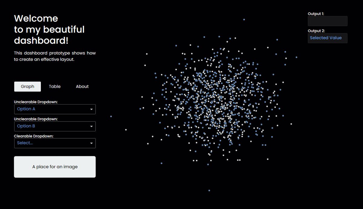
Today, the Moon’s shadow will sweep across North America, creating a total solar eclipse. 🌑✨If you’re looking to see more cosmic events, #PlotlyCommunity member Tanguy Surowiec’s Space Exploration App delves into our journey beyond our planet.
Key features include:
⭐ A 3D rotating Earth that visualizes space launch history by country
⭐ Historical milestones of space exploration mapped out in a Cytoscape graph, resembling constellations
⭐ Dynamic, user-interactive dashboard that displays launch data, success rates, and more, with updates every 6 hours
Check out the app! https://t.co/nVYMhUrxMy
Got any fun weekend plans? If you're taking some nice pictures, you might find this new component from #PlotlyCommunity member Austin K interesting! With DashInstaStories, you can bring the engaging storytelling feature, made popular by @instagram and @Snapchat, directly into your Dash apps. 📸
𝘱͏𝘪͏𝘱͏ 𝘪͏𝘯͏𝘴͏𝘵͏𝘢͏𝘭͏𝘭͏ 𝘥͏𝘢͏𝘴͏𝘩͏-𝘪͏𝘯͏𝘴͏𝘵͏𝘢͏-𝘴͏𝘵͏𝘰͏𝘳͏𝘪͏𝘦͏𝘴͏ to get started. Learn more: https://t.co/JcVU5yK2yJ
Last Seen Hashtags on Sotwe
baitedboys
Seen from Mexico
minichat()**************filter:videos()**************filter:videos
Seen from Chile
抖奶
Seen from United States
foopahh
Seen from Indonesia
mom #ai
Seen from Indonesia
cumslut
Seen from United States
vsmouse
Seen from Germany
limitless
Seen from United States
no1cryptopidginvoice
Seen from United States
momsonn
Seen from United States
Most Popular Users

Elon Musk 
@elonmusk
241.7M followers

Barack Obama
@barackobama
119M followers

Cristiano Ronaldo
@cristiano
114.5M followers

Donald J. Trump
@realdonaldtrump
111.9M followers

Narendra Modi
@narendramodi
107.2M followers

Rihanna
@rihanna
98.7M followers

NASA
@nasa
92.4M followers

Justin Bieber
@justinbieber
91.8M followers

KATY PERRY
@katyperry
90M followers

Taylor Swift
@taylorswift13
84M followers

Lady Gaga
@ladygaga
75.5M followers

Virat Kohli
@imvkohli
73.5M followers

Kim Kardashian
@kimkardashian
70.9M followers

YouTube
@youtube
68.8M followers

Neymar Jr
@neymarjr
66.5M followers

Bill Gates
@billgates
65.2M followers

Selena Gomez
@selenagomez
63.1M followers

The Ellen Show
@theellenshow
62.3M followers

CNN
@cnn
61.8M followers

X
@x
60.7M followers