6 guides I use to find the best chart:
1. Financial Times Visual Vocabulary
2. Chart Guide Chart Chooser
3. The Data Visualisation Catalogue
4. The Tableau Chart Catalog
5. The Data Viz Project
6. The Visualization Universe
https://t.co/eWIYqesgqM
Would you believe that snacking could increase #productivity? 🍫
Our #dataanalysis of the call centre #data proved it!
We found that people's productivity improved after lunch.
Read the full article: https://t.co/CGcCJfYH58
When you visit a particular British tabloid's website from outside the E.U., their website makes requests (likely with some of your data) to more than 70 different ad providers. And they're not even an outlier.🕵 #privacy#gdpr
Welcome back to #MakeoverMonday! For our 1st week of 2022 (week 35), we're making over this visualization from @VisualCap about military spending. I've included additional data for you to explore.
Get the data, links to #WatchMeViz and #VizReview here. https://t.co/ptX8uHsAmo
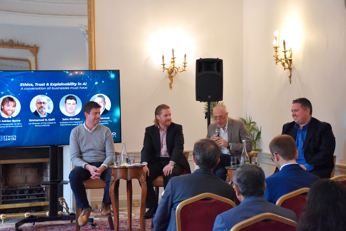
@UnaFitzpatrick0 and Technology Ireland board member Geraldine Magnier, co-founder @idiro_analytics at the launch of @ibec_irl ‘Recommendations to Government to support founders’ - covering the broad founder spectrum from start up to large founder led businesses
Pubs in Ireland - did you know there were about 341 people per pub in Leitrim but there are over 1,900 people per pub in Dublin?
Check out this interactive viz to see more details and changes since 2006:
https://t.co/ql9fDY41Yh
Data from @JOEdotie
A quick #B2VB before hitting the road! For this challenge, I'm throwing best practices out the window for a building-esque 3D bar chart complete with the accurate number of floors. There is a parameter working in the background to filter.
https://t.co/56U0tqPA2b