@NuruFreddy@rrainfo 3. This logo asset on hero section is taking alot of space for nothing you can have a preview of how paying taxes works instead of a big logo
4. the label in CTA "Kanda Hano" - like to do what (You can make it clearer)
otherwise, love the initiative
@NuruFreddy@rrainfo Though visually improved, it doesn’t solve the core UX issues:
1. The hero search box is unclear about what users should search and distracts from the main CTA.
2. Menu labels are too long and hard to scan quickly (they could be shorter)
Introducing Nano Banana 2: Our best image generation and editing model yet. 🍌
Pro-level quality, at Flash speed. Rolling out today across @GeminiApp, Search, and our developer and creativity tools.
@CentralBankRw Exciting innovation! Curious to learn more though, since CBDCs are often built on technologies like cryptography and peer-to-peer networks (which are typically decentralized) how does that align with a centrally monitored and regulated currency backed by our national RWF?
Two major updates
I’m curating the world’s best UI/UX app interactions library for Designers and Engineers @lummiey_app
Got 4000 followers on LinkedIn today
#tech#designs#ai
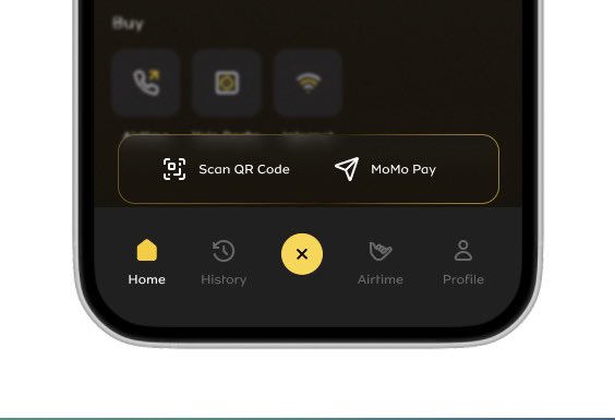
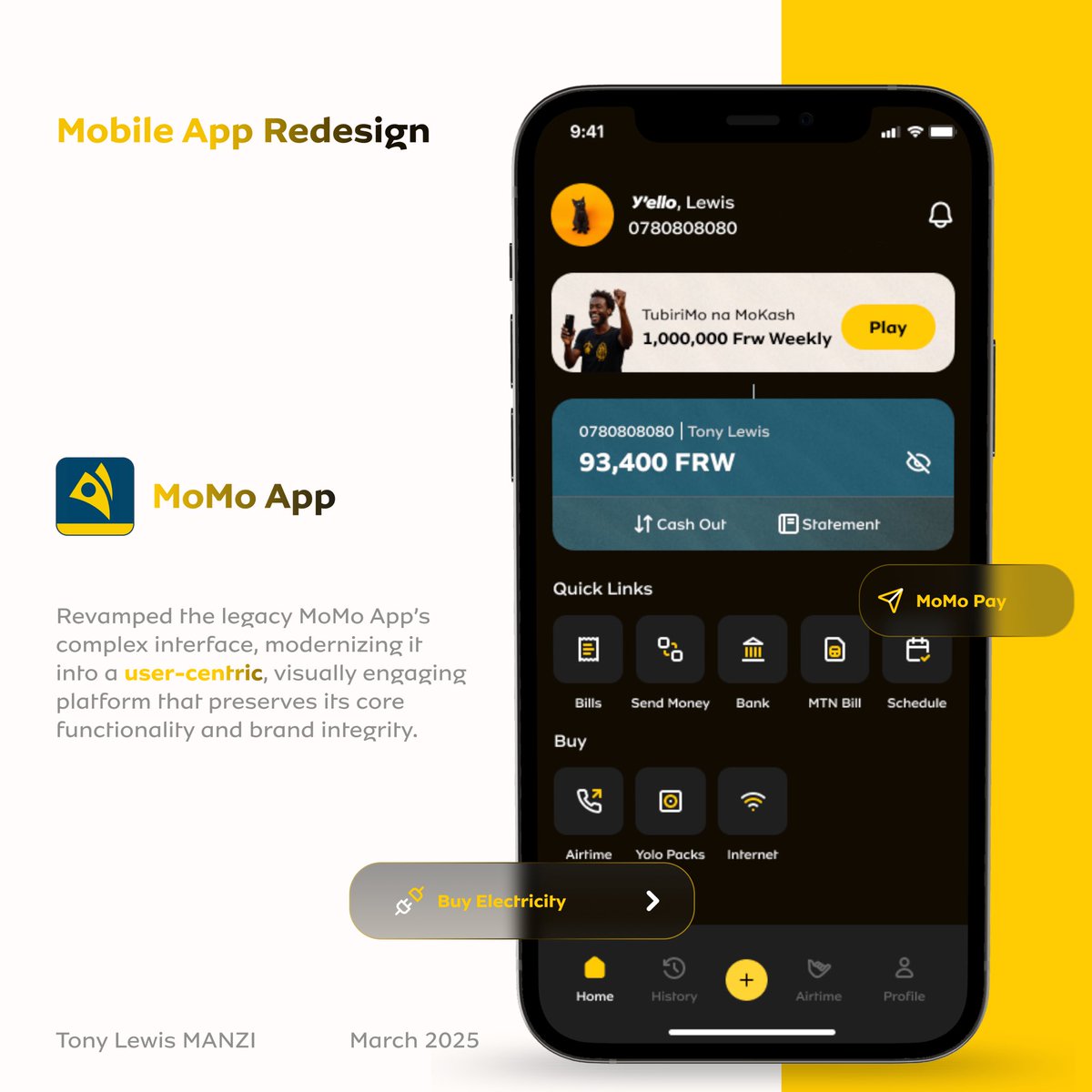
clearer paths to everyday tasks, security that feels invisible, and a flow that mirrors how we *actually* interact with payments.
stay tuned to a full case study on my website
#UXDesign#Product#Design#tech
Redesigning MoMo App started as a quiet rebellion.
I’ve relied on the app for quite some times, But every time I used it, I’d think: “Why does something so essential still feel like work?”
Clunky menus, missed opportunities to simplify routines, security steps that added friction, felt like leaving food on the table.
So I asked: “What if I could reimagine it?”