Imagine every pixel on your screen, streamed live directly from a model. No HTML, no layout engine, no code. Just exactly what you want to see.
@eddiejiao_obj, @drewocarr and I built a prototype to see how this could actually work, and set out to make it real. We're calling it Flipbook. (1/5)
That’s so true 🤣… I could talk about it all day !
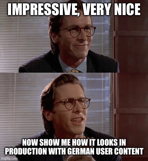
Been working with multiple language since years and German is always something that breaks the UI if not thought properly.
@otfshisuii Désolé c’est con mais ce sont ces petites choses qui font la différences et qui démarquent les gens bien élevés de ceux qui ne le sont pas. Et ça fait toute différence en société.
@otfshisuii Le reuf il abuse. Quand t’as un minimum d’éducation tu sais qu’il est mal élevé d’avoir les Jambes grandes ouvertes comme ça. C’est même pas une question de manspreading ou quoi, c’est juste de l’éducation de base:
on not changing for the sake of change:
the best design doesn't announce itself. it just works, quietly doing what it needs to do without asking for applause.
when we redesign something, the question isn't "how can we make this look different?" it's "how can we make this genuinely better?" better means the person using it gets to their goal faster, with less friction, with more delight in the small moments.
UI should disappear. when someone is writing, they shouldn't think about the text editor. when someone is paying for coffee, they shouldn't think about the payment flow. the interface becomes invisible when it's doing its job right.
constraints are not limitations—they're the foundation of good design. the 140 character limit made twitter what it was. the grid made swiss design timeless. the rectangle made the iphone possible.
subtlety is harder than flash. it takes restraint to not add that extra animation, that additional color, that one more feature. but restraint is what separates craft from decoration.
too many designers optimize for screenshots instead of experiences. they chase the latest trend instead of understanding the core problem. they simplify for the sake of simplifying instead of clarifying what matters.
good design has soul because it serves people, not egos. it emerges from deep understanding of the problem, not surface-level aesthetics. it gets better with use, not worse.
the best compliment you can get is when someone says "i didn't even notice the design—it just worked perfectly."
that's when you know you've made something good.
@emblemo@ludwiczakpawel We have the same behavior at Doctolib, but our icon buttons have a Hover that cover that bleed with a bg.
For icon buttons without bg it could be visually aligned, no ?