Fun weekend activity: Reviving a web project you haven't worked on for 8 years. Updating all the packages, major Python upgrade, fixing all the things, getting it deployed again... And it actually still works!! 😁 (Next up maybe a little design makeover)
https://t.co/eFsfNnCHAI
First in person Vancouver datavis meetup in eons, lovely to see 3D humans again.
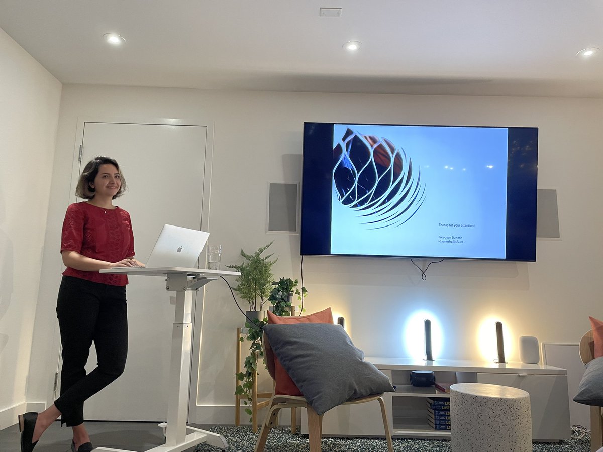
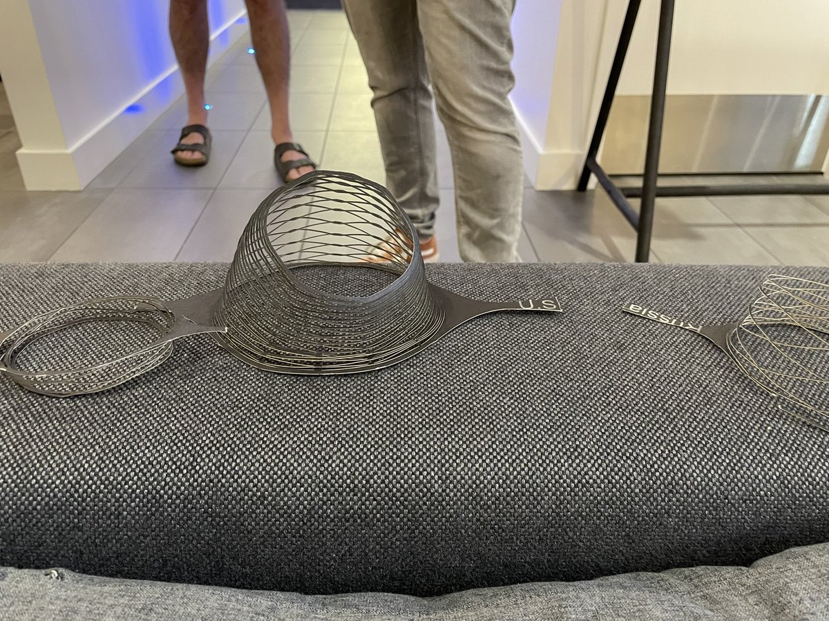
Super cool data physicalization from Foroozan Danesh of SFU, with kirigami inspired approach. Paper on this just accepted to #ieeevis!
We wrote something about a big fullstack feature we worked on and the lessons learned from it. Mostly for ourselves... but putting it out there in case anybody else wants to read about mistakes we made 🥸
How to full-stack feature - with a small team https://t.co/dYEw08kNyZ
Apply to speak at Outlier BY TOMORROW!! Hosted by @DataVizSociety
Show off your skills, share your unique perspective, inspire others, build out your network. 😃
Apply here: https://t.co/b0mdqwoVU9
Call for Speakers article: https://t.co/xfH22kn3Kb
Deadline: Dec 1, 2020
This October @ForesightCAC is championing #womenleadingcleantech. As a business with many highly-skilled women in our team, we acknowledge some of those women today.
Jessica Joy Cho, Johanna Fulda, Katie Applebaum, Kristin Vidi, Louisa Thue, Mairead McMullin, Maggie Campbell
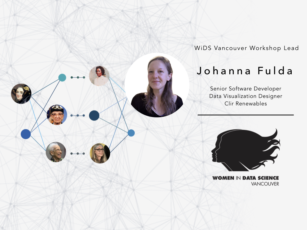
Mar 5, @jofu_ will host the 'Using #Visualization & #Storytelling to communicate the severity of our #climatecrisis' workshop at @VancouverWids
Johanna will share her knowledge & expertise to showcase the impact visualizations have on a story.
Register | https://t.co/49MRPuQb9U
"You can whine about it, but you still have to get up and do something"
(not quite verbatim) says @simondonner
Many inspiring stories tonight at #VanClimateEmergency
Something to get started: https://t.co/DHkFdOBYIy
Meet @jofu_, Johanna specialized in information visualization during her Computer Science studies and worked together with journalists to explore data journalism and interactive storytelling. She also organizes the Vancouver Data Visualization Meetup.
#datascience#wids#widsvan
About to plan your 2020 schedule? Got something for your February. If you are in Vancouver. And want to. Here: "Storytelling with Data: Making an Impact with Data Visualization" https://t.co/i6nAx2w06v @BrainStation
At #ieeevis#VisInPractice next Monday (Oct 21)
M. Venkataswamy + @jofu_ of @Clirrenewables will speak about visualization in the renewable energy sector.
https://t.co/TEAiq1pwMp
Because there was no time for tweeting during the festival, I condensed all my 1000 notes into this now:
EyeO 2019 — a recap
https://t.co/GJj3vdIxKf
#eyeo2019 🤗
O #TimeLineCurator é uma ferramenta online criada pela @jofu_ que identifica datas e cria timelines a partir de qualquer texto ⏰
(e ainda exporta direto para o TimelineJS do @knightlab)
https://t.co/TDpMx0jt5U
“The more colours the better!” — No good data visualiser, ever
Super good retrospect on some of the Economist's charts that turned out to either be misleading, confusing or failing to make the point: "Mistakes, we’ve drawn a few" by @MissSarahLeo