ATF Manarola Font by Arkitype Foundry
ATF Manarola font is a bold display typeface by Arkitype Foundry, built in vintage Italian signage tradition with three styles and Mediterranean palette.
https://t.co/q525jfvhNy
Serial Typewriter #typeface
An exploration of classic typewriters, featuring serif, sans, and compressed versions, along with textural variations that mimic the feel of pencil, ink, and pen.
Ignite your next project
Free trials available
🔗 https://t.co/NzgtZn8CR2
The Japan Railways (JR) Group logo, introduced in 1987 following the privatization of Japan National Railways, was created through a collaborative design effort led by the Nippon Design Center. Yusuke Kaji served as Creative Director, guiding the overall visual identity strategy, while Yoji Yamamoto acted as Art Director and principal designer of the distinctive “JR” letterform. The project was further supported by Kazumasa Nagai, who functioned as Supervising Editor and provided senior creative oversight, and Ikuo Kenmori, who worked as Producer, coordinating the development and implementation of the identity system. Together, this team designed a bold, connected logotype intended to remain legible at high speeds and across varied applications such as trains, signage, and printed materials. The resulting design allowed each regional JR company to adopt its own color variation while maintaining a unified national symbol, helping establish one of the most recognizable transportation brands in the world.
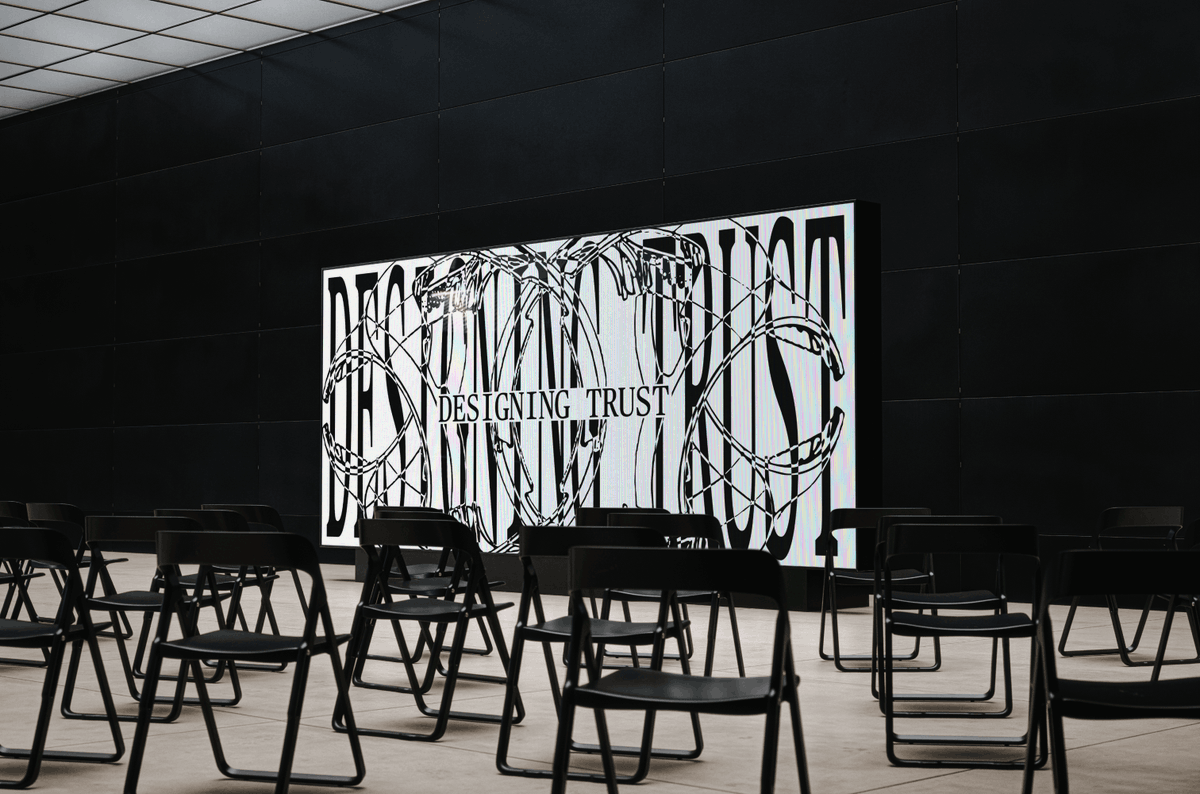
#logodecks
Amsterdam and Cardiff-based design studio @Smorgasbord_ rebranded @CoaltownCoffee by resisting the urge to start over, protecting the slab serif equity the Welsh roaster spent a decade building.
Explore the full case study below ↓
I know many people still see Supply Family as mostly a mockup marketplace, but we’ve been putting a lot of work into fonts for more than a year now.
Feels like it’s finally starting to move. There are now 500+ fonts on the site and new ones are coming in almost every day.