We’re an independent typefoundry from Munich – run by Kai Büschl (kai) @kaibueschl, Oliver Linke (oli) @oliverlinke & Katharina Seidl (kat) @seidlkatharina
@GranshanConf is coming to Munich 🥳! And our very own Lazydog @oliverlinke will be one of the moderators, presenting an amazing line-up ❤️🔠. Get your tickets for the two day conference now, and have a chat with us in person soon 🍻! https://t.co/rCAWHhnzSp
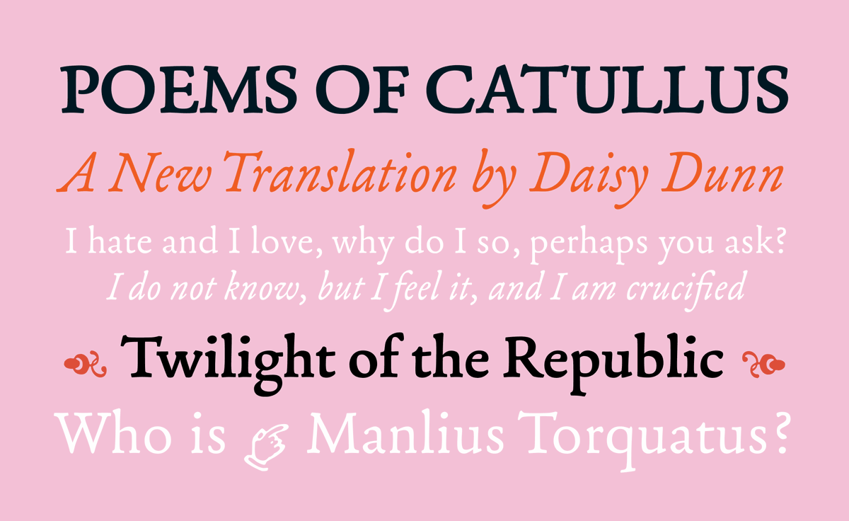
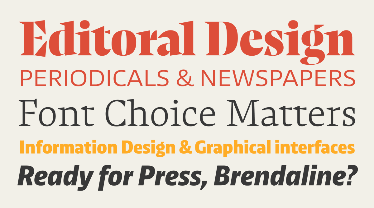
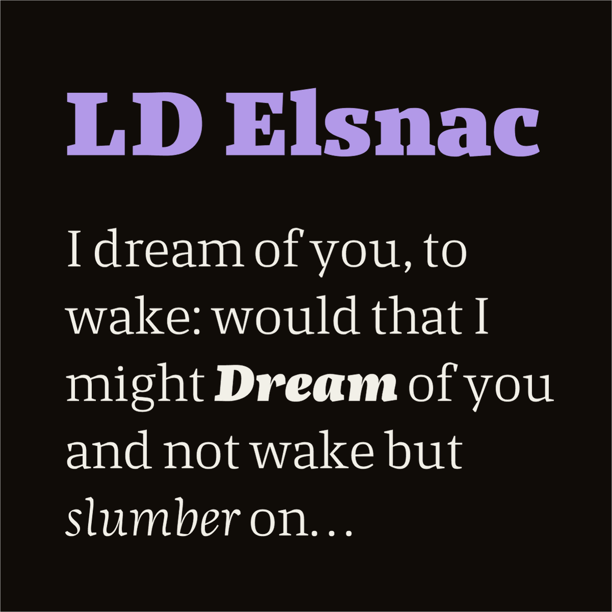
2- LD Elsnac
An accomplished serif for text and display. Use it for editorial design and as web fonts.
On our store: 10 fonts from $27 (was $54)
https://t.co/NjR4mYk6EC
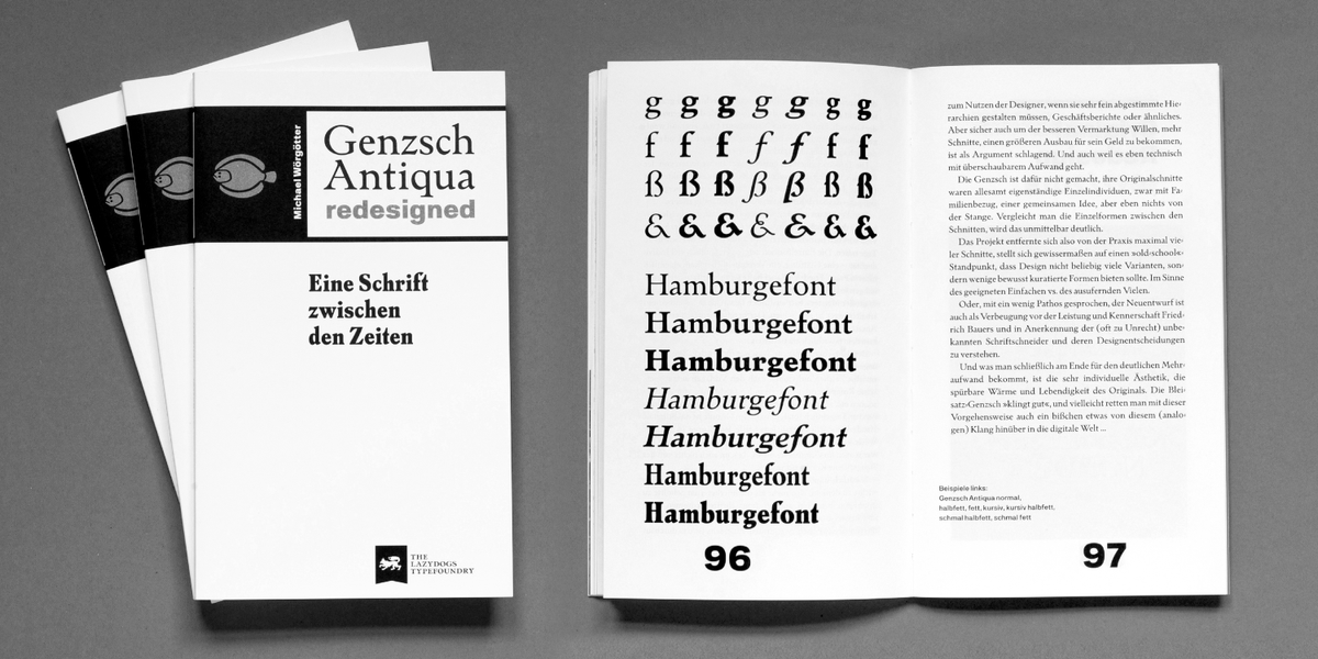
LD Genzsch Antiqua was designed by Michael Wörgötter, Professor of Typography at the University of Applied Sciences in Augsburg. Comes in 7 styles, and is available in the ILT store now: https://t.co/EHfz9rZQ4Q
@fabsoldano@SearchSystem@dsgnprctc I‘m very sorry, Fabrizio… But I didn‘t know that Mr. Havere is a co-founder of our typefoundry?! That‘s simply wrong.
Continuing yesterday’s theme of changing one letter to ruin a TV show. [thanks to @smartalecvt ]
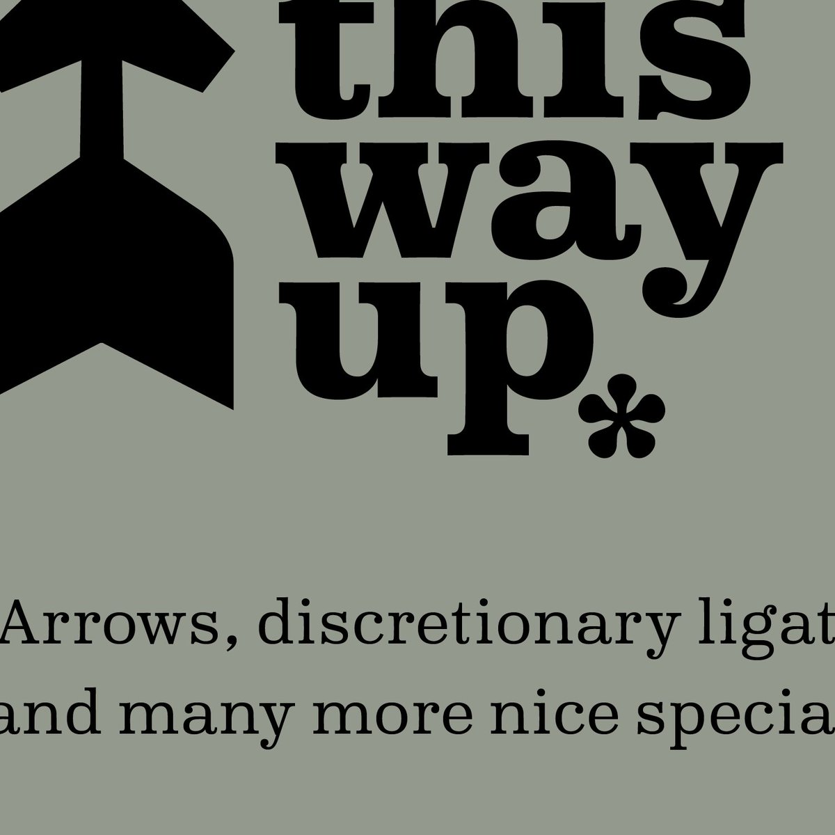
Typeface is LD Moderne Antiqua Fat: https://t.co/fBzgpSAbhV
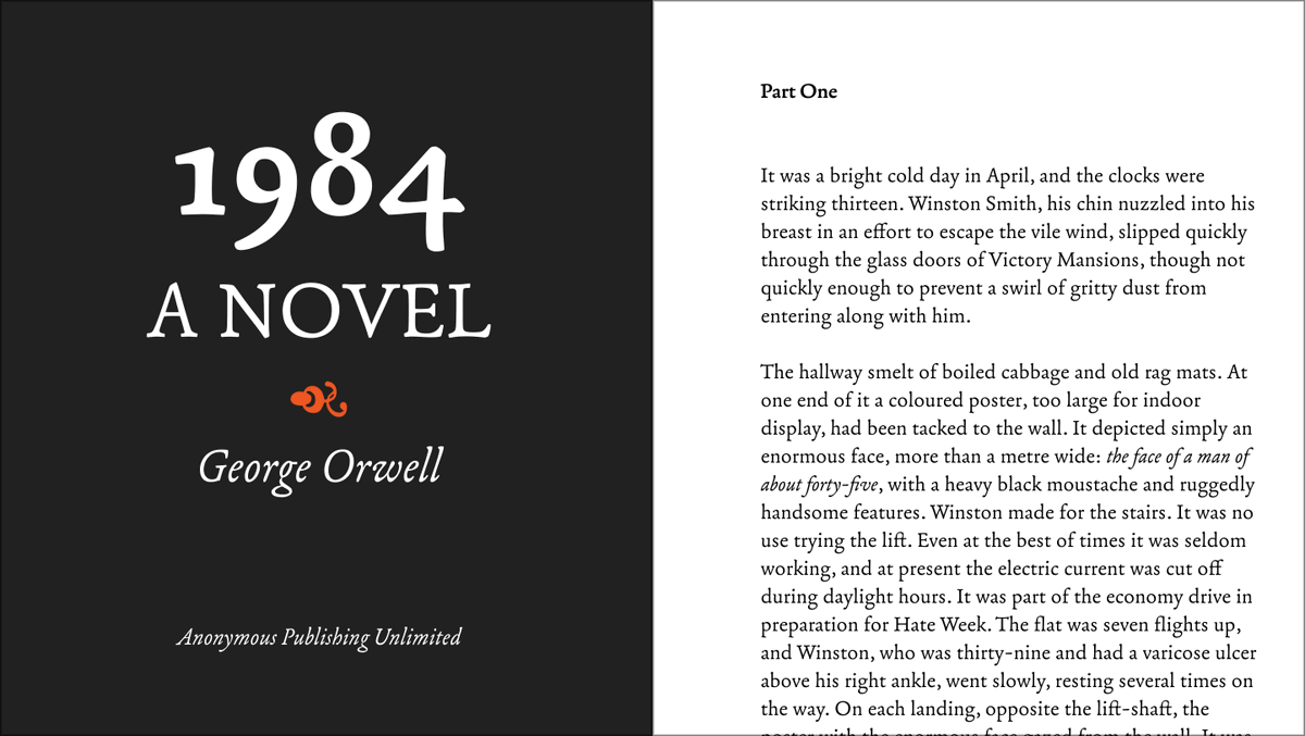
It’s a great selection of fonts for books, including some traditional faces, but with an inspired sprinkling of fonts with contemporary flair. https://t.co/KEGUUgf8xI
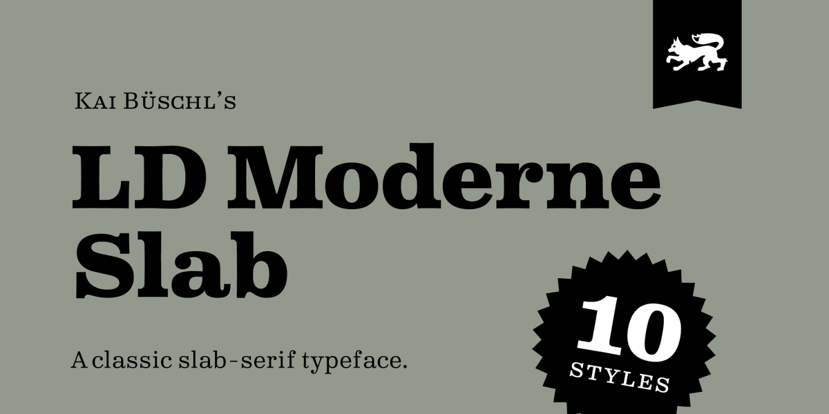
Thank you, Rainer, for the kind praise 🥰 PS: We do not mind advertising our own fonts at all! Check out the details on page 400: the book is set in a mix of LD Moderne Slab and LD Grotesk😎












![ilovetypography's tweet photo. Continuing yesterday’s theme of changing one letter to ruin a TV show. [thanks to @smartalecvt ]
Typeface is LD Moderne Antiqua Fat: https://t.co/fBzgpSAbhV https://t.co/xOyfPxhDI9](https://pbs.twimg.com/media/FbEn2lyagAAJB3A.jpg)