@graphixjuls Most likely A, because the icon already conveys the meaning of "add" well enough, and when there are a lot of cards, text and large buttons would create visual clutter — but that wouldn't work on a mobile device
For some reason, no one ever mentions this, but why does the 'group by priority' button have a notification icon? Wouldn't it be better to do something like this?😌
@thsottiaux
@AbrarInPixels HSL isn't great for this (I used HSB when I was only using Figma). I understand that switching to a different color space is difficult, so personally, I used https://t.co/aCuMi8Bybt to convert to hex > oklch > hsb(l) and feed it back into Figma. The result is surprisingly clean!
@masumparvej_ Is using Duotone at this moment still relevant? Why are you straying from the circular grid? Is there a specific justification, or is it simply to achieve the right icon ratio? It’s fascinating to hear your perspective.
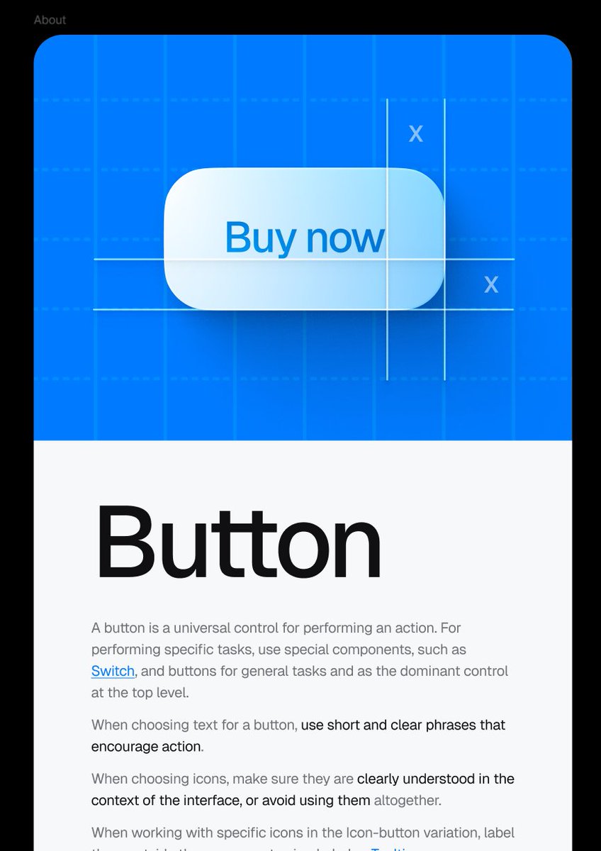
@shadcn Interesting thought: I've noticed that it would be better to refer to this component as a structure rather than a primitive. Don't you think this trend could undermine flexibility, and how do you plan to address it? But the component itself is nice.
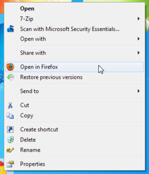
@marcelkargul Overusing icons isn't really the right approach. In older versions of Windows, they were used only to highlight important items. In my opinion, that's actually the better approach, because there's a very fine line between a signifier and visual clutter.
@alaymanguy Cool! Try making the radius of the hover item in the dropdown menu a little smaller — the same as the radius of the outer container minus the padding — and it'll look even more natural and cleaner 🙂
I spent a couple of weeks digging into the topic of signing documents, and honestly, it all looks terrible 🙈 I want to do it properly.
But I managed to collect ~20 screens in a few hours. Either it's experience, or UI Kit is really convenient. Either way, it's a great feeling.
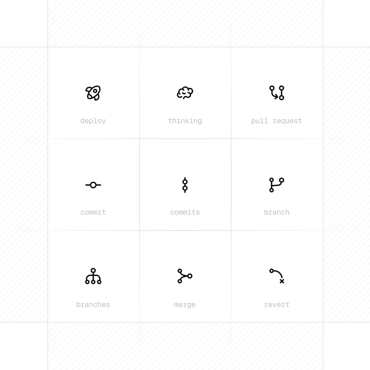
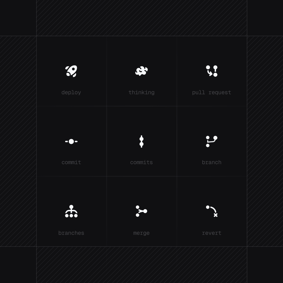
Practising making icons right now because I couldn't find any I liked anywhere 😵
It's an interesting experience, this meticulous pixel-by-pixel work. What icons do you use?
@Nial_Aksyanov It's ready :) A lot of work has been done, but now it's performing well in commerce within my studio. What's more, it's free. Here's the link. https://t.co/lMUUZVBUNv
Not long ago I decided to build my UI Kit with cool components and author icons.
Figma Variables allows you to twist and turn the layout via Modes, but for some reason not many people use it.
It's cool when a layout is designed for mobile at once and in several themes :)