✍️Letters From Covid - Illustration student Alice Gompels has created a virtual time capsule (@lettersfromcov1) for people around the world to share their experiences of the #coronavirus pandemic.
Read more and watch the video: https://t.co/0IqZnEWo2u
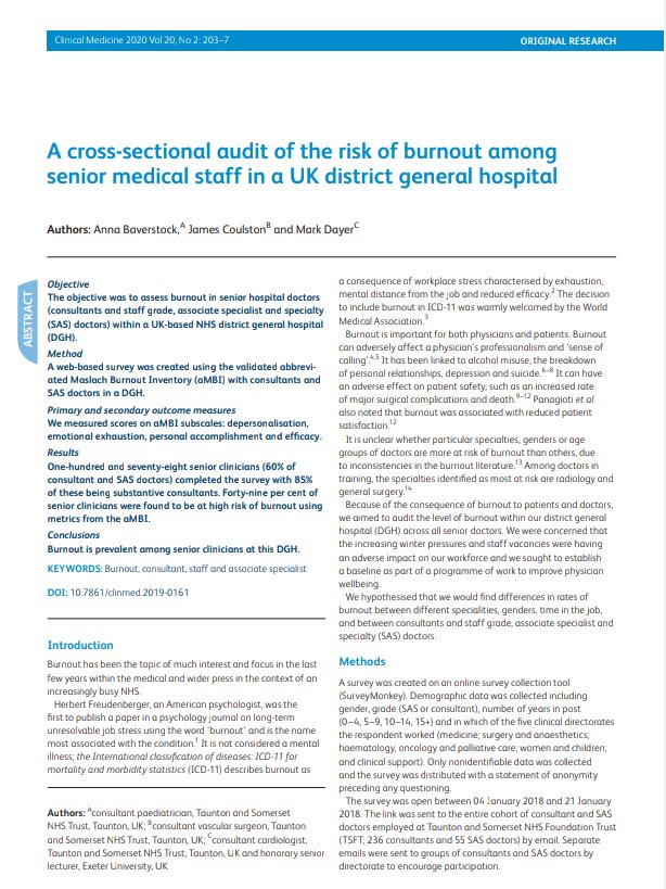
Thanks to @jamesecoulston and Mark Dayer for all the coffee, laughter& challenge to get this published in Clinical Medicine @RCPLondon
More grateful to our senior doctor colleagues @MusgrovePark who trusted us to tell us what they thought! &Laura,Rose,Ali,Mike @drstuartwalker
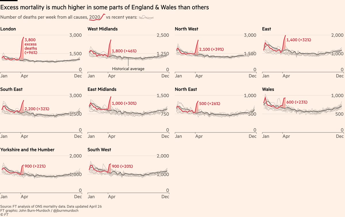
Also suggests excess mort is good proxy for true Covid death toll.
If excess deaths were just capturing heart attacks at home, deaths directly related to lockdown etc, we’d expect excess mort to rise similarly everywhere.
But we see far bigger spikes where outbreaks are worst.
UK:
• Hospitals across GB now have fewer Covid patients than same time last week
• Suggests GB at or near peak for new infections, tho UK testing is lagging & care homes course absent from this data
• But Northern Ireland behind GB on the curve, hospital occupancy accelerating
And more promising news for the UK:
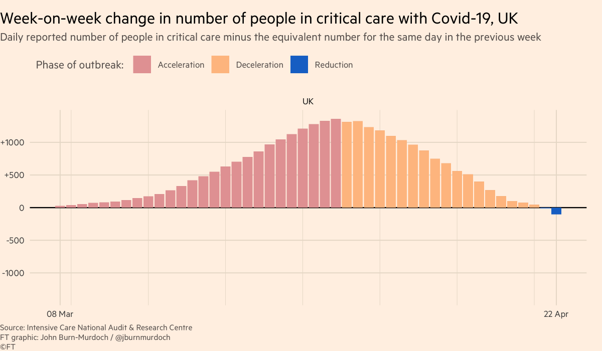
This chart shows net change in Covid patients in intensive care (data from the @ICNARC sample).
UK now has fewer people in intensive care beds than the same time last week 👍
This is how Angela Merkel explained the effect of a higher #covid19 infection rate on the country's health system.
This part of today's press conf was great, so I just added English subtitels for all non-German speakers. #flattenthecurve
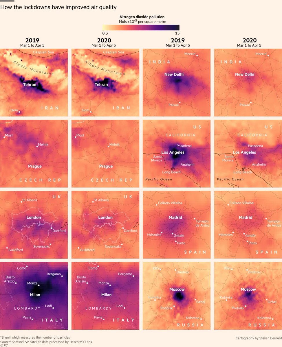
Stunning graphics from @sdbernard in this brilliant story by @lesliehook & @alekswis on how coronavirus lockdowns are improving urban air quality https://t.co/sDn5VNHDrU
Now our newest chart: small multiples of daily deaths in subnational regions:
• We’ve added lines for England, Scotland & Wales (N.Ireland to come). England by far the steepest of the UK countries, followed by Scotland
• London’s death toll still rising faster than Wuhan’s did