Urban & transport geographer
Programme officer at JRC, European Commission, #TRIMIS_EU
Former @MSCActions Individual Fellow at @tGIS_ucm
Views are my own
🆕 #TRIMIS_EU Newsletter out now!
Stay updated on the latest studies, projects & events in 🇪🇺 transport 👉 https://t.co/o9AuKqmxxU
Learn more about automated vehicles, alternative fuels & transport safety!
📢Just published!
December @EU_ScienceHub#TRIMIS_EU newsletter 👉https://t.co/Yt3olUnPaU
Read about the 🇪🇺 drone strategy, automated & hydrogen vehicles, and 2023 events!
Our study supporting the recently adopted #EUDroneStrategy, has shown that the existing land-use patterns can ensure financial viability of #DroneDelivery services in most cities in the EU.
Read more here ⬇️
https://t.co/sEI1sl3vZy
@EU_ScienceHub@Transport_EU
#TRIMIS_EU November newsletter is out!
Topics include road safety, electric vehicles, air traffic management and more!
Read the full newsletter 📄 https://t.co/00xjw5fwPC for the latest policy briefs, events & projects in transport.
@EU_ScienceHub
@pablo_alvrez Perhaps this 👇post would help? First, create polygons which corresponds to the area you want to cover, and then fill the area using the approach described by @ClausWilke in this post? However, I've never tried that, I admit.
https://t.co/EkCoQBppDL
@jschwabish@maartenzam Aggregated for above / below zero & small multiples? Small multiples line charts with all categories as a background (light dark) and particular one as solid, darker line to facilitate positioning category against all the other
@UrbanDemog Many thanks for {r5r} - limited experience (yet) but it looks amazing (and very fast)!
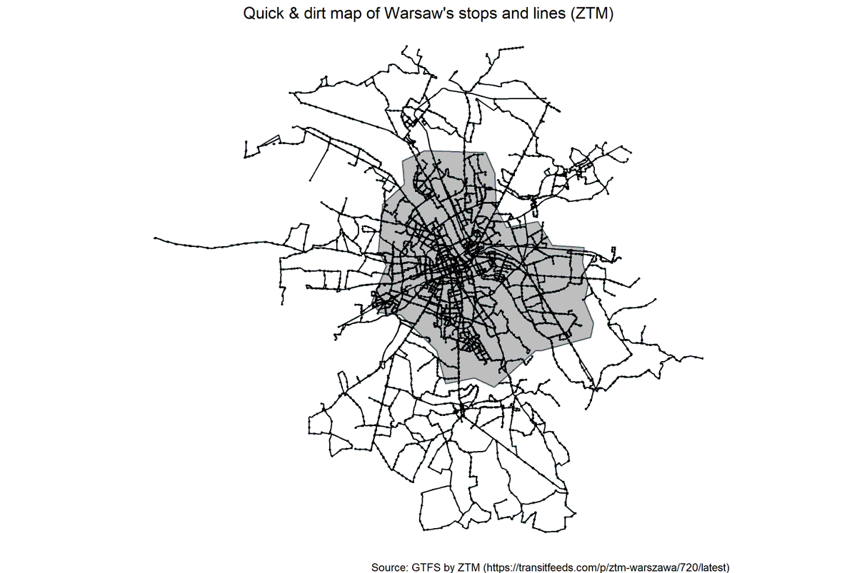
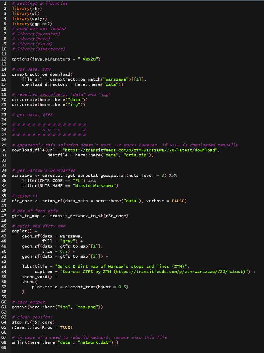
Very quick and dirty map to check how transit_network_to_sf() works using Warsaw's #GTFS data
#rstats#r5rstats
code: https://t.co/CvA9ps8zDG
@donkiszot1@janinadailyblog@mart_markiewicz@MKruszewska_@olkurowska Ile "powietrza" zostawić pod/nad linią to inna sprawa.
Zmiana skali x to inny błąd / manipulacja – w efekcie tworzy się wrażenie, że coś zaczyna wzrastać szybciej niż w rzeczywistości.
Efekt: dwa szkolne błędy będące w istocie manipulacją.
2/3
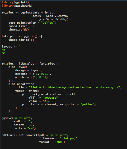
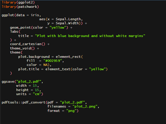
Export: ggsave() to pdf and then pdftools::pdf_convert() to png removes thin white lines at the bottom and/or right side of the image (at least produced at my PC)
Perhaps there is a simpler way to achieve this?
#rstats
Reproducible example:
https://t.co/WMuon7WylT
#rstats#ggplot2 tip: If you have no-white background, coord_fixed() and want to remove white margins in saved output here👇is my workaround:
- create empty plot with theme_minimal
- move plot.background() to plot_annotation()
- use {patchwork}
- ggsave() & {pdftools} combo:
Better data visualizations has finally arrived! And it looks 💯❕
It was more difficult then expected: it was my third order after 2 previous were canceled 🤷♂️
But it was worth to wait 😍