Data Feminism et visualisation de données
L. Klein et C. D'Ignazio lancent un nouveau cours qui développe leur ouvrage « Data Feminism »
Comment l'examen des questions de genre de pouvoir et de justice peut transformer notre façon de visualiser les données
https://t.co/L25LajWZ2z
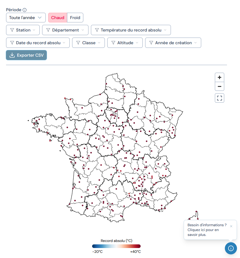
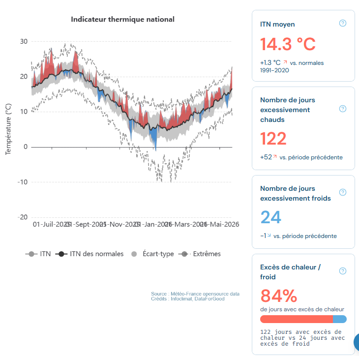
Infoclimat et DataClimat, deux sites utiles pour accéder à des données météorologiques et climatiques
Au moment même où la France est en train de battre des records de canicule pour un mois de mai
https://t.co/AROml9aGVX
Avec tout ça je n'ai pas encore eu le temps de vous parler en détails du nouveau site Data Climat (lancé ce week-end par @infoclimat et @DataForGood_FR) mais c'est une précieuse mine à données, graphiques et cartes météo !
A explorer ici 👉🏻https://t.co/CeGLiEI6DY
(PS : je dois avouer un conflit d'intérêt, j'ai été sollicité pour donner un avis utilisateur en version bêta 😄)
🥵 Précoce, intense et durable : voici en quoi cet épisode de #chaleur est "hors norme" (sachant que "les prévisions ont plutôt tendance à s’aggraver au jour le jour"), infographies à l'appui.
A dérouler⤵️ @le_Parisien
1/8
https://t.co/XzCbUwlZ9m
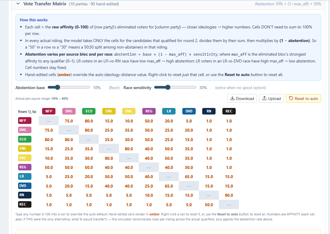
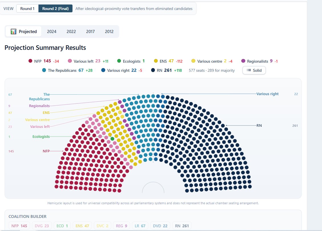
The most comprehensive ever French Legislative simulator is here
It includes:
-All major French political parties/labels
-Round 1 and round 2 simulations
-Desistement simulation
-All regions and departments
-Interactive Map
-Coalition maker
Link in the comment
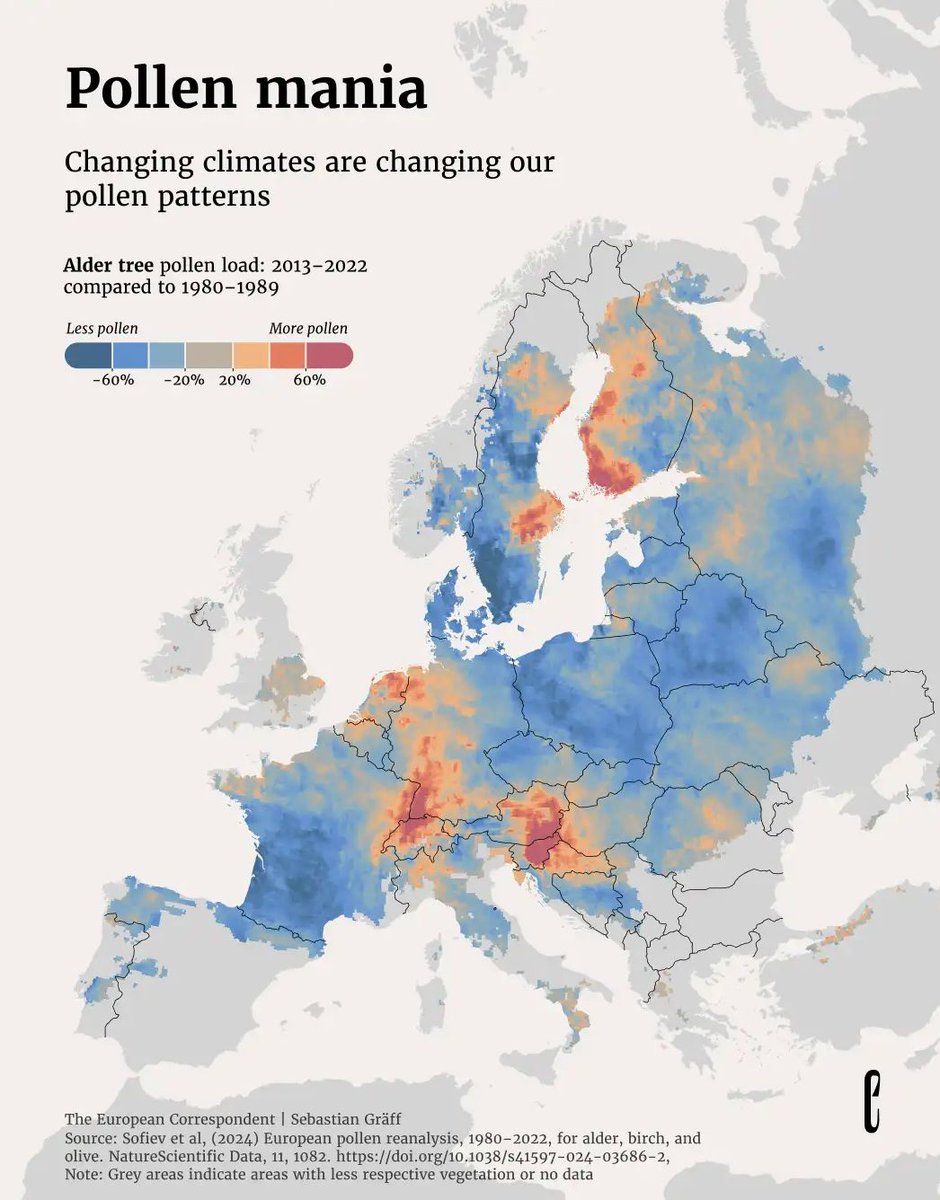
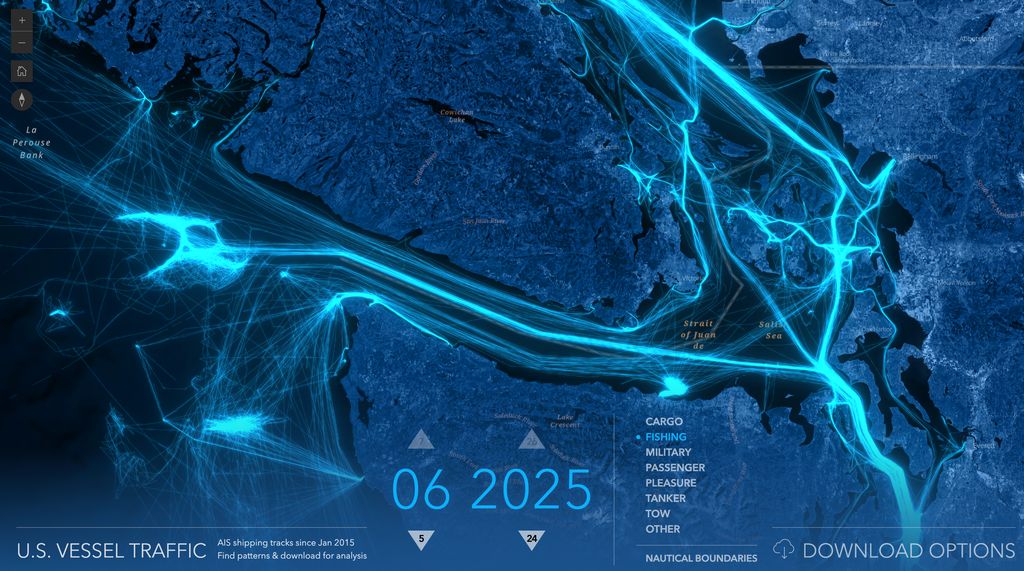
From tracking global earthquakes 🌎, to monitoring vessel traffic 🚢, and on to observing changes in pollen patterns 🌳, maps are useful for visualizing various topics. Explore these and more in the Data Vis Dispatch. 👇
https://t.co/B6BRv5BLoq
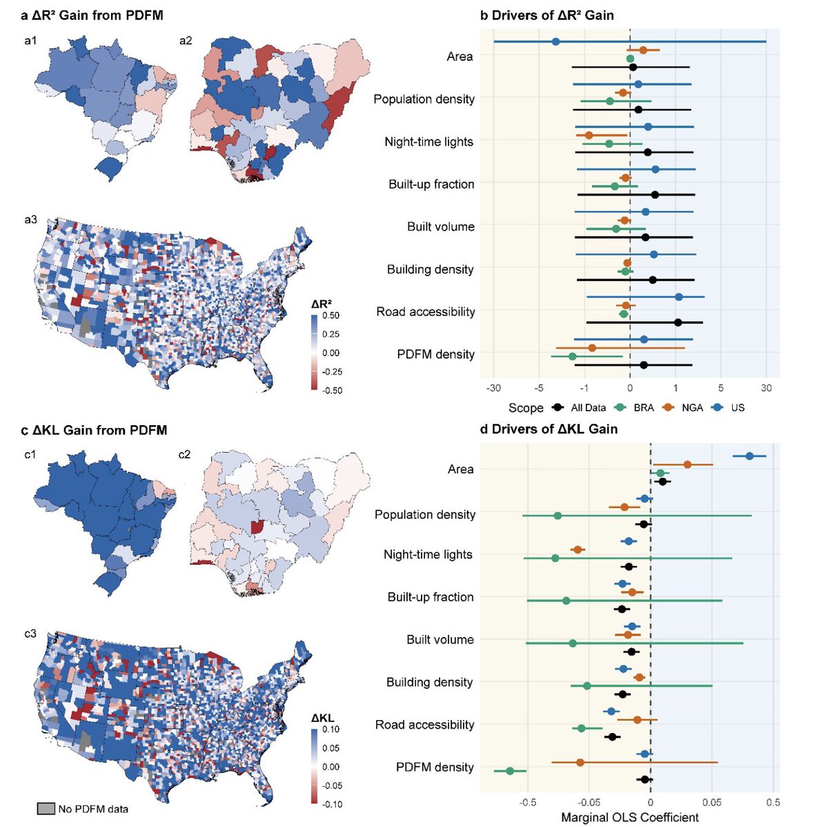
Google turned 46,000 places into 330-number fingerprints, then used them to predict where people live better than maps of nightlights, roads and buildings.
That’s a strange sentence, but it points to a pretty big shift in population mapping.
For decades, the standard approach has been to estimate population from things we can see from above: night-time lights, road networks, buildings, land cover, accessibility, elevation, slope, and other physical traces of settlement.
The basic idea is that people tend to live where there are houses, roads, lights, services, and accessible land.
But the visible world can actually mislead us.
A bright place can be an industrial zone. A dense road network can serve commuters rather than residents. Two built-up areas can look similar from space while having completely different household sizes, incomes, migration patterns, or settlement histories.
A new paper from @WorldPopProject tests Google’s Population Dynamics Foundation Model.
Instead of feeding the model a fixed list of hand-built geography variables, PDFM gives each place a 330-dimensional embedding. You can think of an embedding as a compressed fingerprint: a set of numbers that captures patterns too complex to write down manually.
Those 330 numbers come from several sources.
The first 128 dimensions come from aggregated search trends. The next 128 come from maps and busyness indicators. The final 74 come from weather and air-quality signals.
Then the model links places together in a graph, where districts, postal codes, ZIP areas and local government areas are treated as connected nodes. Places can be connected because they’re geographically close, because they sit inside the same administrative structure, or because their behavioural signals look similar.
That means the model is actually learning the wider pattern of how that place functions.
The authors tested this across three very different countries:
• Nigeria: 783 local government areas
• Brazil: 5,568 districts
• United States: 39,649 ZIP Code Tabulation Areas
Together, that’s 46,000 places.
The benchmark was a standard WorldPop-style feature set: 23 geospatial covariates covering the built environment, night-time lights, accessibility, land use, land cover, elevation, slope and related variables.
The models themselves were deliberately ordinary: Random Forest, XGBoost and Elastic Net. Interestingly, the paper wasn’t trying to win by hiding everything inside a more complex model. It was testing whether the predictors themselves carried useful information.
The evaluation was also stricter than a simple random split.
The authors used spatial cross-validation, grouping smaller places by larger administrative regions. Nigerian LGAs were grouped by state, Brazilian districts by state, and US ZIP areas by county.
That’s important because neighbouring places often share the same roads, markets, lights, infrastructure and settlement patterns. If a model trains on one area and predicts the area next door, it can look more accurate than it really is.
Spatial cross-validation makes the model prove that it can travel.
Across the analyses, the PDFM embeddings consistently improved predictive performance relative to the standard geospatial covariates.
In plain English: the learned place 'fingerprints' contained population-relevant information that the usual satellite and accessibility layers were missing.
That’s a pretty interesting result because population maps sit underneath a lot of real-world decisions.
They shape health planning, disaster response, poverty measurement, climate exposure analysis, infrastructure investment and humanitarian targeting. A small spatial error can change where clinics are planned, where vaccines are sent, where flood risk is counted, and where public money goes.
A pretty interesting part of the paper is its restraint.
The authors thankfully don’t claim that foundation model embeddings make old geospatial features obsolete. Their finding are a bit more useful than that.
PDFM helped most when common physical indicators of settlement intensity and accessibility didn’t already explain the population pattern well. In places where night-time lights, buildings, roads and accessibility were already highly informative, the traditional covariates remained competitive.
That’s exactly the kind of result a good population model should produce.
Buildings matter. Roads matter. Lights matter. Search behaviour, busyness patterns, weather context and environmental signals can matter too.
The real advance is learning when each signal adds value.
This is where the paper becomes bigger than one benchmark. Population modelling is moving from a world built around visible settlement proxies to one built around richer place representations.
The old question was: what can we see from space?
The new question is: what combination of physical, behavioural, environmental and administrative signals best explains where people actually live?
That shift matters because the census is still the anchor, but censuses are expensive, uneven, delayed and sometimes politically difficult. Satellite layers help fill the gaps, but they mostly capture the visible surface of settlement. Embeddings add another layer: the learned context of human activity around a place.
The future probably belongs to hybrid models.
Use the census where it exists. Use satellite covariates where the physical landscape is informative. Use learned embeddings where behaviour, accessibility and local context reveal things the visible landscape leaves out.
I find that to be a more realistic path than replacing one data source with another.
Link to paper: https://t.co/Z0YefvJEzS
À la fin du XIXe siècle, le Mississippi a effacé Kaskaskia de la carte.
Ancien centre français du Pays des Illinois et capitale de l'Illinois, le village a disparu après que le fleuve a changé de lit, rappelant la puissance géomorphologique du Mississippi.
https://t.co/raVaoLhEvX
🌍 Natural world heritage sites are at growing risk under rapid climate change, especially from extreme climate events, a @natureportfolio study shows.
Urgent action and adaptation is needed to safeguard our irreplaceable natural heritage 🌎
➡️ https://t.co/JQqWL6tDKU
With data from @nytimes API, I analyzed all national+local coverage since 2000—224K articles— to see which topics in each state get covered out of proportion to the rest of the country. A portrait of how the paper of record sees America, one state per tweet, alphabetical. 👇
Map Showing Monaco’s Territorial Waters.
If you include its Exclusive Economic Zone, Monaco's has controls an area of water equal to 290km compared to land area of just 2.084 KM2 or 139 times bigger!
More about it: https://t.co/qPZEd283UR
The Hao Xiaoguang’s Generalized Latitudinally Equal-Differential Polyconic Projection has been successfully migrated to QGIS for both vector and raster data. By adjusting different rotation parameters, maps can be arranged in four orientations.
Did you know 2025 saw the 2nd-highest tsunami wave on record? 🌊
An Alaskan landslide triggered a 481m-high wave. Luckily, no one was in the area.
The biggest hazard events don't always cause major disasters. Exposure & vulnerability determine impact.➡️ https://t.co/mef1Y29lXh