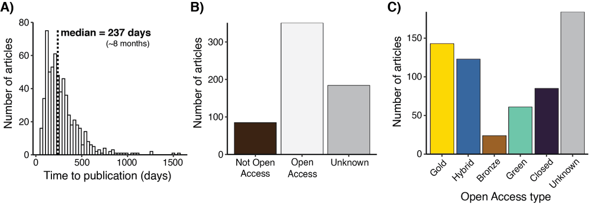
"The promise of community-driven preprints in ecology and evolution"
A brilliant exploration of the first 1000+ #preprints published in @ecoevorxiv. Brilliantly led by @DanielWANoble with a stellar list of co-authors.
📰https://t.co/xFGuwRFYwX
Materials: https://t.co/p6AG76nLzZ
Today I participate at a #FinBIF meeting and talked about activites at the NBIC @Artsdatabanken together with Laura Slaughter. Lots of similiarities in how we approach building biodiversity data infrastuctures although Finland is ahead of us (by an hour :0) @lajitieto@SYKEinfo
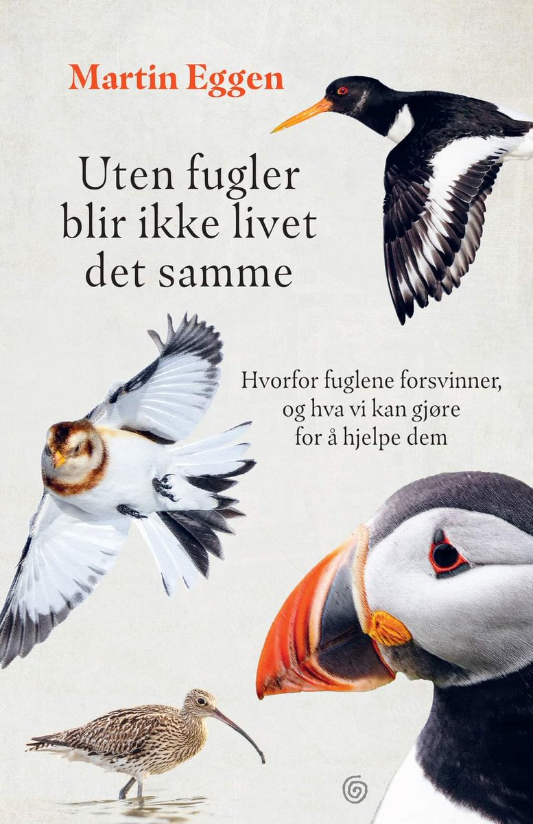
Hvorfor forsvinner fuglene, og gjør de egentlig det? Har vi en naturkrise i Norge, og uansett har vel myndighetene en plan? 🤷 Jeg har skrevet bok om det, og jeg håper du vil lese! Du kan bestille signert eksemplar allerede nå:
https://t.co/XK14p67fQw
@KaggeForlag@NorliBok
A striking visualization of human-caused climate change - watch what happens in the Arctic... 🫠
Temperature anomalies by latitude band (zonal mean) from 1880 to 2022. Visualization produced by @NASAViz at https://t.co/Tu8aN47qlq. Data from @NASAGISS at https://t.co/8pB26JbSzJ.
@KuhnIngolf @BobOHara@dagendresen@VVandvik Wow! This is really a rapidly developing story! :D Five tweets from now and you have picked up playing hardingfele and the trio turns into a quartet...
@eb_nilsen … also the book "Fundamentals of Data Visualization" by @ClausWilke is in general a great resource for questions like this, and the book is available in an online version: https://t.co/e6HPxm5cp9
I think chapter 10 is relevant for your question.
@eb_nilsen In some situations, a layered bar chart can be an alternative. There are some information that may be relevant in this paper (including the illustration below :0) https://t.co/qoYCznWc9T