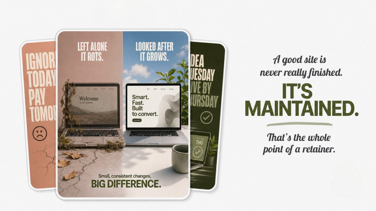
Most websites don't fail all at once. They rot slowly.
A section goes out of date. A new service never gets added because commissioning a whole mini-project for it feels like too much. A competitor's site starts looking sharper. None of it is urgent, so none of it gets done, and two years later the site quietly needs a full rebuild that costs real money.
That slow rot is the exact thing a design retainer prevents.
It's simple. Every month you get a set block of design hours and priority response. Something needs changing, you send one message, and it's handled in a couple of days by someone who already knows your site and your business. No new proposal. No re-explaining. No two-week wait while you chase a quote for a change that was tied to a launch you've now missed.
The version that works looks like this: an idea hits on a Tuesday, it's live by Thursday, and your site gets a little better every single month instead of standing still until it's embarrassing.
One honest caveat, because it's what makes the rest believable: a retainer is only worth it if your site is actually a working part of your business, something you touch and improve regularly. If it's finished and you won't look at it for a year, don't pay for one. Any designer telling you otherwise is selling you a standing invoice.
But if your website is supposed to be pulling weight — booking calls, converting visitors, keeping pace with competitors — then leaving it frozen the day it launched is the expensive choice, not the safe one.
A good site is never really finished. It's maintained. That's the whole point of a retainer.
How do you design a fitness app for people who keep falling off the wagon?
Most apps in this category answer the wrong question. They assume the problem is motivation, so they pile on reminders, badges, streaks, push notifications. But a business looking at retention data would see something different: people don't churn because the app asked too little. They churn because it kept asking after they'd already said no. Every ignored notification is a small reminder that you're failing, and eventually people delete the thing that keeps reminding them.
So the real design problem isn't "how do we push harder." It's "how do we make not showing up feel survivable, so the user comes back tomorrow instead of quitting for good." Retention isn't won on the good days. It's won on the bad ones.
That reframe changed every decision after it.
I cut a mechanic that shrank your plan when you skipped days. On paper it looked encouraging. In practice it quietly rewarded skipping, and it punished the exact users you most need to keep. Cut the badges too, for the same reason: rewarding streaks makes breaking one feel like losing progress, which is the moment people walk.
What survived is deliberately small. One honest question each morning. "Not today" is a real answer, not a failure state. And a streak that tells the truth, where a day you showed up looks different from a day you actually trained. No inflation, no fake encouragement, because the moment an app flatters you, you stop trusting what it tells you.
The visual direction came from the same business logic. I researched the category on Mobbin first (Hevy, Ladder, Runna, Whoop) and found it wall-to-wall dark neon, everything shouting intensity. For an audience that already feels behind, more intensity is the wrong message. So I went the other way: calm light mode, frosted glass, something that lowers the pressure instead of raising it. In a category where everything looks the same, that's also just good positioning.
This is the first exploration of a larger idea, so the point right now isn't polish. It's proving the thinking holds up before anything gets built for real. Four screens, the full user flow, a clickable prototype.
It isn't the flashiest fitness app. It's the one where every decision has a reason behind it.
Most people redesigning a website are scared of one thing: losing the Google rankings they spent years building.
It's a fair worry. Not because a new site is worse, but because search engines lose track of where your content moved to. Pages that ranked drop off. Traffic falls. And most people only notice weeks later, after it's cost them.
So it's the first thing I sort out on any project that replaces an existing site, at the start, not the week of launch.
The short version: every URL on the old site gets mapped to its new home before we go live, with proper 301 redirects so Google reads each page as moved, not deleted. Titles and descriptions carry over so the keywords you already rank for stay put. Sitemap resubmitted the day the new site launches. Then I watch Search Console for a few weeks to catch anything that slipped.
Here's a simple test if you're hiring anyone for a redesign. Ask them what happens to your SEO during the move. If the answer is "don't worry, we'll handle it" instead of an actual plan with redirects and monitoring in it, leave. Vague reassurance is how rankings get lost. A real answer sounds specific and slightly boring, because the process is specific and slightly boring.
I've done this on every site migration I've handled, and none of them lost their rankings.
It's a standard process. The catch is that standard only helps if someone actually does it, and plenty of redesigns skip it entirely.
If you've been holding off on a redesign because you're worried about your search traffic, that's a reasonable thing to worry about. It's also a solved problem. The rankings come with you when the move is planned properly.
I design the same way I try to talk to people.
When I talk to someone I'm always half in their head. How does this land for them, not just for me. What looks obvious from where I'm sitting might look completely different from where they are.
Design works the same way. Before anything else I try to look at the thing from the side of whoever it's actually for.
So I put myself in that person. If the work is for a specific industry I imagine I work in it. What do I care about, what am I confused by, how much do I even know about what I'm looking at, what am I here to get done. Not my opinion as the person who made it. Theirs.
Then I go around again, on purpose, from other people's seats. What does the salesperson need this screen to do. What is the CEO going to care about. What about whoever else has to sign off. Every seat shows you something you couldn't see from the last one.
The trap is that most people only ever look from their own seat and call it finished.
None of this is hard to understand. The hard part is actually doing it, every screen, every seat, when it would be faster to just trust your first instinct. That is the whole job though.
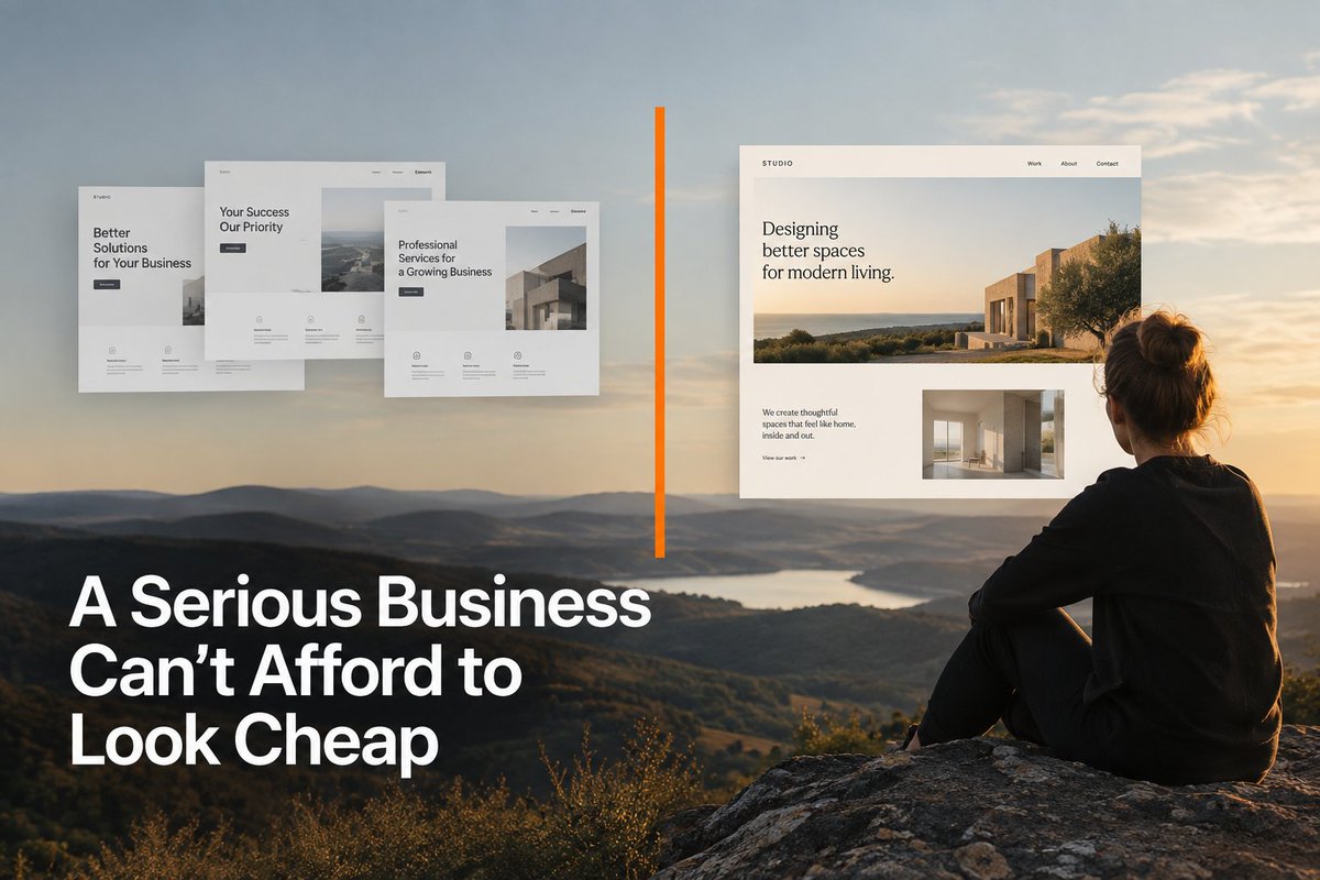
A Serious Business Can't Afford to Look Cheap
I've audited more than 50+ WordPress sites in the past few weeks, mostly during prospect research. The same three things keep showing up.
Alignment that drifts a few pixels between sections. No clear hierarchy, so every heading competes with the next one. Body text at sizes and line lengths nobody can read comfortably on a phone.
None of these businesses are badly run. Most are doing fine. Their websites just work against them quietly, and nobody has told them.
Stanford's research on web credibility found people form a trust opinion about a site in roughly 50 milliseconds, and three out of four say that judgment comes from design rather than content. That lines up with what the audits show. When alignment wanders and hierarchy is unclear, visitors can't tell what matters. They don't think "bad design." They just feel something's off and leave with a slightly lower opinion than they arrived with.
There's a reason the same problems repeat. WordPress runs around 43% of the web, and most of those sites start from the same handful of themes. A theme is built to look good with demo content, not yours. Real headlines run longer. Real photos come in different ratios. Real service lists have five items, not three. That's when the layout starts drifting, and that drift is exactly what I keep finding.
AI site builders push this even further. They train on the same popular templates, so the output converges on the same fonts, gradients and card layouts no matter what the business does. Some designers call it visual elevator music. Pleasant, forgettable, identical everywhere.
Nobody tells you when this costs you work. A visitor doesn't email to say your site looked generic so they went with a competitor. They just leave.
On the platform question, one honest concession: if you're running a large content operation with hundreds of posts and deep custom schema, WordPress and its plugin ecosystem genuinely outmuscle Framer. That's real.
But almost no clinic, law firm or small agency operates at that scale. They need a handful of fast, sharp pages that turn visitors into calls. Framer sites typically land in the 90s on PageSpeed. Typical WordPress sites, once the theme, plugins and tracking scripts stack up, sit around 60 to 70, and closing that gap takes ongoing technical work most small businesses are not intent on.
The cheap route rarely stays cheap. Custom-designed sites convert at two to three times the rate of generic templated ones, because the design is built around how that specific business earns trust instead of around demo content.
Credibility doesn't collapse at once when a site looks generic. It drains slowly. The inquiry that doesn't come in. The call that goes to whoever looked more serious.
Fifty-plus sites in, the pattern is hard to miss. The businesses losing work to their own website almost never know it's happening.
In a sales conversation, offer two exact time slots instead of asking the client to book for themselves.
I used to just send my booking link and wait. Then I'd have to send another email a few days later to check if they actually booked. That follow-up always feels pushy and unnecessary, and it's only there because the first message put the work on them.
Now I offer two specific slots. Real dates, real times, picked deliberately based on my calendar and the hours that client probably works.
Something like:
"I'd like to suggest a 30 minute call. Two times that could work: Tuesday 3:00pm, or Wednesday 4:00pm. If neither fits, you can pick another slot here:
https://t.co/jllXV9Xgew
The book-it-yourself option is still there. It's just the fallback now, for when neither slot works, instead of the only thing on offer.
Two slots picked for them is a yes-or-yes with an easy exit. A booking link is a task you handed someone who was already busy.
@tvaultproject That's exactly what makes it frustrating. The origin is the strongest part, and it's why I called the story good. But people recognise the output, not the brief. If a hand-painted sign ends up as a light sans, the difficulty of the task doesn't show in the result.
McLaren just rebranded, and within a day the internet had decided it looks like Marriott Bonvoy.
The story behind it is actually good. The new wordmark comes from the sign above the service station Bruce McLaren's parents ran in Auckland, where he modified the car that won his first race. The execution is a light sans-serif with a small underscore under the lowercase C.
The complaints came fast. It reads softer than the old mark, less aggressive, closer to a fashion label than a car company. A lot of people said it could belong to any luxury brand at all.
Branding people have a word for this: blanding. Research on the trend found that stripping away what made a brand recognisable measurably hurts how well people can match a logo back to the right company. Toyota, Burger King and Post-It all got the opposite result when they simplified, because they sharpened what was distinctive instead of sanding it down. Same move, done with a point.
That's the actual split. Simplifying because a logo needs to survive as a favicon is reasonable. Simplifying until all that's left is a slightly adjusted typeface is just expensive redecorating.
Burger King is the case worth studying. In 2021 they went backwards, to their 1969 identity, while everyone around them went minimal. Five years later it still holds up, and the reason is boring: in a category where everything looked the same, looking different was the whole point.
As for how long this trend runs, it's already cycled once. Maximalism pushed back in the early 2020s, minimalism returned around 2025 as a deliberate choice rather than the default. It'll keep cycling. What changes is whether being minimal still buys a brand anything, and right now it mostly doesn't.
Which leaves an opening. When every competitor looks interchangeable, being recognisable costs less than being polished. Pick a real colour, a real shape, a real voice, and you get recall that your competitors are currently paying agencies to remove.
Most rebrands aren't trying to say anything new. They're trying to stop looking dated. Worth knowing which one you're paying for.
AI Is Already Making Decisions in Your Business. Is It Making Them Legally?
Most small businesses using AI right now don't think of themselves as "an AI company." A clinic using a chatbot for bookings. An agency using an AI CRM to score leads. A shop using a tool to screen job applications.
Under EU law, that doesn't matter. If an AI tool touches personal data, real obligations apply, whether the business realizes it or not.
Two separate laws, and you're on the hook for both
GDPR governs how personal data gets handled. The EU AI Act governs how AI systems behave. If personal data flows through an AI tool, both apply at once, with separate penalty structures for each.
The part that catches most businesses off guard: using a third-party AI tool doesn't outsource the responsibility. If a chatbot, CRM, or screening tool mishandles customer data, the business using it is accountable, not just the vendor who built it.
Most SMBs fall into the "deployer" category under the AI Act (using someone else's AI, not building it), which means lighter obligations, but not zero:
→ Keep a simple inventory of every AI tool in use, what it touches, and whether it makes decisions about real people
→ Verify the tools are actually compliant, not just popular
→ Disclose clearly when a customer is talking to AI, not a person
Some categories carry real weight here. Recruitment screening, credit decisions, anything that affects a person's access to opportunity, that's higher-risk territory. One documented incident can trigger penalties under GDPR and the AI Act at the same time, from two different angles, for the same mistake.
Worth being honest about what's unsettled: the strictest high-risk deadlines are set for August 2026, but a proposed EU amendment could push parts of that to December 2027 for smaller companies. Not finalized yet. Worth watching, not worth ignoring in the meantime.
Here's the upside most businesses miss: getting ahead of this isn't just about avoiding fines. Being able to answer "how does your business actually use AI, and is a human checking the important decisions?" is becoming a real trust signal, especially for B2B and anyone handling sensitive client data.
Start small. List every AI tool currently in use. Note what data it touches. Flag anything deciding on a real person without a human reviewing it.
That one exercise usually surfaces more than expected.
Somewhere in your comments right now, someone's asking to buy. Nobody's tracking it. A DM, a comment, a missed call all the same thing. All could be revenue if anyone's watching.
Designed this landing page concept for Base360, a system that turns every customer conversation into a tracked sales opportunity. A comment, a DM, a WhatsApp message, an email, none of it should just disappear into a feed nobody checks twice.
Fully animated, one-pager, still fresh from building it.
A client had already picked five templates they liked. None of them would've made the business look like the obvious choice.
I asked them to hold off on picking one. What does the business actually need? What problems are your customers actually dealing with? How are your competitors already trying to solve them, and why are you actually better?
A template answers what something should look like. It doesn't answer why anyone should choose this business over the five others doing the same thing.
We ended up agreeing on the same thing: focus on what they were already strongest at, not on matching what competitors were doing. That became the whole direction.
Today they rank #1 on Google in Hungary for "luxury car transport across Europe," and they've held their position as one of the top names in their industry since.
It isn't a slowdown. It's the difference between a site that looks fine and a site that gives you something real to say back to a competitor.⬆️
An AI compliance startup reached out last week with real design questions already lined up. "What sections should the homepage even have? How should the branding feel more modern, more premium, more approachable? Should it feel more corporate or more personal?"
They weren't stalling or dodging the work. They didn't know yet that those questions sit downstream of ones nobody had answered. Who the service is actually for, what success looks like, what a visitor should do first? You can't answer "corporate or personal" for a business that hasn't settled its own shape yet.
Here's the part most people skip: a homepage section, a color, a tone of voice -each is a decision made on behalf of something. On behalf of a specific customer, a specific problem, a specific outcome the business needs the site to produce. Pick the section before you know who it's talking to, and you're not designing, you're guessing with good taste. It might still look fine. It won't necessarily work.
Taking a step back to answer the foundation questions first isn't slower. It's the difference between fifty decisions each made once, with a reason behind them, versus fifty decisions made twice: once by guess, then again for real once the actual answer surfaces mid-project.
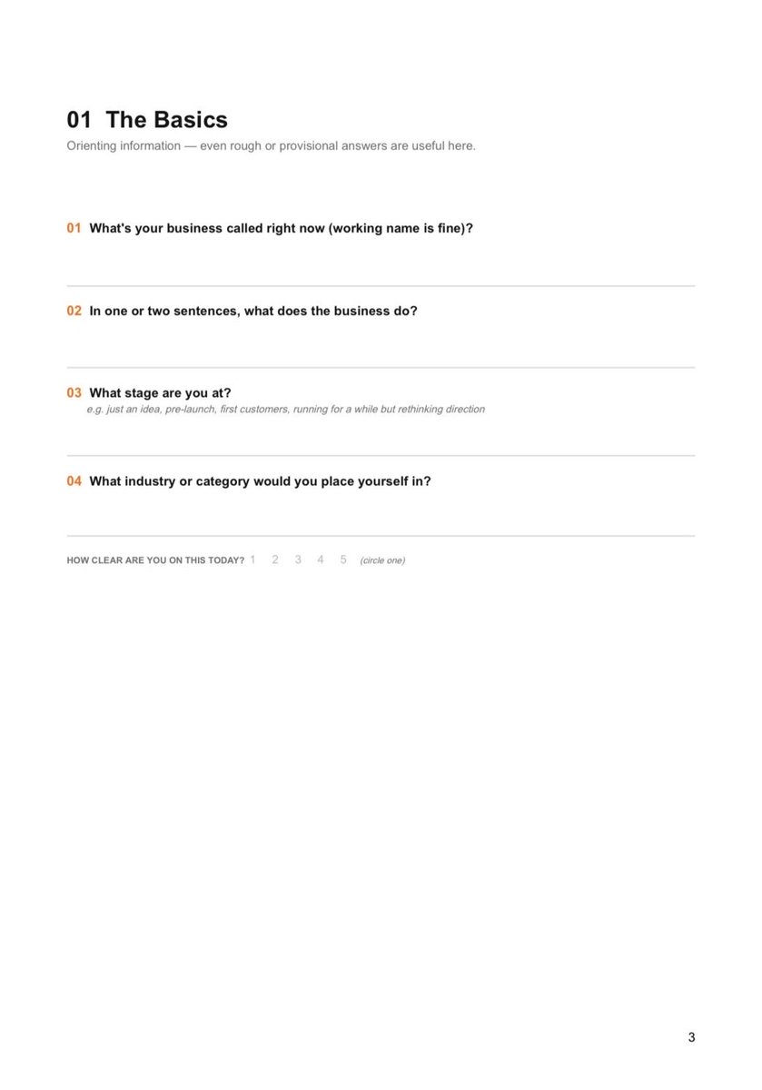
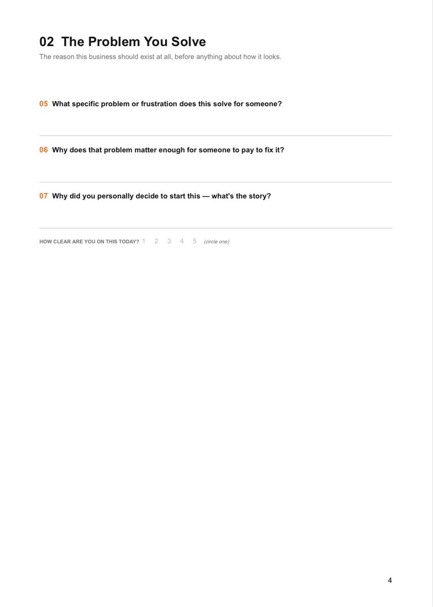
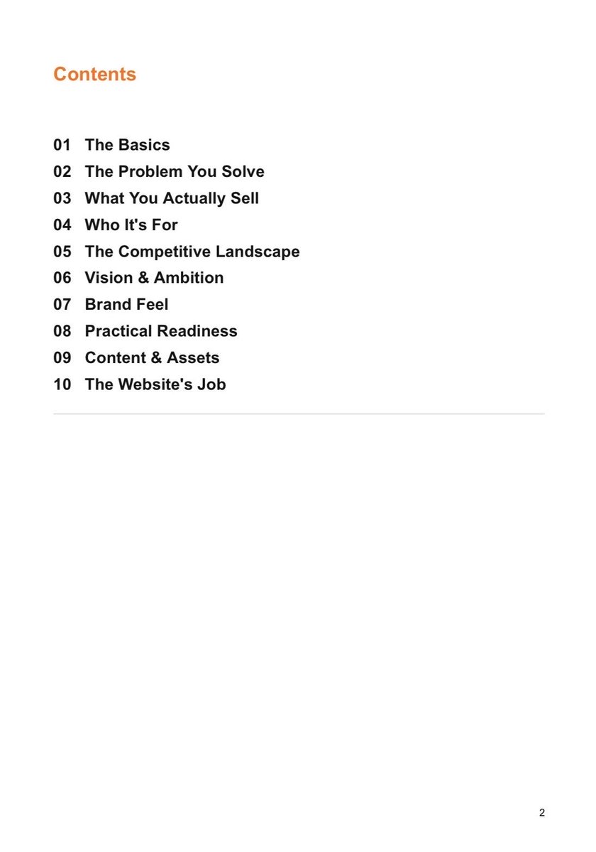
So before any of that, I sent over a brand foundation questionnaire. 32 questions across 10 sections, meant to surface exactly what's unclear before design starts, not discovered halfway through it.
The businesses that answer it honestly walk into design already knowing what they're building. Every design question after that has a real answer to build on, instead of a guess.
Free to grab before your next branding or web project. The first 4 pages attached below. If you need the full document, hit me a DM! 🤳
Most projects fail before a single pixel is designed — because nobody asked the seven questions that decide whether the work is even worth doing.
Every project of mine starts with those seven questions. Not because it’s a process. Because skipping them costs more time than asking them ever will.
1. What made you decide to redesign now, instead of six months ago or six months from now?
2. What result does this website actually need to produce for the business?
3. Right before someone almost buys, what stops them?
4. What's the current site doing right, and what have you quietly given up on?
5. What has to run under the hood for this thing to actually work?
6. What are people using instead of your website right now, and why does it beat what you've got?
7. Who says yes at the end, and what's the real date this needs to be live?
Nobody's moodboard tells me any of this. Colors and fonts are the easy part. They come after.
What these answers give me: the real reason the project exists, who the site has to convince, where people bail before converting, and what has to hold up behind the design for any of it to matter.
Number seven wrecks more projects than bad design ever does. I've seen strong strategy and clean design sit dead for weeks because nobody bothered to figure out who actually signs off.
Discovery isn't the warm-up before the real work. It's how I stop building on guesses.
Getting some DMs on this guide I wrote way back...
If you want a copy for FREE, just repost this and send me a DM with the word "Guide".
I'll check your profile later today and will send you the PDF and a workbook that went with it.
🫡
Introducing Contra Payments.
The first payments platform that lets you sell to AI Agents.
RT + Comment “Contra” and I’ll send you 100 products AI agents are looking for.