iOS and CSSer. UX/UI and brand unmesser. Design Lead @interchange. Previously @crossriverbank, @seedbiz, and @meridianapps(acquired by @arubanetworks and @hpe).
I’m excited to announce our latest product: @interchange Equities.
Equities is our US equities execution, clearing and custody platform we built from scratch in just 18 months – obtaining all necessary regulatory approvals in only 14 months.
We achieved this in not just what we think is record time, but we did it while staying true to our goal of building the world-class product for this industry.
@RobinhoodApp built a self-clearing firm in reportedly 24 months (we believe actually much longer). Ask anyone in the industry and they’ll tell you corresponding clearing is orders of magnitude harder than self-clearing.
Proud of the entire @interchange team and thank you to everyone who has supported us.
Excited to officially launch our first live product, @Interchange Treasury.
We built Treasury to make cash management programmable and seamless. It’s an API-first, 100% automated money market fund sweep that generates yield on the day of deposit - with same-day liquidity for withdrawals. The sweep balance is also instantly available for equity purchases.
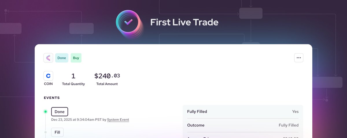
An important milestone achieved by the @Interchange team today - we’ve executed our first live trade! We bought one share of @Coinbase ($COIN), entirely through the proprietary Interchange platform, powered by Interchange Clearing, our @FINRA, @The_DTCC and @NasdaqExchange member broker-dealer.
This might not sound like a big deal, but I assure you it is. The amount of work required to get to this point is monumental. Being able to execute a live trade is like the tip of the iceberg, with all the work required to get there below the surface.
I’m super proud of what the team has achieved and look forward to the next milestone!
I’m super excited to finally talk about what we’ve been working on! Allow me to introduce you to @interchange - the future of financial market infrastructure. Today we’re announcing we’ve raised $17m in seed funding from an amazing group of investors including MS&AD Ventures, @BoxGroup, @pnpfintech and @Liquid2V and angel investors @eglyman, @karimatiyeh, @immad, @ankurnagpal, @shamir_k to name a few, as well as regulatory membership approvals from @FINRA, DTC, NSCC (@The_DTCC) and @NasdaqExchange.
Made many improvements to Sage, my pet AI recipe app. Notably, you can paste links and it will extract recipes from most websites. Also I put it on the App Store / Google Play (for free). Go try it out—or not, I really built this just for me to enjoy 😎
@nfarina But if you’re gonna just paste in a hex, you probably don’t know much about color, so it’s nice that Figma basically says “hey, did you know #FF0000 can be more red if you use P3?” HSL or OKLCH should be used to “author” color—in which case Figma spits out P3 and hex from that.
@miggi@rogie@figma Related: I’d love to have access to the opacity of a Color Style at all times. If it’s set as a background color on an Auto-Layout container, you can’t change opacity of that background alone (without it effecting everything in the container).
@miggi@rogie@figma Let me attach Color Styles to an Effect! My design system can’t use drop shadows because the shadow color can’t be linked to a Color Style.
@WdeB Yeah. I really wish Figma did component variants … differently. I don’t like a ton of variants either because they don’t all link back to that original. But for more complex components, gotta have dem variant toggles instead of showing/hiding layers everywhere.
@WdeB It’s not perfect, because each icon is a bit different inside that 24x24 container, but if you have a solid icon set that’s consistent with regard to perceived size, I find reducing that left padding looks better than not reducing it imo.
@WdeB I have 24x24 as well, but I tend to have a button component variant for icon+text that slightly lessens the padding on the left when an icon is present.
Was just at Newark Liberty Airport and every restaurant is like this. It felt so dystopian—all these themed Disneyland-like facades with no menus posted at all. Scan a QR, see if you like the menu, pay, watch a zombie come bring your food to the wrong table. Water? Good luck.
Had dinner with a couple other families at a local brewpub that was entirely app-based. Seat yourself, scan QR code, place and pay for order on your phone. There was no server to interact with; food came out at wildly different times. It felt like dining inside a vending machine.