Francis A. Walker, Plate XXXI: Chart Showing the Ratio of Church Accommodation to the Total Population Over 10 Years of Age, 1874.
An early example of modern information design. Colors to visualize religious denomination ratios in states.
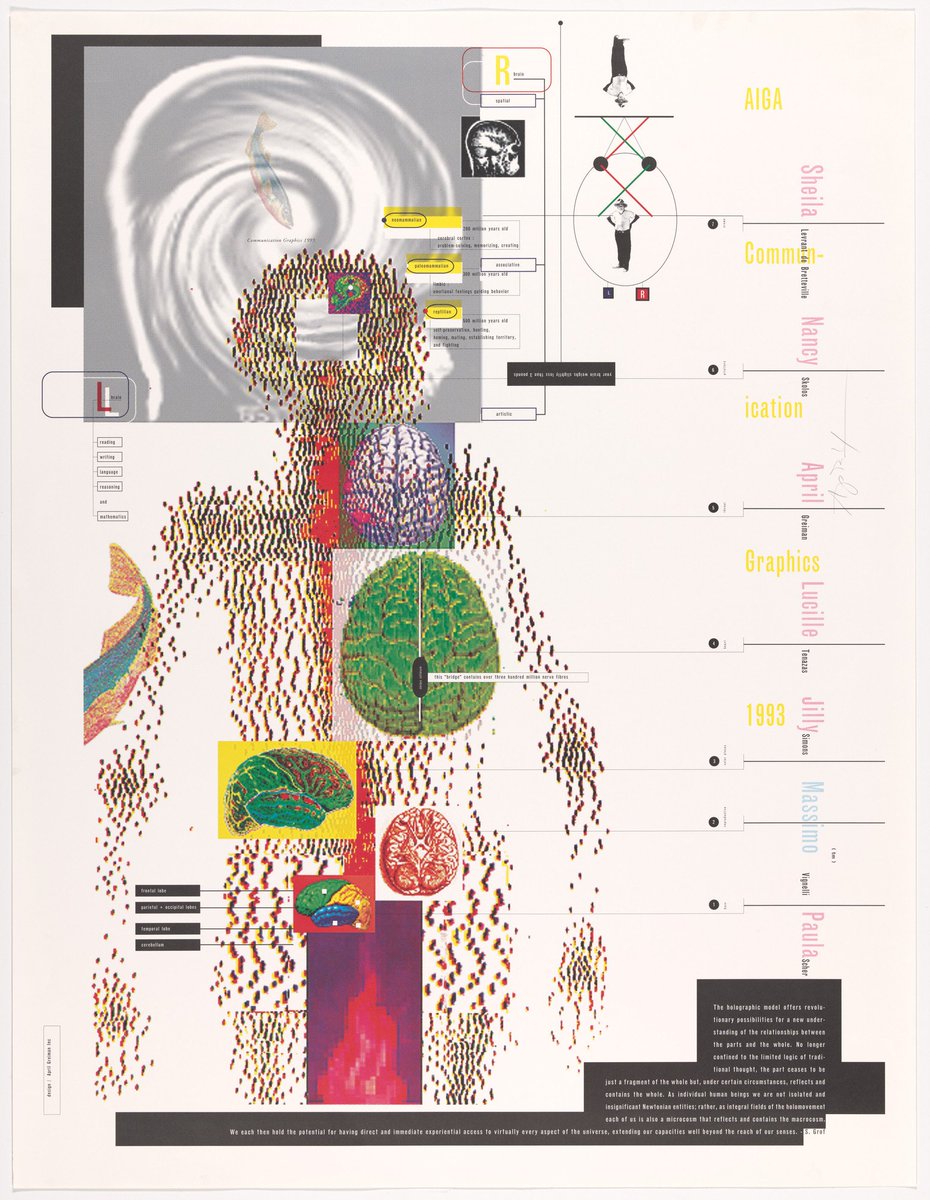
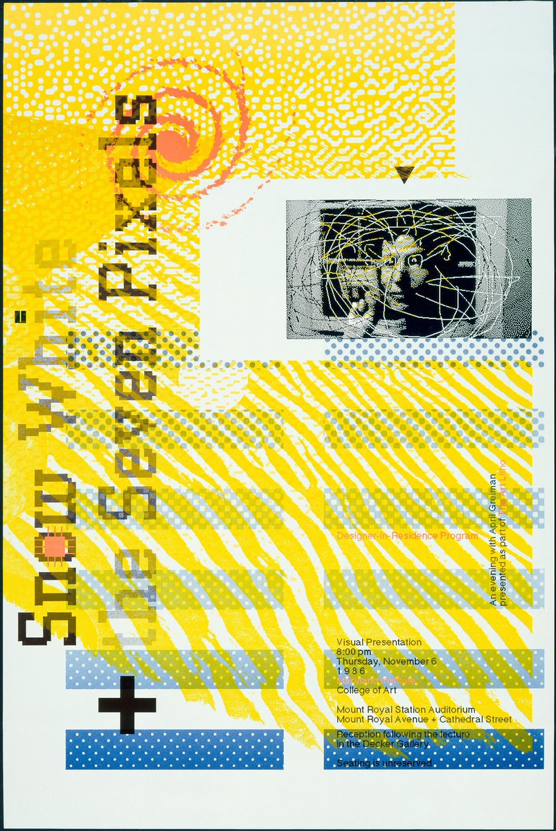
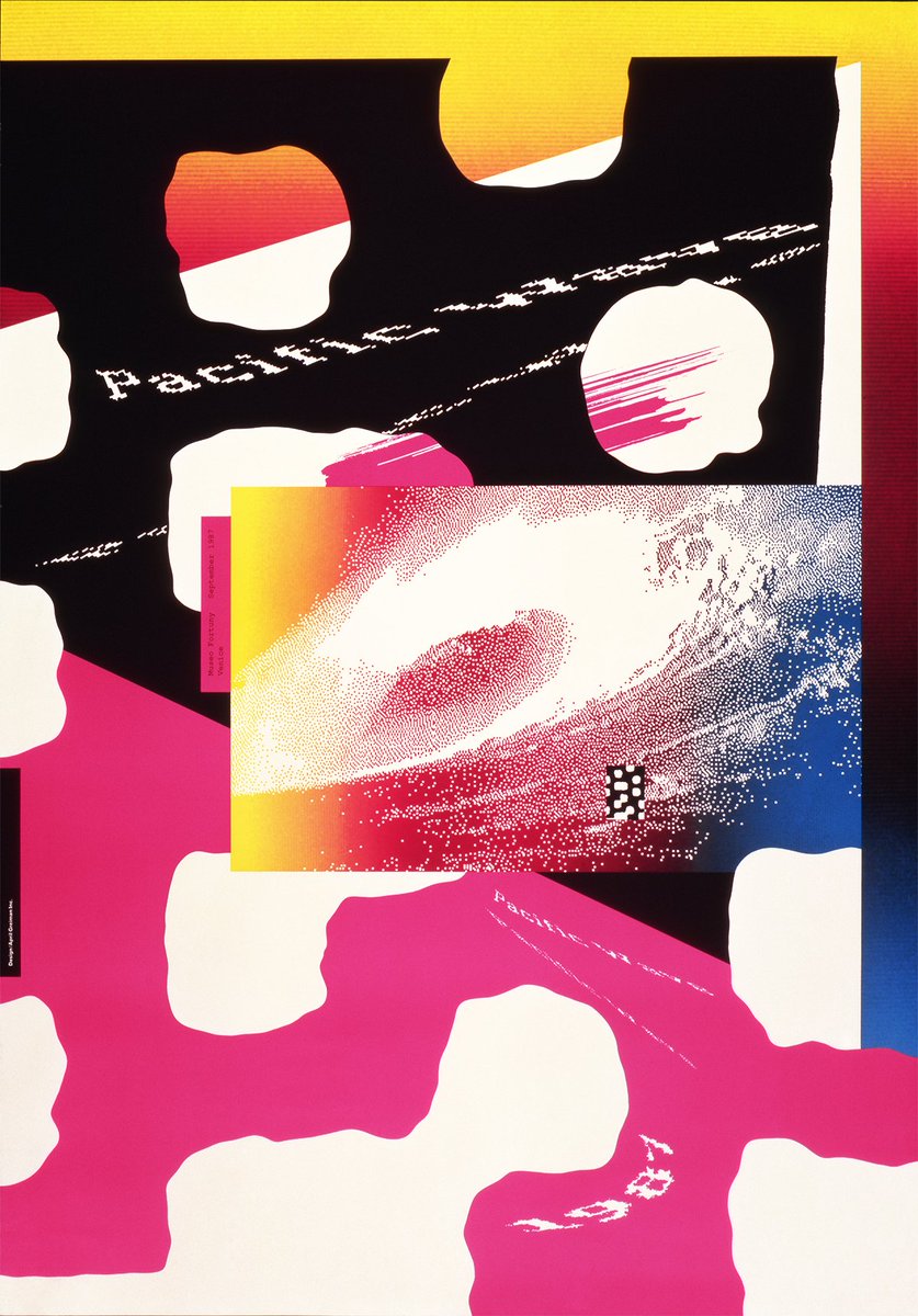
April Greiman was one of the first graphic designers to use a computer as a creative tool. in 1986 she made one of the earliest digitally produced graphic design pieces on a Mac, it took over an entire issue of Design Quarterly, and instead of the usual magazine format, it was a huge double-sided foldout (check out the 4th pic)
1/ Pacific Wave, 1987
2/ Snow White + the Seven Pixels, An Evening with April Greiman, 1986
3/ AIGA Comm Graphics, 1994
4/ Design Quarterly, no. 133, “Does It Make Sense?”, front and back, 1986
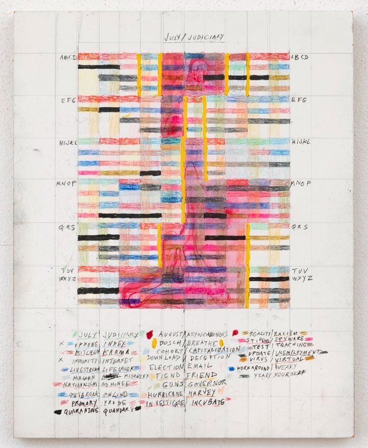
Leslie Roberts, Inbox. 2021.
Acrylic and ink on panel.
The legends around the edges are the key. Colors stand for concepts like health, distance, or karma, while the central grid translates those ideas into patterned visual language.
One of the best early articles on computer art.
In 1986, @TeleCulture looked back at the first decade of computer art (1965–1975). He traces the shift from scientist led exhibitions to artists seriously using computers as a creative medium. It’s still one of the clearest overviews of the early years of digital art.
Max Bill’s exhibition posters, 1974-82.
He needed very little, four colors, a few geometric rules, and each poster became a completely different system. His loose handwritten name cuts through all that precision and gives the geometry a human presence.
Страдариуму исполняется четыре года! В честь дня рождения мы собираем наших любимых лекторов, чтобы поговорить об одном из главных текстов мировой культуры — «Одиссее» Гомера.
♥️ Николай Гринцер — доктор филологических наук, специалист по древнегреческой литературе архаической и классической эпох, античной литературной и лингвистической теории, сравнительной мифологии и истории религии.
♥️ Галина Юзефович (признана иностранным агентом в РФ) — литературный критик, преподаватель. По образованию филолог-классик. Автор книг «Удивительные приключения рыбы-лоцмана», «Таинственная карта» и «О чем говорят бестселлеры
Это бесплатно, надо только зарегаться: https://t.co/ZlZqwYYuSZ
Иллюстрация: «поэт Гомер» (ʾŪmīrūš al-šāʿir) из арабской рукописи XIII века, вероятно выполненной в Мосуле.
A periodic table you've probably never seen before.
Created by chemistry professor William F. Sheehan in 1976, this chart scales each element according to its relative abundance on Earth instead of giving every element an equal-sized box.
The larger the area, the more common the element. That's why hydrogen, oxygen, silicon, and iron dominate the map, while rarer elements occupy only small spaces.
A clever visual reminder that not all elements are equally abundant in the world around us.
one piece of wood. sixteen animals.
designed by enzo mari in 1957, 16 animali transforms a simple puzzle into a timeless lesson in creativity, form, and learning through play.
discover more on designboom: https://t.co/PtHRUBxbzE
Sir David Brewster, Plate XXVIII, from “Description of a Monochromatic Lamp for Microscopical Purposes,”. 1822.
Hand-colored engraving.
The colored bars record which parts of the spectrum remained after light passed through different absorbing media. Brewster’s lamp then isolated those surviving rays, giving microscopists controlled, nearly monochromatic illumination instead of ordinary white light.
In 1856, a 17-year-old woman from Rhode Island embarked an a unique and brilliant project. She gathered autographed pieces of silk from hundreds of celebrities (including Dickens, Emerson, and Lincoln) and incorporated them into a stunning quilt: https://t.co/7fHp97Zgn3