The Mighty Five National Parks of Utah
This was 100% created with R (aside from downloading font and shapefiles). Here's a short thread about my general strategy to tackle this graphic...
#rstats + #rayshader code: https://t.co/jHJg3rP1vz
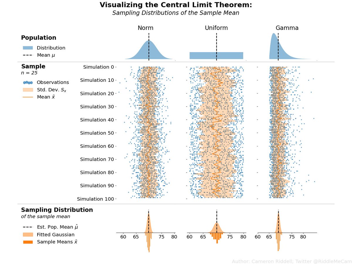
Been working on some visualizations in @matplotlib to highlight statistical concepts. This one intends to demonstrate (via simulation) the Central Limit Theorem: the sampling distribution of the mean is gaussian if given a large enough sample size regardless* of the population.
Saw this beautiful real life visualization at a bookstore, on the avg no. of books we could read in a year, with the time we spend on social media.. #datafam
Today's shaded relief map is South Africa. Turns out it wasn't #raymachine, it just takes an awfully long time—hours—to render. 😅
#rayshader adventures, an #rstats tale
When scrolling through his Twitter feed, @odbol noticed that all he saw was engagement-bait. Despite careful curation of who he followed, he saw little content from his "friends." He decided to conduct an experiment. Find out what the Algorithm was hiding: https://t.co/zXwD1XTZsr
It's been a while since I've done a #dataviz side project but I was feeling inspired by an idea and made these posters visualizing what parts of a piano keyboard are played the most in famous classical music pieces. I always love how much I learn from these sorts of projects!
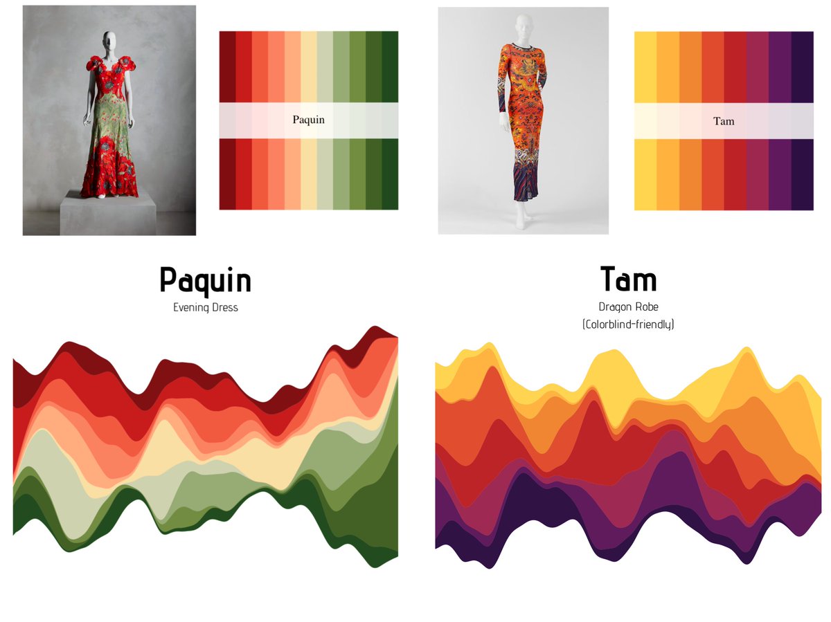
✨✨ PACKAGE UPDATE ✨✨
MetBrewer 0.2.0 is officially out 🥳 Available both on Cran and through my GitHub here: https://t.co/wYHMEKoJLH
New Palettes are out and some amazing new features. Full description of what has changed below :)
#MetBrewer#rstats#r4ds#dataviz
The clever people at @NASA have created this deceptively simple yet highly effective data visualisation showing monthly global temperatures between 1880-2021. Watch until the end...
Learn more here - https://t.co/yvLKEgcIZ7
#ClimateEmergency#ClimateCrisis#climate
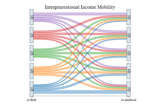
I think it's done. @AsjadNaqvi Here is a graph for Intergenerational Mobility (data from NLSY79-97)
The thickness of the line represents the Share of people moving from a particular quantile to another.