The Pearson correlation coefficient is a widely used measure to quantify the linear relationship between two variables. While it is straightforward to calculate, it requires careful interpretation to avoid drawing incorrect conclusions.
Strengths of proper use:
✔️ It quantifies the strength and direction of linear relationships, helping identify patterns in data.
✔️ It is computationally efficient, making it suitable for both small and large data sets.
Challenges and considerations:
❌ It only assesses linear relationships and fails to capture nonlinear or complex associations.
❌ Outliers can distort results, leading to misleading conclusions.
❌ Requires the variables to be continuous, with adequate variance and normally distributed data.
❌ Does not distinguish between causation and correlation, which can lead to incorrect inferences.
❌ Sensitive to range restriction; a limited data range can underestimate the true correlation.
The visualization below presents several examples of paired data points. The top row demonstrates varying strengths of linear relationships, while the middle and bottom rows highlight cases where Pearson correlation is inadequate. For example, in the middle plot, the correlation is undefined because the variance of one variable is zero. Source:
https://t.co/GYRgZBvoHa
🔹 In R: Use cor() for correlation computation and cor.test() for hypothesis testing. Leverage ggplot2 for scatter plots and regression lines to visually assess the linearity and detect outliers.
🔹 In Python: Utilize numpy.corrcoef() or pandas.DataFrame.corr() for calculations. Use matplotlib and seaborn to create scatter plots and heatmaps to explore relationships and spot nonlinearity or outliers.
Always inspect the data set for assumptions like normality, linearity, and the absence of outliers before interpreting Pearson’s coefficient. Combining correlation with visual and exploratory analysis ensures accurate and reliable insights.
If you’re interested in learning more, consider joining my online course on Statistical Methods in R. For more information, visit this link: https://t.co/7YQCRDKSPO
#ggplot2 #RStats #Rpackage #DataViz #datavis #rstudioglobal #Data #Statistics #DataScience #tidyverse #datastructure
One of the most common mix-ups in statistics is between standard deviation (SD) and standard error (SE). They sound similar, but they describe two completely different things—and using the wrong one can lead to misleading conclusions. Here's how to tell them apart.
🔹 Standard Deviation (SD): SD measures how spread out individual values are in your sample. It tells you about the variability within the data set. Example: How much do individual incomes vary in a sample of 1,000 people?
🔹 Standard Error (SE): SE measures how much an estimate (like a mean or proportion) would vary across repeated samples. It tells you how precise your estimate is. Example: How much would the sample mean income change if you ran the survey again?
As your sample gets larger, SE gets smaller because you're more confident in your estimate. But SD often stays about the same since it reflects the natural spread in the data, not how many observations you have. Use SD to describe the data, and SE to describe the reliability of the estimate.
For more on statistics, data science, R, and Python, subscribe to my email newsletter.
Click this link for detailed information: https://t.co/ktUcWo9XpO
#DataAnalytics #RStudio #datasciencetraining #RStats
gander is an R package that brings AI directly into RStudio or Posit.
Instead of switching between your IDE and a chat window, gander lets you ask questions or request code changes right inside your script. It automatically shares relevant context such as variable names, data types, and the surrounding code, so the model can provide precise answers without extra copy-pasting.
You can trigger it with a simple keyboard shortcut, choose from different AI models (OpenAI, Claude, or local ones), and control how much of your data is sent for context. In short, gander makes working with AI in RStudio smoother, faster, and smarter.
Take a look at the visualization below. It shows an example of how to use gander to create a ggplot2 graph. It’s taken from the package website: https://t.co/DbsZTbsmVK
Join my newsletter for more tutorials and insights on R, Python, data science, and AI.
See this link for additional information: https://t.co/ktUcWo9XpO
#tidyverse #R #datastructure #RStats
Bayes' Theorem is a fundamental concept in data science.
But it took me 2 years to understand its importance.
In 2 minutes, I'll share my best findings over the last 2 years exploring Bayesian Statistics. Let's go.
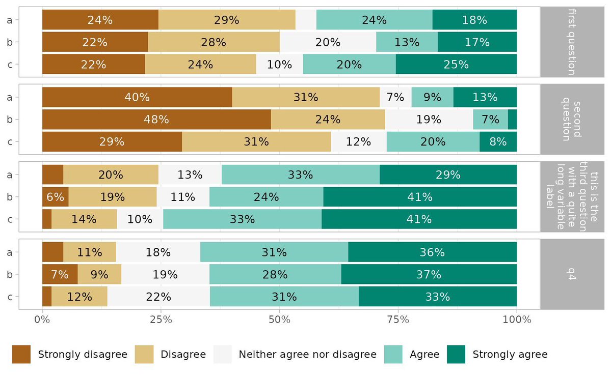
Visualize Likert-type survey data with ease using ggstats and its gglikert() function. Whether you're analyzing responses to survey questions or exploring patterns in attitudes and opinions, gglikert() provides a clear and effective way to represent Likert-scale data in R.
Why use gglikert()?
✔️ Tailored for Likert data: Specifically designed to handle Likert-type items, ensuring a structured and interpretable visualization.
✔️ Detailed insights: Displays distributions of responses, making it easier to understand trends and group differences.
✔️ Customizable plots: Leverages ggplot2’s flexibility to adapt the appearance to your needs and preferences.
The visualization included here originates from the ggstats documentation, showing how gglikert() can transform survey data into meaningful insights: https://t.co/ZrEMomuMWm
Want to take your data visualization skills further and explore tools like ggplot2 and its extensions? Check out my online course, "Data Visualization in R Using ggplot2 & Friends!" For more information, visit this link: https://t.co/ztlEzoEDWv
#DataViz #statisticians #RStats #Data #StatisticalAnalysis #DataVisualization #R #ggplot2
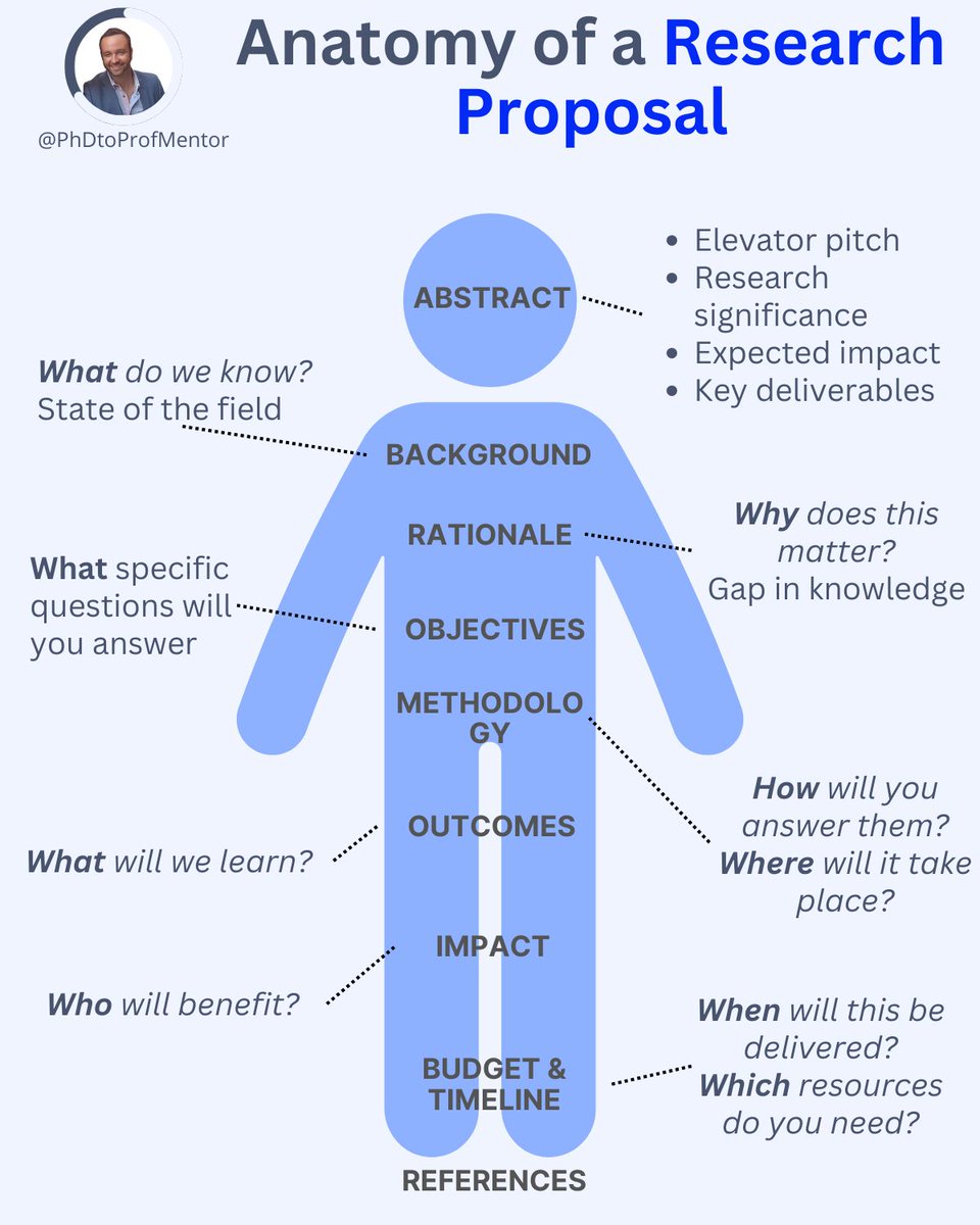
5 journal rejections taught me one lesson.
18 months collecting data. Perfect analysis. Field-changing findings.
But my paper kept getting rejected.
After rejection 4, a peer read my draft: "Your research is solid. Your structure is chaos."
This is how to structure your paper for success:
I've put together a comprehensive list of essential R programming functions, featuring 511 (!) tutorials and examples. This can serve as your go-to cheat sheet for mastering R programming!
Link to all tutorials: https://t.co/pdvUN2M1xM
If you're new to R and want to learn more, take a look at my course, "Introduction to R Programming for Absolute Beginners." It will help you build a strong foundation in R programming starting from the basics to more advanced topics.
For more information, visit this link: https://t.co/lUOKp2kv2r
#R #Statistical #coding #RStats
"Probability does not exist."
This provocative quote is by the Italian statistician and probabilist Bruno de Finetti.
It encapsulates the core idea of Subjectivism or Bayesianism, a major school of thought in probability. De Finetti argued that probability is not an objective property of the world (like mass or temperature). Instead, it's a measure of an individual's degree of belief about an uncertain event, based on their knowledge and evidence.
Essentially, he meant that a "50% chance of rain" doesn't exist in the clouds themselves; it exists in the mind of the meteorologist who assigns that value based on the data they have. It's a powerful statement that reframes probability as a tool for reasoning under uncertainty, rather than a feature of physical reality.
#Infographic: Graph Algorithms
➕
Graph algorithms book: "Graph Algorithms the Fun Way" at https://t.co/xIZLBWvsde
➕➕
The author also wrote "Data Structures the Fun Way" — available at: https://t.co/PTzRnJEbF9
Amazing! The text under the figure is in Persian and briefly says that in each right triangle (drawn by black lines), the hypotenuse is one and one-third greater than the longer leg, and this process continues sequentially to infinity.
We are proud to announce the launch of Artificial Intelligence for Transportation.
This new journal is dedicated to advancing the integration of machine learning and artificial intelligence into the field of transportation.
Find out more > https://t.co/uoaDlWJl3p
Turn your research into a page-turner!
This will help hook readers and get your paper published 👇
Ever thought of making your paper as engaging as a Hollywood hit?
Here's how to draw in readers and score that publication: