Thanks y'all for the conversations today ❤️ I've had so little representation of Asian-Am identity throughout my undergrad so this week's reading was special I only hope y'all be open to real conversations in the future & welcome POC voices to speak their truths ✊🏼✨#ENGL157
Y'all don't understand how much I LAUGHED at this part because I totally related to it! There were too many times to count where I really tried my best to order in Tagalog but the aunties just stared at or laughed at me... 🤣😅 #ENGL157
@natalieitu_sdsu I think this also reflects the classic coming-of-age story with him leaving on his own as we the readers watched his entire journey alongside him to me it's just one of those conventions in storytelling that makes sense ~
@sophiamiah5 I see similar art choices from the bottom tier right panel in manga! The shadow over the face and not drawing the eyes usually shows the seriousness of the character or of what they're saying
@The_JohnBerry_ In addition to that, I think it's interesting that his face stays the same in the two separate panels from the rest of the chaotic splash page. It really captures the shock and is unable to process or react to the explosion.
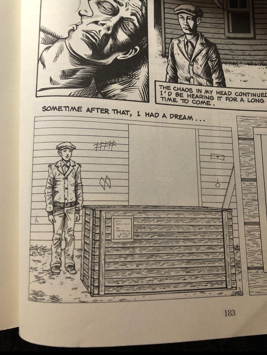
Was anyone able to decipher these symbols? I found this website a source for cross-references but we may need to find more! I see 5 symbols in total. https://t.co/AHqYVggook #ENGL157
@ayan__heart Right? I think having a social context or time period where the setting takes/inspired by a place is a whole other set of research and background that enhances the fictional world we're reading in these graphic novels like in Stuck Rubber Baby or Bitter Root!
@pau_caro3 Same! I see it as a fragmented narrative whereas the audience, we're left with elliptical storytelling where we're left wondering what a scene meant but it's later revealed to us to put the pieces back together
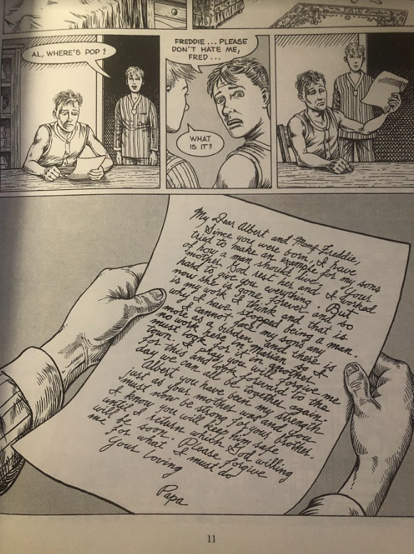
Mentioned this in class but there's so much to uncover on page 11. Fred's father is absent yet his voice/letter takes up the majority of the page & the typography is different from the usual text boxes or speech bubbles & the paper itself is its own panel #ENGL157
The last panel in the 3rd tier is powerful... The build-up of her crying, covering her eyes, then turned to black. I don't think the impact would be the same if Satrapi if she drew her screaming; it's minimal but impactful. #ENGL157
Layout detail with the border in the bottom tier left panel on page 43! Funny how the father says let's enjoy our freedom when the devil's body confines them in the panel. Foreshadowing perhaps? #ENGL157
I feel so torn... Values of history... WRITTEN history is so crucial. But then this makes me think, do we historians and archivists have a say in preserving these voices when it wasn't even ours to begin with? Who gave us the right or did we just welcome ourselves in? #ENGL157
Looking to attention to detail, the third panel on the second tier has a bolded border and is not aligned with the other panels, to bring attention to the real emotion in her dialogue! #ENGL157
I like the little details of the dancers in the background. The shading really makes Vladek and Anja pop and emphasize the background characters in the cafe! #ENGL157
Cruse really hones in on the moral ambiguity of characters and the story in Stuck Rubber Baby. Part of me feels unsatisfied but I also enjoyed taking ownership of making sense of the story and themes. #ENGL157
Part of me facepalms when Toland talks about himself in situations where it's not about him... But I also empathize because I'm watching him trying to navigate the world around him; he's still young and figuring himself out as we all were at one point or another. #ENG157