@mttymtt I always feel like I should have used the smaller one for bigger uses, they’re so cute and stripped down! Then a tiny dot for the smaller haha.
Instead of telling you what's wrong with your photography portfolio, going to stick to showing you good examples. Here are some of the best I saw today
I finally bought @kern_on for @glyphsapp and now kerning feels like cheating. The fonts for my 22/22 project have around 100 glyphs each. I kerned one and started to laugh maniacally, out loud, for real.
It's tempting to think that simpler letterforms = more legibility. But in my experience, that's not true. Typefaces are design systems too, and they need a certain level of complexity to work well. Here's why
(thread) 🧵
I hope the new @instagram feed is a temporary test and they get rid of it ASAP. It's awful and the dark gradient and the caption are covering the image. Please, don't try to fix what's not broken.
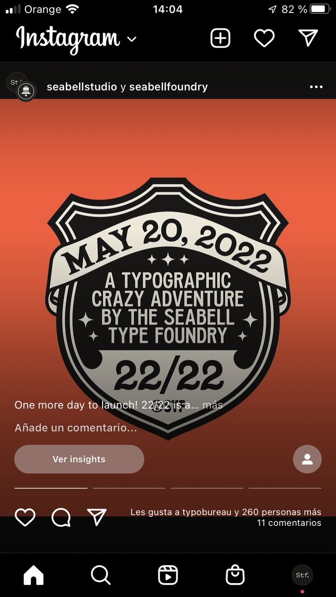
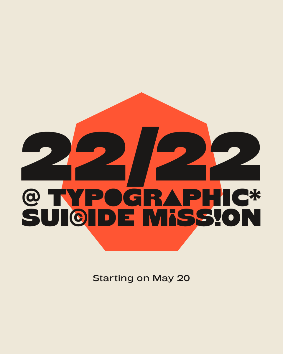
22/22 starts on May 20. 22 fonts for free before 2022 ends, available every 10th, 20th and 30th of each month only until a new one is released.
More info soon!