How to set up garbage collection logs to learn about memory use in R.
I break down GC logs and show how to stop R from crashing your machine.
code: https://t.co/Sv5iag6kBF
#rstats#DataScience#CodingLife
Simpson’s Paradox is a fascinating statistical phenomenon where the relationship between two variables can completely change when a third variable is considered. This often leads to contradictory conclusions if not carefully analyzed.
For example, in a data set, you might see a negative trend between variables X and Y. However, when you split the data into subgroups based on a third variable, Z, the trend might reverse or disappear.
Key takeaways:
✔️ Always consider potential lurking variables that could influence your results.
✔️ Be cautious with aggregated data; sometimes the real insights lie in the subgroups.
✔️ Use visualizations to better understand the relationships within your data.
The Wikipedia article on Simpson's Paradox offers this great visualization (https://t.co/jHyvsNH7IS), emphasizing the importance of thorough analysis to avoid such pitfalls. This paradox underscores the necessity for data analysts to be meticulous in their work to prevent erroneous interpretations.
For regular tips on data science, statistics, Python, and R programming, check out my free email newsletter! See this link for additional information: https://t.co/X93SeCe0rb
#StatisticalAnalysis #Python #RStats #Statistics #R
🇪🇺🤝🇮🇩 A new, game-changing chapter for the EU and Indonesia.
We have finalised negotiations on a trade agreement that will open for EU exports a market of 280 million people to European businesses.
We promised to diversify our partnerships.
We are delivering ↓
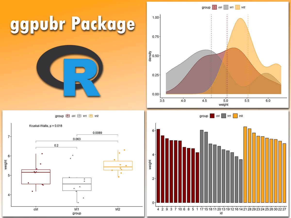
Creating publication-ready plots in R is easier than ever with ggpubr. This extension for ggplot2 simplifies the process of generating clean and professional graphics, especially for exploratory data analysis and reporting.
The attached visual, which I created using ggpubr, demonstrates its versatility. It includes a density plot with group comparisons (upper right), a boxplot with statistical significance annotations (lower left), and a grouped bar chart (lower right). These examples showcase how ggpubr helps streamline the creation of informative and visually appealing plots, perfect for presentations and publications.
If you’d like to learn how to create publication-ready visualizations with ggpubr and other tools, join my online course, Data Visualization in R Using ggplot2 & Friends. In this course, you’ll learn how to design polished graphics like these step-by-step! Click this link for detailed information: https://t.co/ztlEzoFbM3
#datavis #datastructure #Rpackage #Data #pythonlearning #tidyverse #Python #ggplot2 #RStats
The ggalign package in R brings flexibility to your visualizations by helping align multiple plots and incorporate complex hierarchical data structures, like dendrograms, alongside your primary charts. This extension of ggplot2 makes it easier to organize heatmaps with clustering and other detailed data views, all in a clean, cohesive layout.
With ggalign, you can combine multiple plot types effectively, making it a powerful tool for exploring high-dimensional data. Here’s why it’s worth exploring:
✔️ Seamless Integration with ggplot2: Works alongside ggplot2 for consistent, customizable visuals.
✔️ Multi-Plot Alignment: Aligns heatmaps with other elements like dendrograms, gene annotations, or K-means clusters, as seen in this example, for clear, layered insights.
✔️ Enhanced Data Exploration: The ability to layer information enables users to observe patterns across different groupings, making it easier to spot relationships.
In this visualization from the package website, ggalign combines a heatmap of gene expression data for various cell types, clustering information, and additional data panels for gene annotations, distribution, and K-means groupings. The heatmap uses a gradient from dark to light to show gene expression intensity, with accompanying panels for cell type and gene attributes, offering a comprehensive view of this complex data set.
If you're interested in learning more about creating powerful visuals in R, check out my Data Visualization in R Using ggplot2 & Friends course.
Take a look here for more details: https://t.co/ztlEzoFbM3
#RStats #ggplot2 #datasciencetraining #RStudio #datastructure
It's now incredibly easy to build calendar heatmaps!
Thanks @joseph_barbier for your dayplot library!
Documentation:
https://t.co/QyCBM9FV85
If you like making charts with Python, come learn with us at https://t.co/sCU4unfXJY!
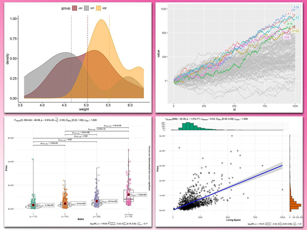
Adding statistical metrics to your plots can transform your visualizations from basic to highly informative. With ggplot2 in R and its versatile extensions, incorporating features like p-values, confidence intervals, and regression lines becomes both straightforward and visually appealing.
These are my top 5 packages for adding statistical metrics in ggplot2:
1️⃣ ggstatsplot: Combines statistical analysis and visualizations, displaying p-values, confidence intervals, and effect sizes directly on your plots.
2️⃣ ggpubr: Simplifies the process of adding p-values, statistical comparisons, and summaries to boxplots, bar charts, and more.
3️⃣ ggsignif: Adds significance brackets with p-values to plots like boxplots and bar charts, making statistical comparisons easy to interpret.
4️⃣ stat_poly_eq: Annotates regression equations, R² values, and p-values on scatter plots, ideal for showcasing relationships in linear models.
5️⃣ gghighlight: Highlights specific data points or groups in plots, drawing attention to key statistical trends or outliers while maintaining context.
With these tools, integrating statistical insights into your ggplot2 visualizations becomes both effective and effortless. In the graph shown here, you can see examples of how these packages enhance your plots: a density plot with group means marked by vertical lines, a crowded line plot with selected series highlighted for clarity, a violin-boxplot hybrid with p-values annotated for group comparisons, and a scatter plot featuring a regression line, confidence intervals, and marginal histograms for added context. These enhancements demonstrate the power of ggplot2 extensions for making statistical insights visually accessible.
If you’d like to learn how to use ggplot2 and these extensions, join my online course, Data Visualization in R Using ggplot2 & Friends. I’ll guide you step-by-step to create visualizations packed with statistical insights!
Further details: https://t.co/ztlEzoEDWv
#ggplot2 #Rpackage #R #tidyverse #pythonlearning #DataVisualization #RStats #Python #datavis
😍 Just discovered the #dataviz work of Colas Droin
He's a researcher transitioning to data visualization, and just released a very nice piece of scrollytelling:
https://t.co/0tLfj4LSDU
Bonus point: he used the https://t.co/Viic1zuQc4 to learn how to use d3.js in React 😇
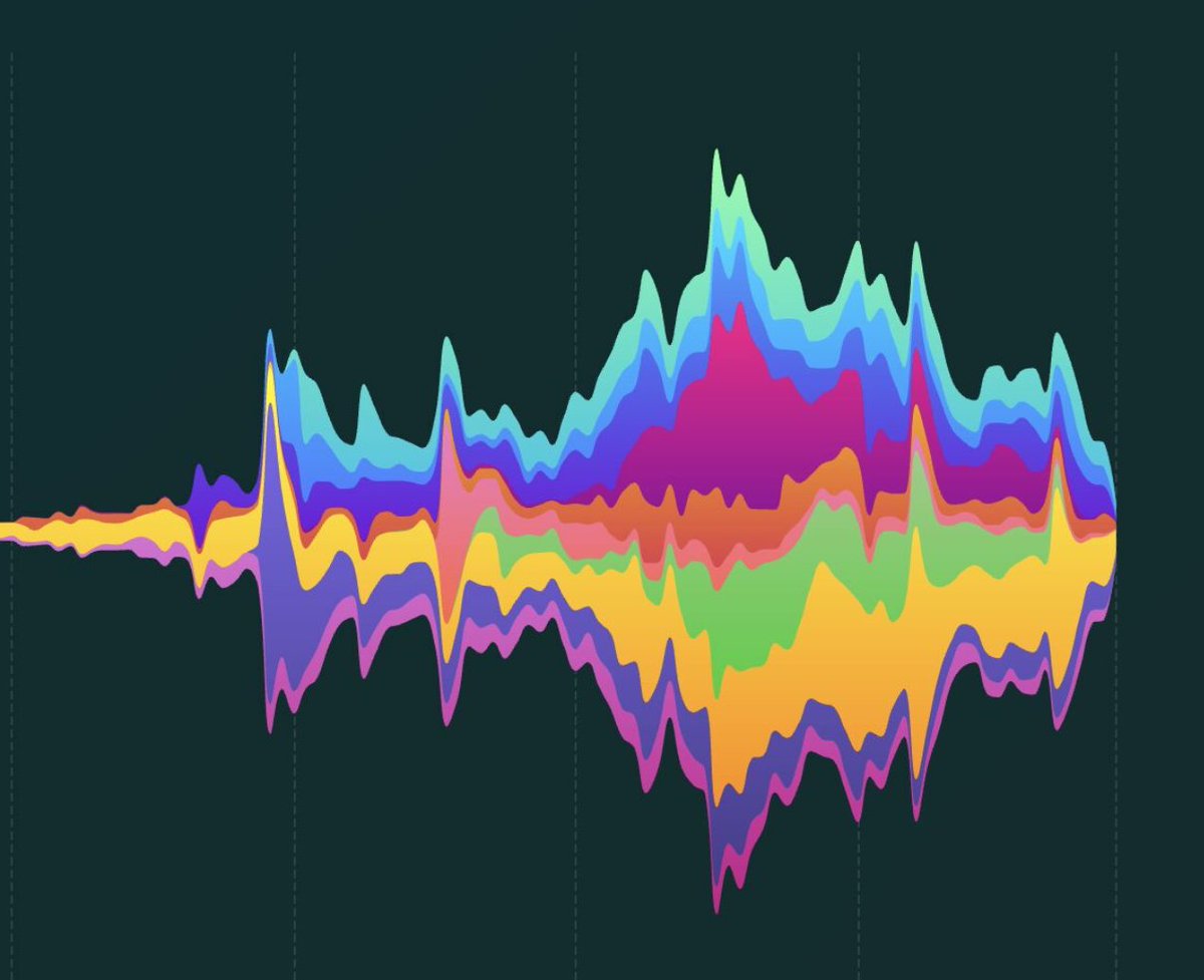
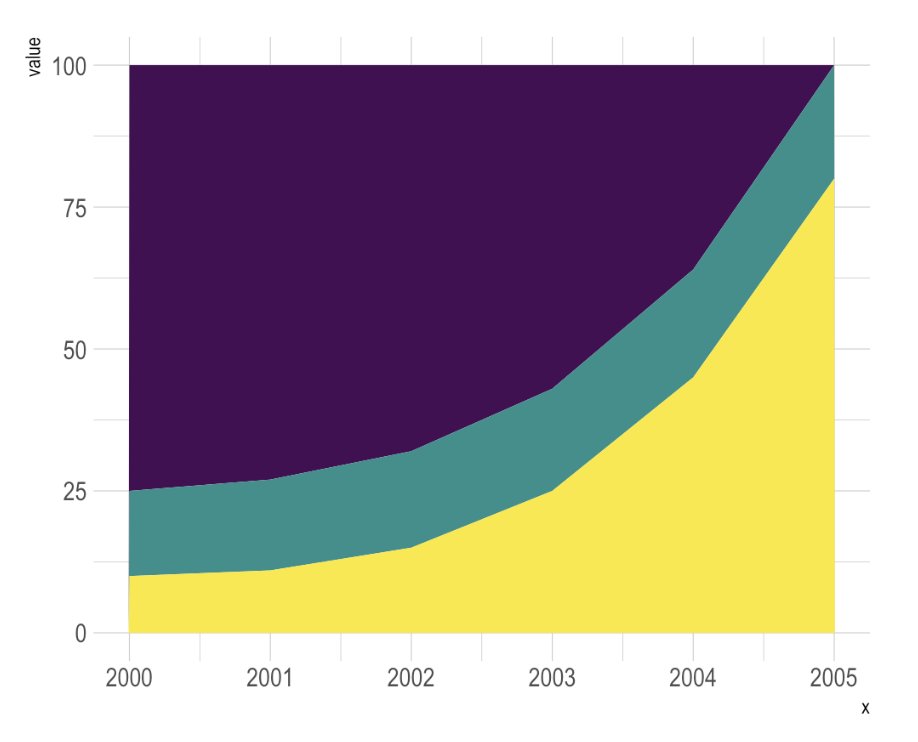
🍔 Stacking is dangerous in #dataviz.
Is the green group increasing or decreasing? 🤔
It's so hard to tell (answer here https://t.co/xa9NLR7hwy)
Stacking is great if the main focus is on the whole. For single group evolution, use small multiple!