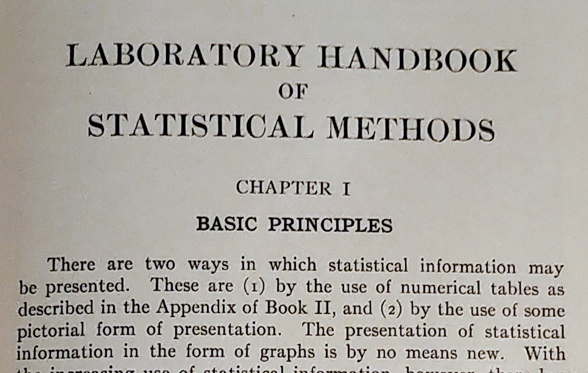
According to the Laboratory Handbook of Statistical Methods (1931), we do charts or tables.
But in fact, it is not an exclusive or. We can do both at the same time. and there are also semi-graphical displays, such as https://t.co/l6hvDuRvPU (@stemgraphic)
#dataviz#infoviz
#BREAKING#NorthCarolina will begin mandating face masks and the state will remain paused in Phase two for at least three more weeks as COVID-19 case trends have worsened. Read more >> https://t.co/ZjV2RaOGCi
Do you need to gain insight on your data? See the multimode? See the distribution shape? Potential issues? Check out this article about our free tool @stemgraphic
https://t.co/HDqez2ucy7
Did you know stemgraphic also has a wide range of semi-graphic displays you can use from the console, in a python or ipython session (or in a notebook even, see: https://t.co/NJMmEkcb7r)
#stats#python#infoviz#dataviz
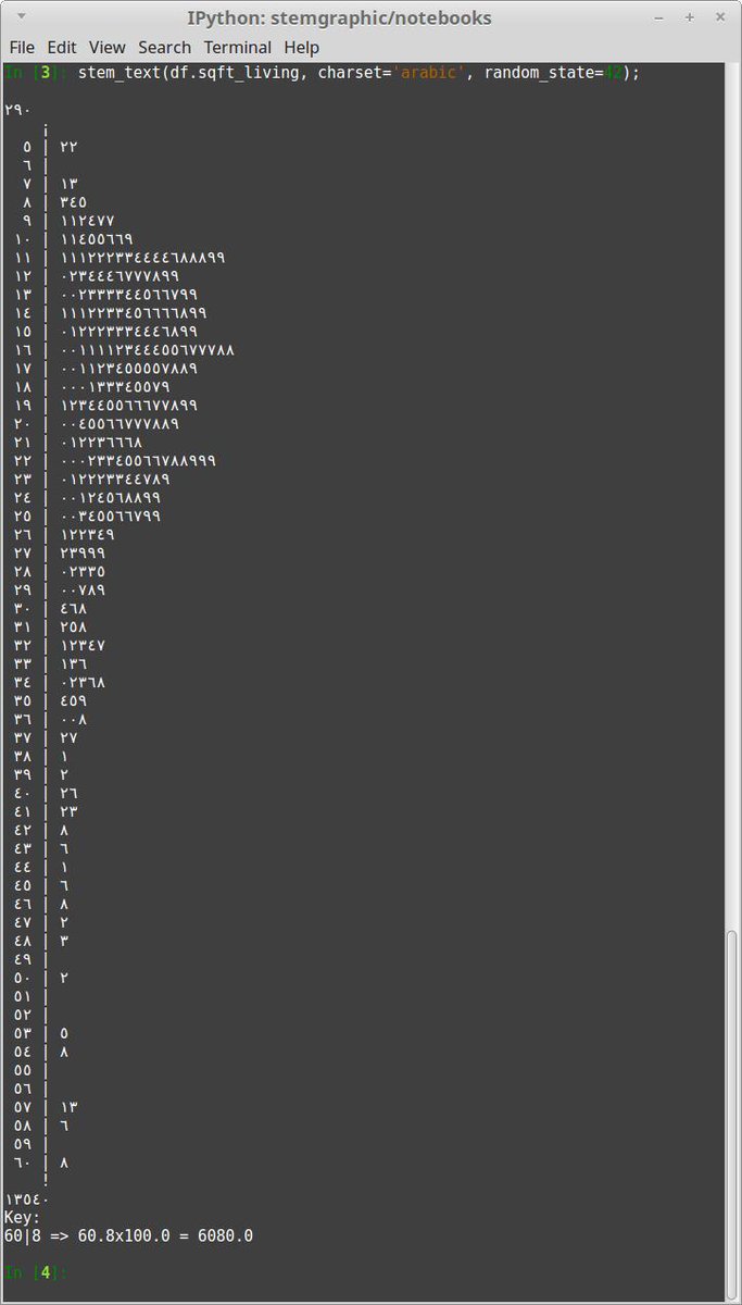
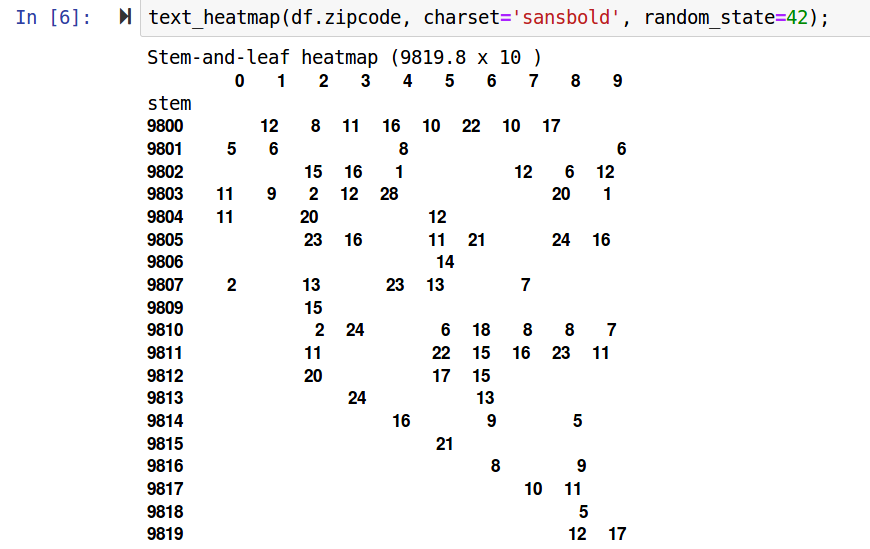
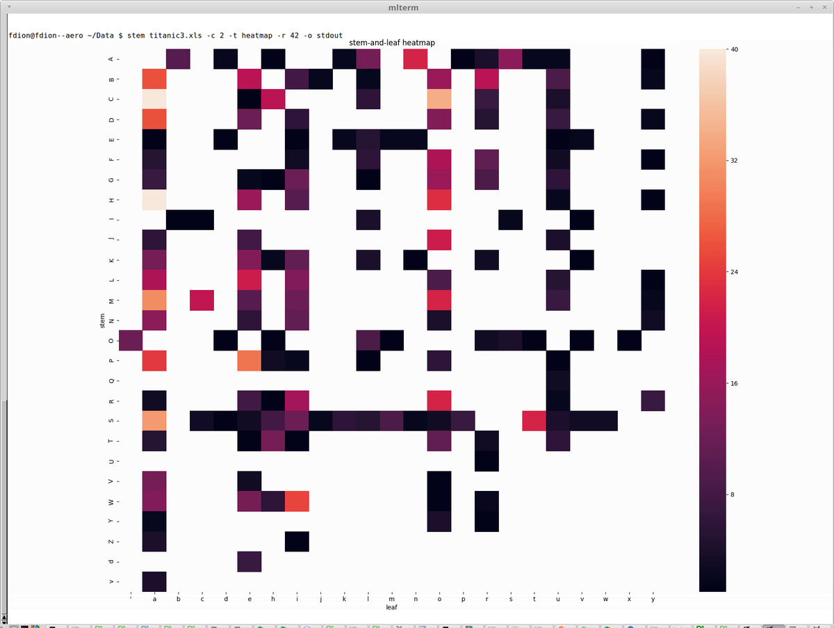
@stemgraphic The unicode charset support is also pretty handy to have, say, "bold" text. Even in a terminal. Simply add charset="bold" to the call (heatmap in this example with zipcodes).
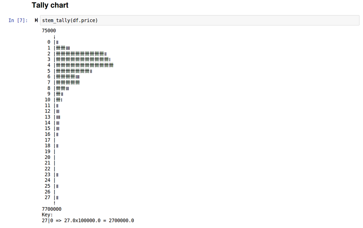
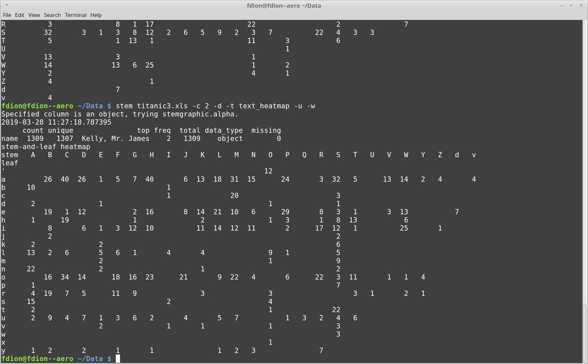
@stemgraphic Probably one feature that few people know about, @stemgraphic provides a bunch of text and semi-graphic displays. From the command line or from ipython, or in the notebook, but as text.
For example, good old tally chart
And finally, if you use xtem, mlterm or any other terminal supporting Sixel graphics in a text environment, then stem has a -o stdout graphical support you will appreciate. Still command line, but with graphics inside your terminal.
Did you know stemgraphic also has a wide range of semi-graphic displays you can use from the console, in a python or ipython session (or in a notebook even, see: https://t.co/NJMmEkcb7r)
#stats#python#infoviz#dataviz
Heatmatrix are when you want all the numbers in a filled matrix. But for patterns, you might prefer a compact form with the zeros removed:
Again, this is using the stem command line tool from stemgraphic, but using text_heatmap as type.
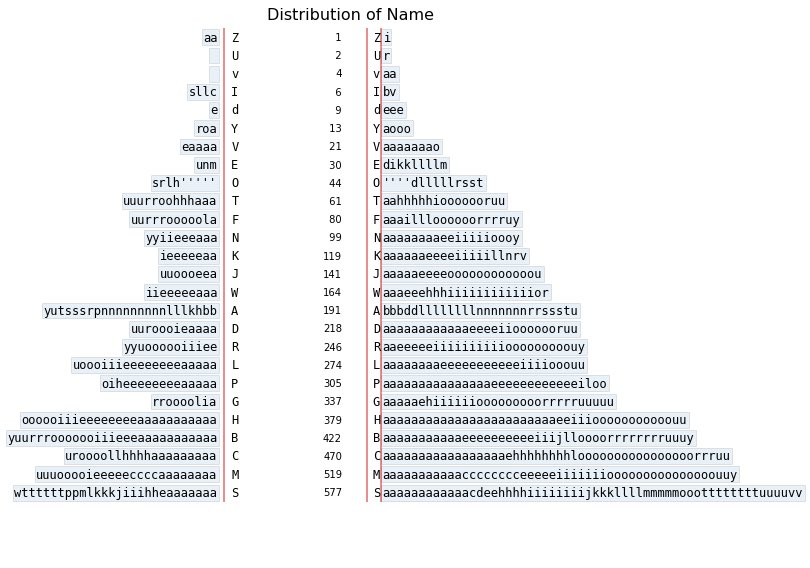
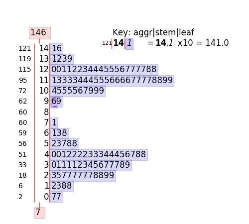
Of course with @stemgraphic, you can do stem-and-leaf plots in text mode, wide format now. Millions of rows in a few seconds on my laptop.
And, if you’ve missed it, @stemgraphic has been able to do them with categorical or text too #dataviz#infoviz
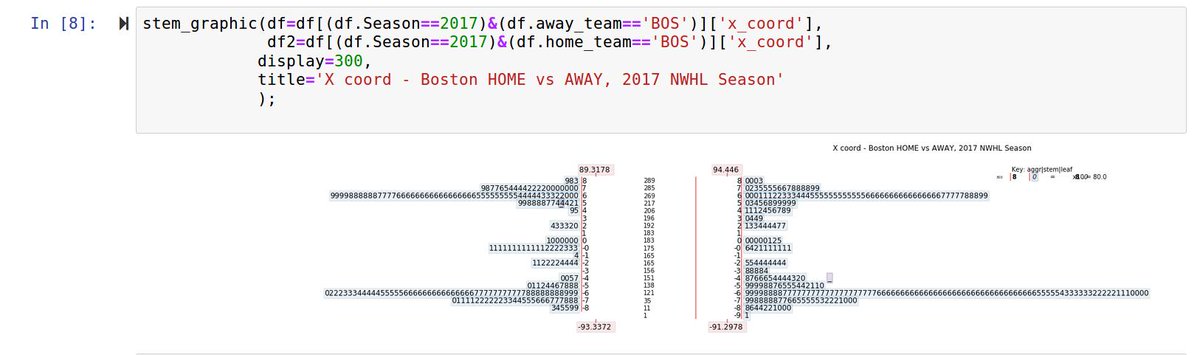
@quarkyhockey@dataandme @NWHL Also, violin plots seem to suggest plays outside of the rink... Not the case with stem-and-leaf.
Here's an example with NWHL data, 2017 season, using @stemgraphic to plot it (using pandas to select year and team, BOS), in a back to back format, for X coordinate:
That's a back to back @stemgraphic in case you are wondering. Distances are read directly on the stem and the fractional feet are the leafs. gives the *exact* distribution, unlike a box plot or violin plot.